Blog
Thumbnail Size for YouTube Video The Definitive 2026 Guide
Published May 21, 2026
The recommended thumbnail size for YouTube video is 1280 × 720 pixels with a 16:9 aspect ratio, a minimum width of 640 pixels, and a typical 2 MB upload limit. That's the baseline, but it's only the starting point if you want a thumbnail that still looks sharp, readable, and click-worthy after YouTube shrinks it across different devices.
A lot of ecommerce founders get this wrong in a very normal way. You spend hours scripting a product demo, editing hooks, cleaning up the voiceover, and maybe even shooting fresh footage on your phone or camera. Then the thumbnail gets treated like an afterthought. The result is a soft image, awkward crop, tiny text, or a product photo that looked fine in Canva but turns unreadable once it hits YouTube.
That mistake costs attention before your video gets a chance to earn trust. For a brand selling products, the thumbnail is often the first ad creative a shopper sees. If it doesn't communicate fast, people scroll.
Table of Contents
- Your Thumbnail Is Your Video's First Impression
- The Official YouTube Thumbnail Specifications
- Why These Thumbnail Specs Are Non-Negotiable
- Designing for Clicks Within the Safe Area
- An Ecommerce Creator's Workflow for Thumbnail Optimization
- Common YouTube Thumbnail Questions Answered
Your Thumbnail Is Your Video's First Impression
A founder films a solid product video. The hook is good. The offer is clear. The product solves a real problem. Then YouTube shows a blurry frame grab with the product half cut off and the founder mid-blink.
That's not a small presentation issue. It changes whether someone clicks.
For an ecommerce brand, the thumbnail isn't decorative. It's the packaging for the video. Before a shopper hears your voice, sees your demo, or understands your offer, they judge the thumbnail. If the image looks messy, cheap, or confusing, they assume the video will feel the same way.
This is why experienced creators treat thumbnails like performance creative, not admin work. The best ones do one job well. They make the promise of the video obvious in a split second. That might be a product close-up, a face with a clear reaction, or a bold visual contrast between problem and solution.
A thumbnail doesn't need to explain everything. It needs to earn the click.
This matters even more if you're repurposing content across platforms. A product education video on YouTube, a cutdown for Meta, and a short-form teaser all benefit from the same visual discipline. If you're already thinking about cross-platform content, this guide on how to grow on TikTok pairs well with a stronger thumbnail system.
What weak thumbnails usually get wrong
- They rely on auto-selected frames instead of a custom image with intent.
- They cram in too much text and force viewers to squint.
- They ignore mobile viewing even though many people first see the thumbnail small.
- They treat sizing as a technical detail instead of a conversion factor.
A good thumbnail gives your video a fair shot. A bad one buries strong content under poor presentation.
The Official YouTube Thumbnail Specifications
Start with the official spec, then make smart production choices on top of it.
YouTube's baseline thumbnail setup is straightforward: 1280 × 720 pixels, a 16:9 aspect ratio, a minimum width of 640 pixels, and a maximum file size of 2 MB. The platform also commonly accepts JPG, PNG, and GIF for thumbnail uploads.
YouTube thumbnail spec sheet
| Specification | Requirement |
|---|---|
| Resolution | 1280 × 720 pixels |
| Aspect ratio | 16:9 |
| Minimum width | 640 pixels |
| File size guideline | 2 MB maximum |
| Common upload formats | JPG, PNG, GIF |
These specs are easy to memorize, but the reason they matter is practical. You are creating a master asset that has to display cleanly across YouTube surfaces without getting cropped, stretched, or degraded too early.
What each spec means in practice
1280 × 720 pixels is still the standard working size because it gives you enough room to build a clean composition and export a file that holds together well after upload compression. For ecommerce videos, that extra room helps with small but important details like product edges, packaging text, facial expression, and contrast between the subject and background.
16:9 aspect ratio keeps your composition aligned with YouTube's native video frame. If you design on the wrong canvas shape, the thumbnail can look off before anyone even clicks. A square-first layout often leaves too much dead space. A vertical-first layout tends to force awkward crops.
640 pixels minimum width is only a floor. It tells you what YouTube can accept, not what usually gives you the best result. If you upload at the minimum, you leave less margin for compression, scaling, and reuse across other channels.
2 MB maximum file size forces a quality trade-off. Large files can preserve cleaner detail, but oversized exports create upload problems. This is one reason JPG is usually the default choice for thumbnail production. It keeps file weight under control while still looking strong if the image is lit well and the composition is simple.
JPG, PNG, and GIF each have a place. JPG works well for photo-based thumbnails, especially product shots and faces. PNG is useful when the thumbnail includes sharp graphic elements, bold cutouts, or text overlays that need cleaner edges. GIF is accepted, but it is rarely the best choice for a polished ecommerce thumbnail.
Key takeaway
Use 1280 × 720 as your default production baseline because it matches YouTube's official standard and gives you enough image quality to work with. Then build the thumbnail with compression, downscaling, and cross-platform reuse in mind.
Practical rule: The upload spec gives you compatibility. Strong click performance comes from how well the image survives at small sizes.
Why These Thumbnail Specs Are Non-Negotiable
YouTube doesn't show your thumbnail in just one place. It pushes versions of that image across search results, recommendations, channel pages, embeds, and other surfaces. That means your upload has to behave like a master file.
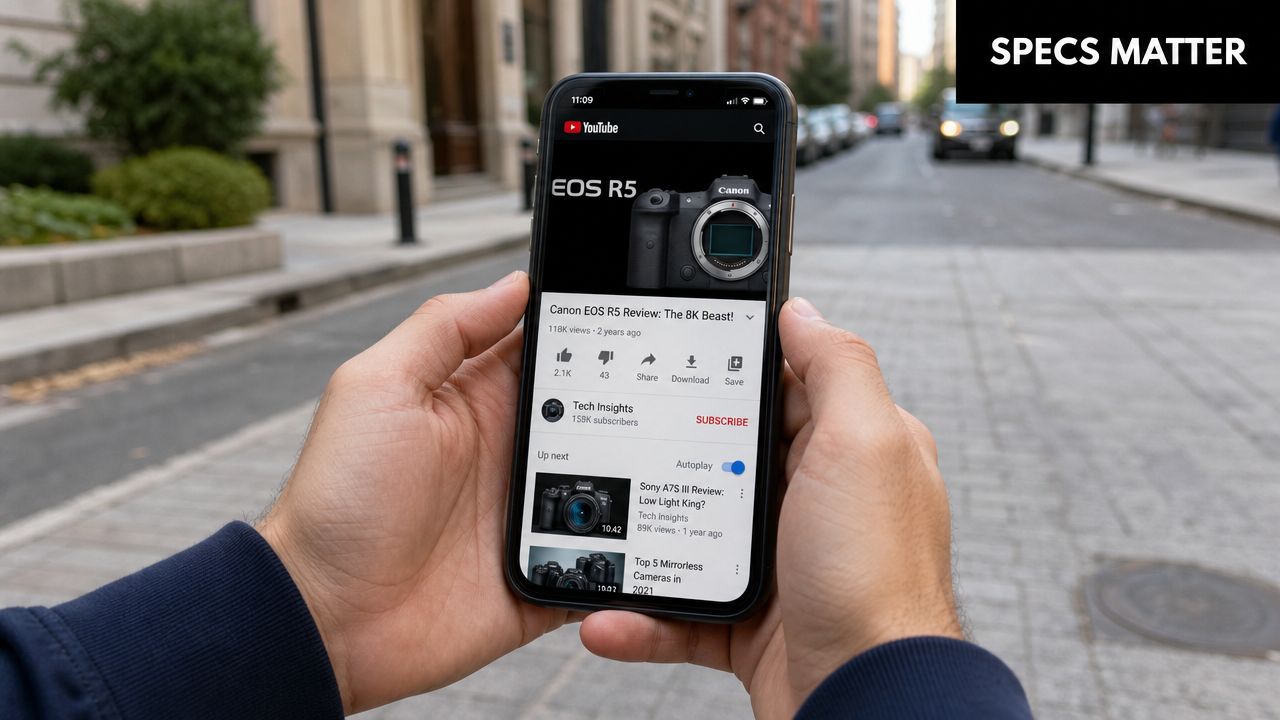
Google's own API documentation shows that thumbnails are delivered in multiple standardized sizes, including default at 120 × 90 pixels, plus medium, high, standard, and maxres versions depending on the resource and placement, as detailed in the YouTube Data API thumbnails documentation. That's the reason a thumbnail that looks acceptable at full size can fall apart when someone sees it in a tiny recommendation slot.
Your thumbnail is a master asset
Think of the thumbnail like packaging artwork. If the original file is clean, properly shaped, and composed with restraint, YouTube can scale it down without destroying the message. If the original is weak, every smaller version gets worse.
That's why certain design habits keep showing up among strong creators:
- High contrast wins attention because small previews need clear separation between subject and background.
- Large subjects hold up better than busy scenes with multiple focal points.
- Minimal text survives resizing better than sentence-length headlines.
- Clear edge definition matters for products with slim shapes or neutral colors.
What happens when you ignore the specs
The most common failure isn't that YouTube rejects the file. It's that the thumbnail technically uploads but visually underperforms.
Here's where things usually break:
- Wrong aspect ratio leads to awkward cropping or visual dead space.
- Low-resolution exports make the image feel soft, especially around text and facial features.
- Overdesigned layouts become unreadable after YouTube resizes them.
- Tiny product shots disappear when the thumbnail gets reduced.
The practical issue is consistency. A shopper might first see your video on mobile in a very small preview, then later on desktop, then again in an embed. If the core visual idea changes from one context to another, you lose recognition.
What actually works
A useful thumbnail size for youtube video isn't just about meeting the upload requirement. It's about making one visual idea survive across many display sizes.
Use one subject. Keep the promise obvious. Make sure the product, result, or emotional cue stays legible at a glance. If you can't understand the thumbnail when it's small, YouTube's resizing system will expose that weakness immediately.
Designing for Clicks Within the Safe Area
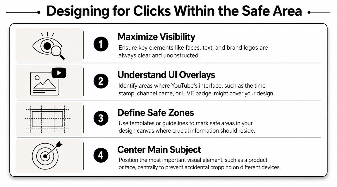
A correctly sized thumbnail can still fail if the important parts sit where YouTube overlays interface elements. This is the piece most beginners miss. They design a clean thumbnail, upload it, and then the video duration stamp covers the one line of text that mattered.
What the safe area actually means
The safe area is the part of your canvas where critical information is least likely to get blocked, cropped, or crowded by YouTube's interface. In practice, you should assume the edges are less reliable than the center, and the bottom-right corner is especially risky because of the duration label.
If your product price card, logo, or key word sits there, you're gambling with visibility.
A composition rule that works
Keep the visual hierarchy simple:
- Primary subject near the center or slightly off-center.
- Short text away from corners and away from the bottom edge.
- Logo small and secondary, not competing with the main hook.
- Background details supportive, not essential.
A lot of ecommerce thumbnails improve immediately when the founder stops trying to use the whole canvas equally. The center carries the message. The edges support it.
Don't put anything essential where a platform overlay can sit on top of it.
What to protect first
When I review underperforming thumbnails, these are usually the assets that deserve safe placement before anything else:
-
The product itself
If you're selling a physical product, make sure its shape is obvious. A bottle, gadget, or beauty item should read instantly, not blend into props. -
The face or reaction
If your thumbnail uses a founder, creator, or customer expression, keep the eyes and mouth unobstructed. Cropped faces lose their impact fast. -
The promise text
If you use words, keep them short and bold. One phrase is enough. The title can handle the nuance. -
The contrast edge
Leave breathing room around the subject so it doesn't merge with a noisy background.
For creators also focused on sales performance after the click, this breakdown of how to increase conversion rates is useful because the same principle applies. Clarity beats clutter.
A quick self-check before upload
Shrink your thumbnail on-screen until it feels close to a feed preview. Then ask:
- Can I identify the subject immediately?
- Is the key text still readable?
- Would a timestamp cover anything important?
- Does the design still make sense without the title?
If the answer to any of those is no, the thumbnail needs another pass.
An Ecommerce Creator's Workflow for Thumbnail Optimization
A workable thumbnail process saves time long before it improves click-through rate. Ecommerce teams usually need the same creative idea to serve more than one job. It has to look sharp on YouTube, hold up in a paid social workflow, and stay close enough to your brand system that the next video does not start from zero.
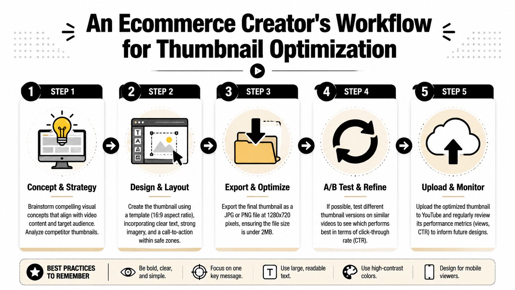
That is why I rarely build thumbnails as one-off files. I build a master asset first, then export the version YouTube needs.
Build the master larger than the final upload
Plenty of articles stop at 1280 x 720. That is still the standard upload size creators need to support. But Google's newer guidance has pushed more creators to work from higher-resolution source files, and this review of the newer 4K YouTube thumbnail recommendation explains why that shift matters.
The practical takeaway is simple. Design large if you want flexibility. Export correctly if you want reliability.
For an ecommerce brand, that trade-off matters. A larger master file gives your team room to crop for ads, product education posts, sales pages, or email graphics without rebuilding the concept. The exported YouTube version keeps file size manageable and avoids upload problems.
Use a repeatable production flow
Start with the click promise.
Before opening Canva or Photoshop, answer one question: what should the viewer expect after the click? A product test, a side-by-side comparison, a dramatic result, a fix, a reveal. If the thumbnail cannot communicate that core promise quickly, the design is still too vague.
Then choose one hero visual. One product shot. One face. One clear result frame. Ecommerce thumbnails get messy fast when founders try to show the box, the product, the founder, the testimonial, and a headline all at once.
If you work in Canva, build a brand template with locked fonts, color styles, and spacing rules. If you work in Photoshop, keep a layered master file with editable text and cutout subjects. Both approaches work. The better choice is the one your team can update quickly without breaking the layout.
Before export, it helps to see a creator talk through the process in a more visual way:
Export with the platform in mind
Your design file is not the deliverable. The uploaded thumbnail is.
For YouTube, export a version that fits the platform's normal requirements and keeps the file light enough to load cleanly. JPG is usually the safest default for ecommerce creators because it balances quality and file weight well. PNG can be useful for certain graphics-heavy designs, but it is easier to end up with a file that is heavier than it needs to be.
Name the file like an asset your team may need again in three months. Product-name-demo-thumbnail-v2 is useful. finalfinalnew.jpg is not.
Build a system, then test the creative choices
The fastest-growing channels usually follow a pattern. Consistent type. Consistent contrast. Consistent framing logic. That consistency helps returning viewers recognize your videos, but each thumbnail still needs a distinct hook.
Testing belongs inside that system. Keep the format stable and test the variable affecting interest: the product angle, facial expression, headline wording, or before-and-after image. If you want a more structured approach, this guide to multivariate thumbnail testing methods is a good next step.
A strong workflow removes opinion fights. The team knows what gets templated, what gets tested, and what gets exported.
For ecommerce creators, that is a major upgrade. Build once at a quality level high enough for YouTube and paid media, then export the version each channel needs.
Common YouTube Thumbnail Questions Answered
Can I change my video's thumbnail after it has been published
Yes, you can change it after publishing. That's useful when the original thumbnail isn't pulling attention, when the video topic shifts based on comments, or when you want the thumbnail to match a stronger title revision.
Treat that as a normal optimization step, not a sign you failed the first time.
What happens if I upload the wrong size anyway
If the file is too small or doesn't fit YouTube's expectations, you can run into rejection, cropping, or a thumbnail that looks wrong once it's displayed. Even when the upload succeeds, the bigger risk is visual damage. Text becomes harder to read, your product may sit too close to the edge, and the image can feel off-brand.
The issue usually isn't technical compliance alone. It's how the thumbnail performs after YouTube adapts it across placements.
Do YouTube thumbnail tests use different size requirements
No separate size requirement is needed for alternate thumbnail versions. The smart move is to keep every variation built from the same core template and export standard-compliant files for each option.
When founders test, the variable should be the creative decision. Change the focal image, headline wording, facial expression, or background contrast. Don't change the basic technical structure from one version to another unless you're diagnosing a formatting problem.
Should I design at 1280 × 720 or at a larger size
Use 1280 × 720 if you want the simplest direct workflow for YouTube. Use a larger master creative if you also need the asset for social ads or other marketing placements, then export a YouTube-ready version from that source file.
That approach gives you flexibility without turning your upload process into a mess.
If you're launching your first product and need help turning product pages into ad-ready creative systems, Social Loop AI helps you plan campaigns, generate brand-aware creatives, and build a practical testing workflow without hiring an agency.