Blog
How to Increase Conversion Rates A Beginner's Guide
Published May 18, 2026
You launched the product, built the Shopify page, turned on Meta ads, and the clicks started coming in. That part feels promising. Then nothing happens. No sales, few add-to-carts, and a store that looks active from the outside but dead from the inside.
That gap is where most beginners get stuck. They assume the fix is “better ads” or a full site redesign. Usually it's neither. Instead, the job is to tighten the path from ad click to checkout so your store makes the next step obvious, credible, and easy.
If you're trying to learn how to increase conversion rates on a small budget, the most impactful moves aren't fancy. They're the practical fixes that remove friction, improve message match, and help you test the few things that truly change buyer behavior.
Table of Contents
- Why Traffic Isnt Turning into Sales
- How to Find Your Conversion Leaks
- Tactical Fixes for Your Product Page
- Matching Your Meta Ads to Your Landing Page
- A Practical Testing Plan for Small Budgets
- Tracking Your Progress and Scaling Wins
Why Traffic Isnt Turning into Sales
New dropshippers often misread the situation. They see traffic and assume demand exists, so they blame the product when sales don't show up. Sometimes the product is weak. More often, the store is leaking intent.
A visitor clicks because something in the ad caught them. Then they land on a page with a generic headline, cluttered layout, weak product explanation, and a CTA that asks for commitment before trust exists. That buyer didn't reject the category. Your store just didn't make the decision easy enough.
The good news is that conversion work at this stage doesn't need enterprise tooling or a massive data team. It needs disciplined observation. You need to ask where people hesitate, what expectation your ad created, and what doubt your page failed to answer.
Practical rule: If your store gets clicks but no movement lower in the funnel, assume friction before you assume failure.
The mistake I see most often is changing everything at once. New merchants rewrite the product page, swap the theme, change the pricing, launch new creatives, and add urgency banners all in the same week. That feels productive, but it makes it impossible to tell what made a difference.
A better approach is simpler. Treat your store like a chain of small decisions:
- The ad click: Did the creative attract the right person?
- The product page visit: Did the page immediately confirm they were in the right place?
- The add to cart decision: Did the page answer the core buying questions?
- The checkout start: Did the buyer feel enough trust to continue?
- The purchase: Did anything add friction at the final step?
If you fix the biggest leak first, results improve faster than they do with broad redesigns. That's how beginners should think about conversion rate optimization. Not as a polished brand exercise, but as a practical system for turning paid traffic into clearer buying behavior.
How to Find Your Conversion Leaks
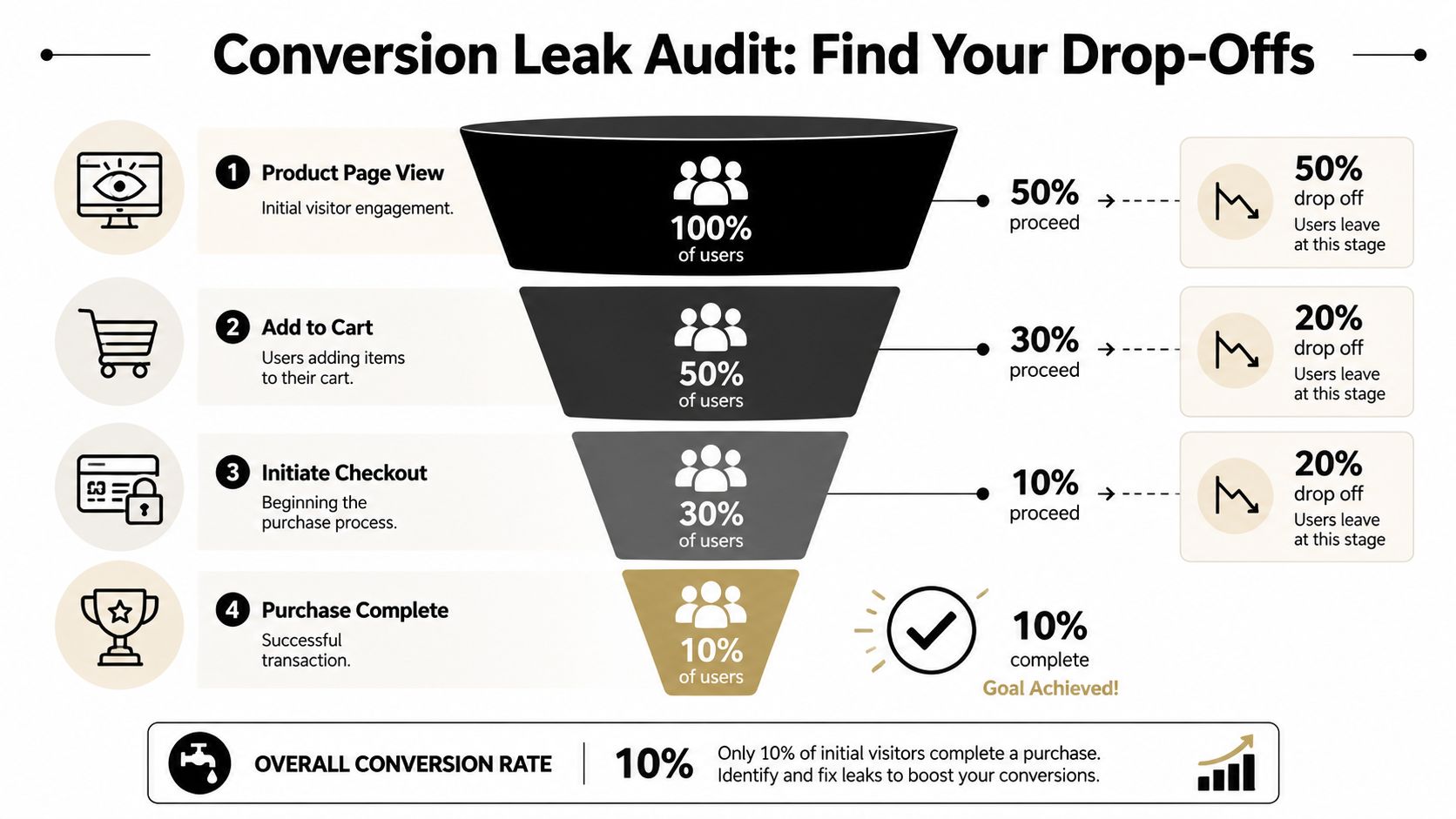
The fastest way to waste money is to optimize the wrong part of the funnel. If you only look at your top-line conversion rate, you won't know whether the problem is weak traffic, weak product-page persuasion, or checkout friction. A more useful method is to break the journey into micro-conversions and inspect the drop-off between each stage, which is the approach recommended in Winning by Design's guide to improving sales conversion rate.
Stop looking at one number
“Low conversion rate” is not a diagnosis. It's a symptom.
If your product page gets attention but few add-to-carts, your issue is usually offer clarity, trust, pricing context, or page focus. If carts happen but checkout starts don't, buyers may feel uncertainty about shipping, delivery times, returns, or payment trust. If checkout starts but purchases stall, the friction is likely late in the process.
That's why a funnel audit matters. It gives you a place to act.
Track the handoff between stages, not just the final outcome. That's where the real problem usually shows up.
Run a fast funnel audit
Open Shopify and Meta Ads Manager side by side. Then review one product or one campaign at a time. Don't blend everything together.
Use this short audit:
-
Check the ad click quality
Look at the ads that are sending visitors. Read the headline, primary text, and offer. Then ask a blunt question: does this traffic seem curious, or does it seem ready to buy? -
Inspect the product page reaction
Once people land, do they scroll, engage, and move toward the cart, or do they stall? If the page doesn't make the product, outcome, and offer obvious in the first screen, that's a likely leak. -
Compare add to cart against checkout starts
This gap often reveals trust or price shock. Buyers may like the product but hesitate when they realize shipping terms, return policy, or total cost aren't clear. -
Look at completed purchases after checkout starts
If people begin checkout and disappear, review payment options, checkout simplicity, surprise fees, and mobile usability.
A simple working sheet helps. Use something like this:
| Funnel stage | What you want to learn | Common leak |
|---|---|---|
| Product page view | Did the click land on the right message? | Weak message match |
| Add to cart | Did the page create desire and confidence? | Confusing copy or weak trust |
| Initiate checkout | Did the offer still feel worth it? | Shipping or policy uncertainty |
| Purchase complete | Could they finish without friction? | Checkout complexity |
Keep the diagnosis narrow. If one stage is clearly weaker than the others, don't jump ahead and “optimize everything.” Fix the biggest leak first, then measure again.
Tactical Fixes for Your Product Page
Most beginner product pages suffer from the same problem. They try to say everything, so they say nothing clearly. The fastest gains usually come from focus, not creativity. Industry benchmarks summarized by Insiteful's CRO statistics roundup show top-performing landing pages can reach an average conversion rate of 11.45%, compared with a typical 2.35% average. The same roundup notes that pages with fewer than 10 elements can achieve about 2x higher conversion rates than cluttered pages, and personalized CTAs have been reported to outperform standard ones by 202%.
Sharpen the page before you redesign it
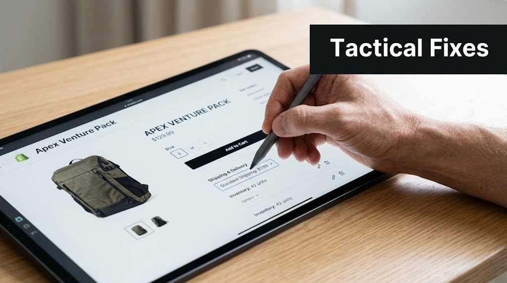
To increase conversion rates without rebuilding your store, start with the visible essentials.
- Headline first: Your headline should describe the main outcome, not just the product name. “Portable Blender” is weaker than a benefit-led promise that tells buyers why it matters.
- One primary CTA: Remove competing actions near the buy area. A product page should not feel like a menu.
- Benefit-led copy: Features support the sale. Benefits make the sale. Lead with the problem solved, then explain how the product does it.
- Cleaner layout: Strip out extra icons, popups, app widgets, and decorative clutter that don't help a buyer decide.
For a deeper look at focused page structure, review these landing page best practices for clearer conversion paths.
A weak product description often sounds like a supplier sheet. It lists material, size, and package contents, but never answers the buyer's real question, which is why this helps me right now.
Try this structure instead:
- Opening line: State the use case or desired outcome.
- Three short bullets: Explain the main benefits in plain language.
- Objection handling: Add shipping, returns, compatibility, sizing, or setup details.
- CTA support: Place a short confidence statement near the button.
A buyer doesn't need more words. They need fewer doubts.
Fix trust before you fix style
A prettier page won't rescue a page that feels risky.
Use trust signals close to the buying decision, not hidden in the footer. That means shipping info, return terms, secure checkout language, and any relevant proof near the CTA area. If you have reviews, use them. If you don't, you can still add credibility through clear policies, product demos, and specific explanation.
Later in the page, this kind of walkthrough can help you tighten structure and presentation:
A few product-page fixes usually outperform theme tweaks:
| Area | Weak version | Better version |
|---|---|---|
| CTA | Add to Cart | Get Yours Today |
| Description | Lists specs only | Leads with outcome and use case |
| Social proof | Hidden or missing | Near CTA and product imagery |
| Policies | Buried in footer | Visible near price and CTA |
If budget is tight, don't pay a designer first. Rewrite the promise, reduce clutter, improve trust placement, and tighten the CTA. That's where small stores usually get their first meaningful lift.
Matching Your Meta Ads to Your Landing Page
A lot of beginners try to fix conversion rate on the site while leaving the ads untouched. That's backwards. Your ad decides who clicks and what they expect to see next. If that expectation breaks on the landing page, conversion drops before the buyer even reads your copy.
As noted in WordStream's guidance on improving conversion rates, the bottleneck for new ecommerce advertisers is often traffic quality and message-match, not just on-page persuasion. WordStream recommends optimizing the customer journey, prioritizing keywords by intent, and using multiple ad copy variations because aligned messaging materially affects conversion probability.
Your ad creates the promise
Every Meta ad makes a promise, whether you meant it to or not.
If the ad says the product saves time, the page should open with that angle. If the ad leans on a gift use case, the page shouldn't greet the visitor with generic product specs. If the creative shows a pain point being solved in a specific context, the landing page should continue that story.
When merchants ignore this, they get the worst kind of click. Interested enough to visit, unconvinced enough to leave.
Stronger call to action phrases that fit buyer intent can help, especially when the CTA on the page reflects the exact promise made in the ad.
How to tighten message match fast
You don't need a new page for every ad. But you do need consistency between the ad and the page.
Use this checklist:
- Repeat the core angle: If the ad leads with convenience, lead the page with convenience.
- Match the visual context: If the ad shows the product in use, don't switch to generic catalog imagery above the fold.
- Keep the offer consistent: If the ad implies a bundle, discount, or specific buyer outcome, confirm it quickly on the page.
- Mirror the language: Reuse the same key phrases so the click feels continuous, not jarring.
A simple example makes this clear:
| Ad angle | Bad landing-page match | Better landing-page match |
|---|---|---|
| “Stop messy cords in your car” | Generic product title only | Headline reinforces cleaner car setup |
| “Great gift for dog owners” | Technical feature list | Gift-focused opener and use-case images |
| “Easy kitchen cleanup” | Lifestyle copy with no proof | Demo image plus quick cleanup benefits |
The biggest win here is psychological. Buyers relax when the page confirms they made the right click. They get suspicious when the page feels like a bait-and-switch, even if the product is technically the same.
If you're spending on Meta, message match is one of the cheapest fixes available. It doesn't require more traffic. It requires less disconnect.
A Practical Testing Plan for Small Budgets
Most advice about testing assumes you have enough traffic to run clean experiments every week. New dropshippers usually don't. That doesn't mean you shouldn't test. It means you should test fewer things, in a better order.
The most useful beginner approach is to prioritize by expected impact and start with high-friction elements like CTA copy and trust signals, as discussed in Northpeak's CRO testing tips. That beats random testing every time.
Pick tests by leverage not curiosity
A small-budget store shouldn't start by testing button shades, font families, or tiny layout tweaks. Those are low-impact tests unless your page is already strong.
Start with the elements closest to buyer hesitation:
- Offer framing
- Headline
- Primary image
- CTA wording
- Trust signals near the CTA
- Checkout friction
If you want a more advanced view of testing frameworks later, this guide to multivariate testing and when to use it is useful, but beginners usually need simpler priorities first.
Small-budget rule: Test what changes buyer confidence, not what changes decoration.
Use rounds instead of endless experiments
Think in rounds. Each round should target one clear source of friction.
| Round | Element to Test | Why It's a Priority | Example Variation |
|---|---|---|---|
| Round 1 | Offer and headline | This shapes first impression and relevance | Lead with problem solved instead of product name |
| Round 2 | Primary image and CTA | These affect clarity and next-step action | Swap catalog shot for in-use image, rewrite CTA |
| Round 3 | Trust signals and reassurance copy | These reduce hesitation near purchase | Add shipping, returns, and secure checkout reassurance |
Run one meaningful change at a time where possible. If you're changing the headline, don't also replace all images, pricing language, and page layout on the same day. You need to preserve cause and effect.
A practical cycle looks like this:
- Pick one leak.
- Choose one high-impact fix.
- Let traffic hit the change long enough to reveal a pattern.
- Keep the winner if buyer behavior improves.
- Move to the next friction point.
This isn't about building a perfect lab. It's about making informed improvements while protecting a small ad budget from chaos.
Tracking Your Progress and Scaling Wins
Most beginners drown in dashboards. They watch too many numbers and still don't know what to do next. For a small store, the useful question is simpler: did the latest change improve buyer movement through the funnel?
A disciplined testing process helps here. Quantum Metric's advice on improving conversion rates recommends forming a concrete hypothesis, changing only one element per test, and iterating based on the result. That one-variable-at-a-time approach reduces wasted spend and keeps your read on performance cleaner.
Watch the few metrics that matter
For a new ecommerce store, I'd focus on three practical checks:
-
Ad click quality from Meta Ads Manager
This tells you whether your creative and targeting are earning relevant visits. -
Add to cart behavior inside Shopify analytics
This shows whether the product page is creating buying intent. -
Purchase conversion behavior across the funnel
This reveals whether the store turns intent into completed orders.
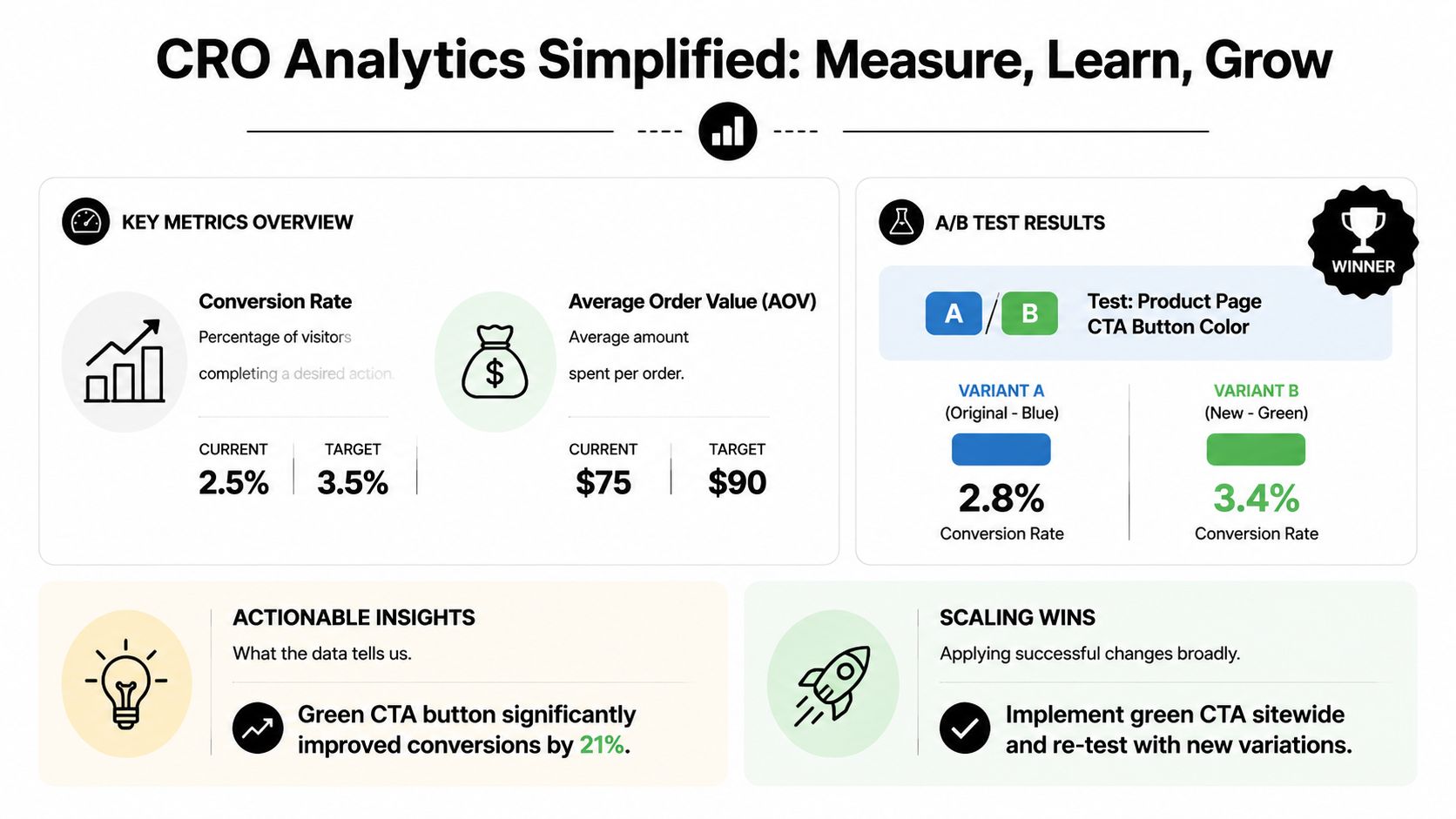
Don't overreact to a single day. Look for directional change after a controlled adjustment. If clicks improve but add-to-carts stay flat, the ad may be attracting attention without enough buying intent. If add-to-carts rise but purchases don't, your issue likely sits later in the path.
Scale only what you can explain
A result is more valuable when you know why it happened.
Keep a simple test log with four notes:
| What to log | Example |
|---|---|
| Change made | Rewrote headline around convenience |
| Hypothesis | Clearer outcome will improve page relevance |
| Metric watched | Add to cart behavior |
| Result | Improved, flat, or worse |
That habit matters because scaling without understanding is how stores lose money after one promising week. If a change works, roll it out more broadly only after you can connect it to a clear buyer response.
The long-term loop is straightforward. Audit the funnel. Fix the biggest leak. Test one variable. Read the outcome. Repeat. That's the practical version of how to increase conversion rates when you're starting small and can't afford guesswork.
If you're launching Meta ads for the first time and want a faster way to connect your product page, creative angles, buyer objections, and testing plan, Social Loop AI helps turn a product URL into a practical ad launch system. It's built for first-time dropshippers who need clearer creatives, stronger landing-page messaging, and a budget-aware plan for what to test first.