Blog
10 Best Practices for Landing Pages in 2026
Published May 16, 2026
Your Ads Get Clicks, But Why No Sales? You've crafted the perfect Meta ad, your targeting is dialed in, and the clicks are rolling in. But your Shopify dashboard shows a flatline, zero sales. This frustrating gap between ad clicks and actual conversions almost always points to one culprit: your landing page. Before you spend another dollar on ads, you need to ensure your page is built to convert. This guide provides 10 essential landing page best practices specifically for new ecommerce owners, focusing on quick fixes that build trust, clarify your offer, and turn curious visitors into paying customers.
For new dropshippers, this matters even more because you don't have much room for waste. If you're testing a product on a tight budget, every bad click hurts twice. First, you pay for the visitor. Then you lose the chance to learn what would have made them buy.
A weak landing page usually fails in familiar ways. The ad promises one thing, the page says another. The visitor lands, sees too many choices, can't tell if the product is legit, and leaves. Good pages fix that before launch. They make the offer obvious, remove friction, and answer the doubts that stop first purchases.
Table of Contents
- 1. Clear Value Proposition Above the Fold
- 2. Single-Focus Hero Section with Micro-Copy Optimization
- 3. Strategic Use of Social Proof and Trust Elements
- 4. Audience-Targeted Copy That Speaks to Specific Buyer Personas
- 5. Mobile-First Design and Fast Loading Speed
- 6. Persuasive CTA Hierarchy and Strategic Placement
- 7. Objection Handling Through Benefit-Focused Product Information
- 8. Scarcity and Urgency Messaging Without Appearing Manipulative
- 9. Conversion-Focused Form Design and Checkout Optimization
- 10. Continuous A/B Testing and Data-Driven Iteration
- 10-Point Landing Page Best Practices Comparison
- Turn Your Page Into a Conversion Engine
1. Clear Value Proposition Above the Fold
A common pre-launch mistake looks like this. The ad gets clicks, CPC is acceptable, and the product seems promising. Then the landing page opens with a brand slogan, a large logo, and a hero image that looks polished but says almost nothing. That is how new dropshippers burn through early ad spend without learning what failed.
Your first screen needs to answer three questions fast: what the product is, who it helps, and why this version is worth buying from your store instead of Amazon, Temu, or a near-identical competitor. If any of those answers are missing, cold traffic hesitates. Hesitation is expensive.
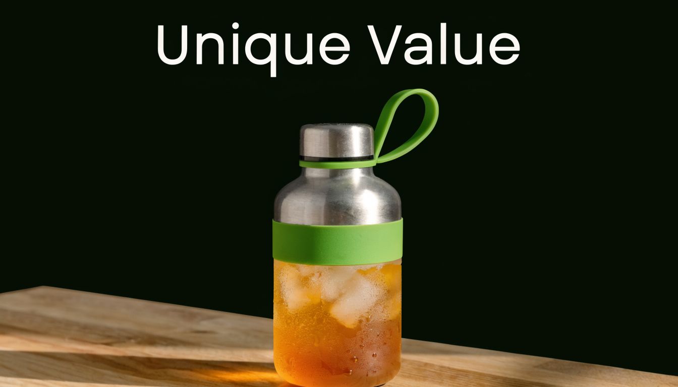
Make the first screen carry the click
For a new store, the value proposition is not brand poetry. It is conversion insurance for paid traffic. A strong above-the-fold section usually includes a clear headline, one supporting subhead, one primary CTA, and a product image that shows the item in use.
The job here is simple. Match the promise of the ad.
If your ad sells convenience, the headline should lead with convenience. If the ad sells a pain-point fix, the headline should name that fix. If the ad sells a specific outcome, the page should repeat that outcome in clearer language than the ad did. This message match is one of the fastest pre-launch fixes for the classic problem of high click-through rates with weak conversion rates.
A waterproof phone case should say, "Take underwater photos without risking your phone." A posture corrector should say, "Sit straighter during long work sessions without bulky braces." Those lines tell a shopper what the product does and why it matters. "Premium protection for modern lifestyles" tells them nothing.
Practical rule: If your headline could sit on ten different products, rewrite it.
Use this quick formula before launch:
- Headline: Name the product and main outcome
- Subhead: Add the buyer, use case, or differentiator
- CTA: Ask for one action only
Here is a pasteable template:
- Headline: "[Product] that helps you [primary result]"
- Subhead: "Made for [specific buyer] who want [benefit] without [common frustration]"
- CTA: "Shop [Product Type]" or "Get [Primary Benefit]"
Example:
- Headline: "An insulated bottle that keeps drinks cold for hours"
- Subhead: "Made for commuters, gym-goers, and travelers who want spill-free hydration without bulky gear"
- CTA: "Shop Bottles"
I usually tell founders to test three angles before spending hard on ads: problem-first, outcome-first, and buyer-identity-first. If the headline still feels flat, review a few value proposition examples from Social Loop AI and rewrite yours until a first-time visitor can explain the offer back to you in one sentence.
2. Single-Focus Hero Section with Micro-Copy Optimization
You launch ads, clicks come in, and the product page still does not convert. A cluttered hero is one of the first places I check. If the first screen asks a cold visitor to process a menu, swipe a slider, close a pop-up, compare two buttons, and decode vague copy, you pay for attention you never turn into action.
For a new dropshipping store, the safer pre-launch setup is simple. One hero. One offer. One next step. That matters when you are buying traffic with a small budget and cannot afford curiosity clicks that stall out on the page.
A focused hero reduces a common failure point: high click-through rates with weak add-to-cart rates. The ad already did the job of getting the click. The hero now has to confirm, fast, that the visitor is in the right place and knows what to do next.
Build the hero around one conversion path
Pick the primary action before you design the section. If the goal is a purchase, the hero should push toward "Shop Now" or "Buy Now." If the goal is collecting leads for a waitlist or preorder, every element on that screen should support email capture. Mixing goals usually hurts both.
What to remove before launch:
- Extra navigation links that pull shoppers off the page
- Rotating banners that compete with the main offer
- Pop-ups that appear before the visitor understands the product
- Secondary CTAs unless they support the same buying path
- Generic badges or icons that add noise without answering a real objection
I usually tell founders to test the hero with one blunt question: "Can a first-time visitor explain the next step in five seconds?" If not, simplify it again.
Tighten the small words that carry the sale
Micro-copy is where a lot of cheap conversion wins live. The button text, shipping note, returns line, and short reassurance under the CTA can fix hesitation without adding another paragraph.
Use those lines to answer the objections that block the first click:
- Shipping doubt: "Tracked shipping rates shown at checkout"
- Trust concern: "Secure checkout with encrypted payment"
- Returns hesitation: "Easy returns if it is not the right fit"
- Commitment anxiety: "No account required to order"
Weak micro-copy creates friction because it forces the shopper to guess. "Submit" says nothing. "See Colors," "Check Availability," or "Get Mine" works better when it matches the next step on the page.
Small words near the CTA often do more work than a longer block of body copy.
Pasteable fix for pre-launch pages
If your ads are getting clicks but the page feels flat, use this hero stack:
- Hero headline: "[Product] for [specific use case]"
- Supporting line: "Get [main benefit] without [main frustration]"
- Primary CTA: "Shop Now" or "Get Yours"
- Micro-copy under CTA: "Secure checkout. Shipping options shown before payment."
Example:
- Hero headline: "Grip socks for home workouts"
- Supporting line: "Stay stable during Pilates and stretching without slipping on hard floors"
- Primary CTA: "Shop Grip Socks"
- Micro-copy under CTA: "Secure checkout. Easy returns if the fit is off."
Read the full hero section out loud on your phone before you launch. If any line feels decorative instead of useful, cut it. Early campaigns often fail because the product page creates extra decisions before the shopper has enough trust to make one.
3. Strategic Use of Social Proof and Trust Elements
When you're a new store, shoppers don't know your brand, your shipping standards, or whether your photos match the actual product. That's why social proof isn't decoration. It's conversion infrastructure.
A lot of beginners make the same mistake. They dump a review app block at the bottom of the page and assume that's enough. It isn't. Proof works best when it appears right next to uncertainty.
Place proof where doubt appears
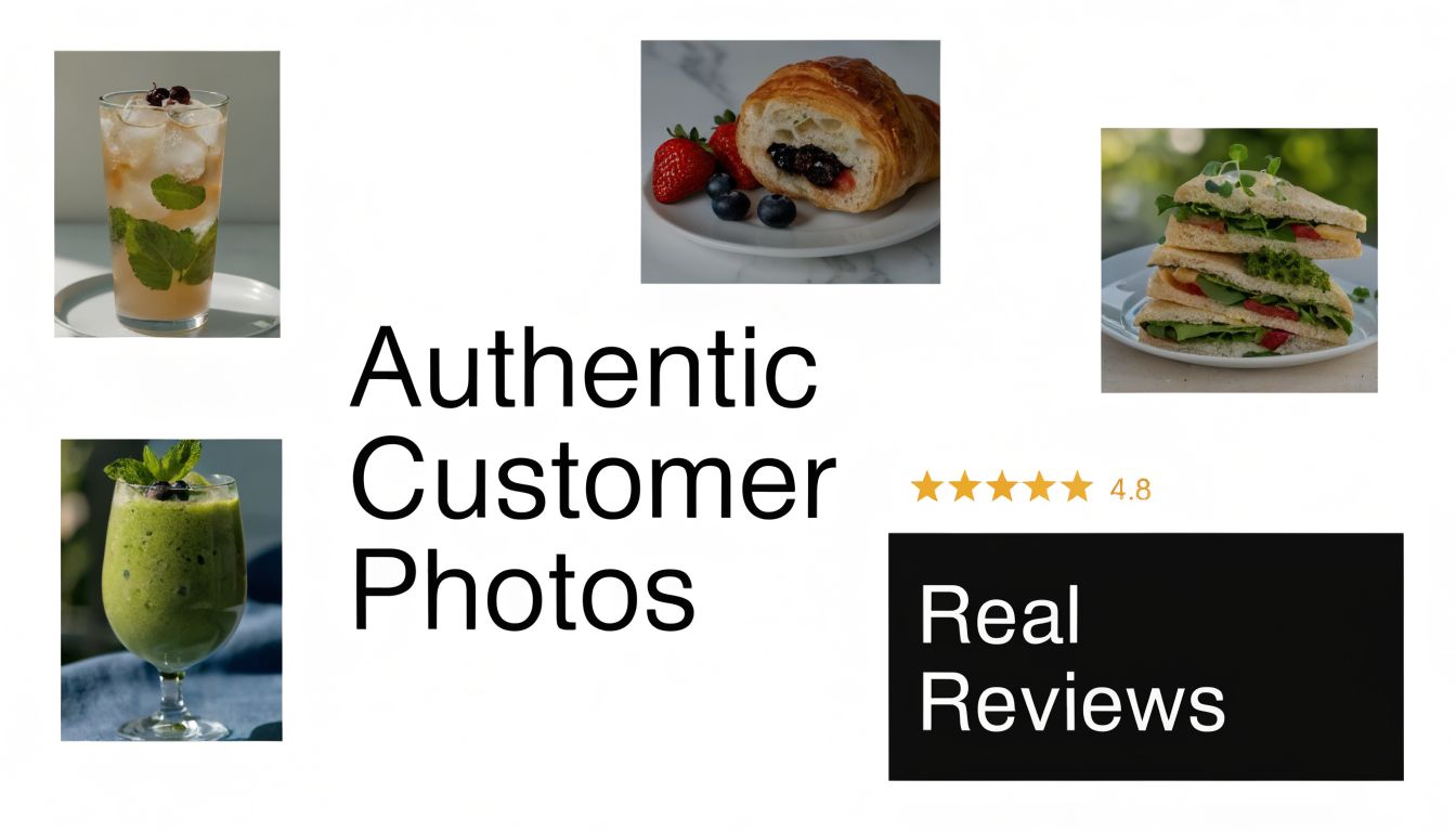
Glossier built product trust with customer photos that felt native to the shopping experience, not bolted on. Allbirds has long used ratings and customer feedback in places where buyers want reassurance before they commit. For dropshippers, user-generated content usually beats polished mockups because it answers the unspoken question: what does this look like in real life?
Use different proof formats for different objections:
- Near the headline: Add a short review snippet that confirms the main benefit.
- Near the CTA: Add trust badges, secure checkout signals, or a return-policy reminder.
- Near product details: Add customer photos showing size, fit, or use case.
- Before checkout: Add a final review cluster focused on delivery, quality, and ease of purchase.
The strongest testimonials are specific. "Love it" doesn't help much. "The material felt better than I expected" or "It looked like the video when it arrived" does. If you're early and don't have many reviews, use creator content, product demo clips, or honest founder-shot videos instead of fake-looking review walls.
4. Audience-Targeted Copy That Speaks to Specific Buyer Personas
A new store owner launches ads, gets clicks, then watches the session recordings later. People land, skim for two seconds, and leave. The product is not always the problem. The page often reads like it was written for everyone, so no one feels sure it fits them.
That gap shows up fast with paid traffic. Your ad makes a specific promise to a specific buyer. If the landing page switches back to broad, store-style copy, the click loses momentum and the visitor starts doing extra work to figure out whether the product is really for them.
A rugged phone case is a good example. A contractor wants to know if it survives drops on concrete, dust, and long workdays. A hiker wants to know how much weight it adds, how it handles rain, and whether it takes up space in a pack. Same category. Different reason to buy.
Match the page to the click
New dropshippers waste ad spend here all the time. One ad angle pulls in a certain kind of buyer, then the page answers a different question. High click-through rate, weak conversion rate. That usually means the message match broke after the ad.
The fix is simple. Build the page around one buyer persona and one traffic angle at a time. You do not need dynamic personalization tools to do this well before launch. You need copy that reflects the exact concern, desire, and language behind the ad.
If you're running Meta traffic, write the first screen and key product sections to continue the conversation started in the ad. A pain-point ad should lead into relief and proof. A convenience ad should lead into time saved and ease of use. A gift ad should lead into emotional payoff, presentation, and low-risk ordering. If you need help tightening that audience-to-offer match before launch, Social Loop's guide to generating leads on Facebook is a useful planning reference.
Use this quick persona checklist before you finalize the page:
- Who are they buying for? Themselves, a partner, a child, or a friend.
- What problem bothers them enough to click? Be specific.
- What will make them hesitate? Quality, shipping time, sizing, durability, or legitimacy.
- What words would they use? Write in customer language, not supplier language.
Here are pasteable examples that work better than vague copy:
-
Too broad: "Built for every lifestyle"
-
Better for contractors: "Protects your phone from concrete drops, dust, and long jobsite shifts"
-
Too broad: "Perfect for outdoor use"
-
Better for hikers: "Light enough for day hikes and tough enough for rain, dirt, and trail drops"
-
Too broad: "Makes a great gift"
-
Better for gift buyers: "An easy gift for someone who always drops their phone and never replaces the case on time"
Write like you're talking to one buyer who just clicked one ad. That is how you protect budget before launch and give your traffic a real chance to convert.
5. Mobile-First Design and Fast Loading Speed
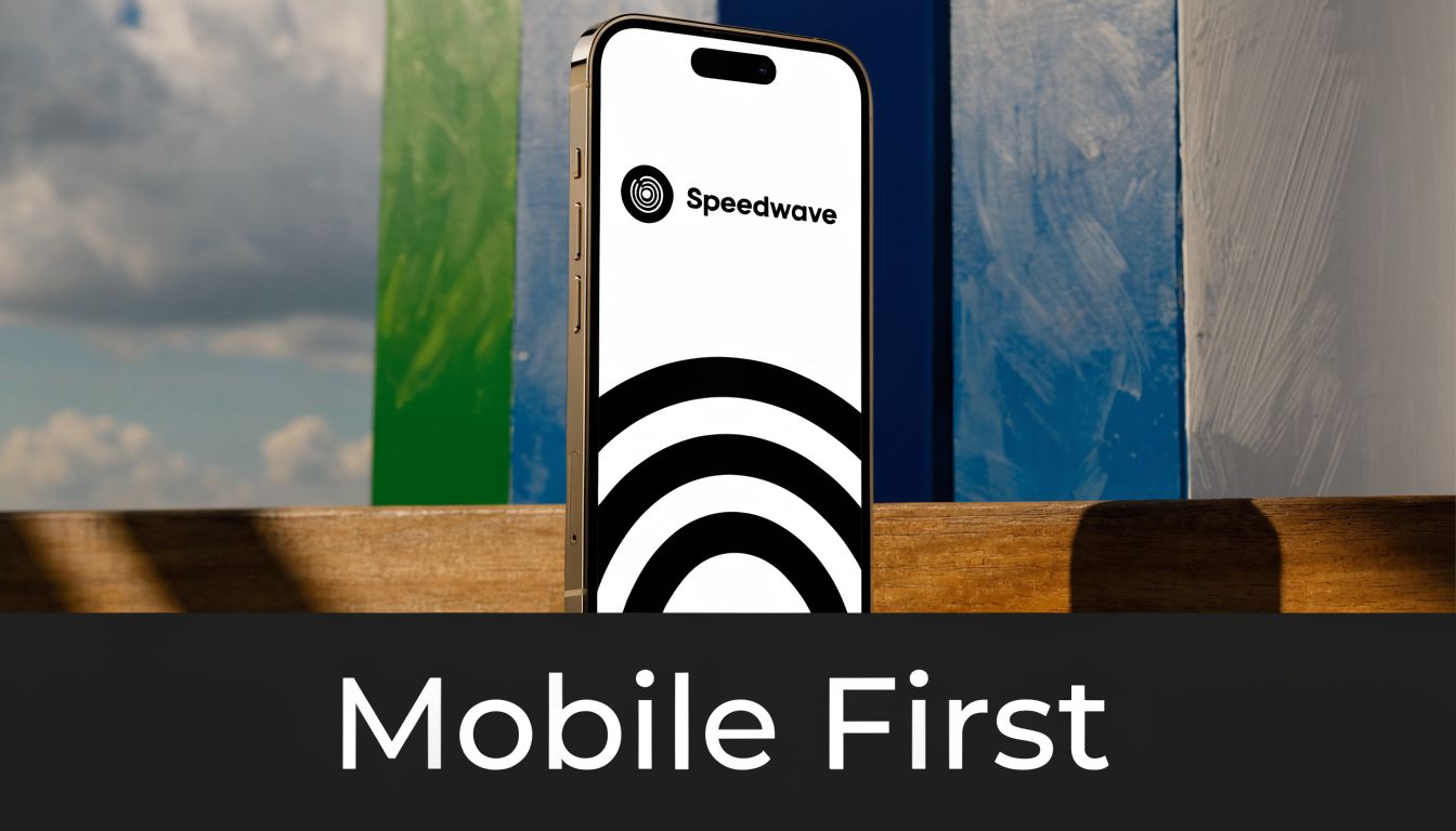
Most first-time store owners build on desktop and hope mobile holds up. That's backwards. Your paid traffic is often coming from a phone, from a distracted user, on a shaky connection, with low patience.
If your page feels slow, cramped, or awkward on mobile, your ad budget leaks before your offer even has a chance. One source summarized by Stensul's landing page best practices reports that a 1-second delay in page load can reduce conversions by 7%, and that pages loading in 1 second can have a 5x higher conversion rate than pages taking 10 seconds. The same source recommends aiming for load times under about 2.4 seconds for mobile.
Speed fixes that protect paid traffic
New dropshippers usually lose speed in obvious places. Oversized images, autoplay video, too many apps, and theme customizations stacked on top of each other. You don't need a developer to fix the first round.
Start here:
- Compress images before upload: Your hero image shouldn't be a giant uncompressed file.
- Cut nonessential apps: If an app doesn't directly improve trust or conversion, disable it for the test.
- Load the hero first: Make sure the main image, headline, price, and CTA appear fast.
- Check on a real phone: Browser preview isn't enough. Open your page on older devices and slower connections.
A simple Shopify theme with clean product media often beats a flashy build full of effects. On a tight budget, speed is not a nice-to-have. It's part of your conversion strategy.
6. Persuasive CTA Hierarchy and Strategic Placement
A weak CTA setup creates a strange kind of failure. Visitors don't hate the page. They just don't know what to do next. You see decent engagement, some scrolling, maybe even add-to-cart activity, but the page doesn't push people forward.
CTA hierarchy fixes that. Your primary action should look primary, read primary, and feel easy to take. Secondary actions should support the sale, not compete with it.
Guide the next click clearly
Think about how brands structure intent. On many ecommerce pages, "Add to Cart" is the main move. "View Reviews" or "Learn More" can help, but they shouldn't visually overpower the purchase action. If you're selling a single-product offer, your page doesn't need five equal buttons.
A practical hierarchy looks like this:
- Primary CTA: Buy, add to cart, claim offer, start order
- Secondary CTA: View reviews, see demo, read details
- Support CTA: Chat, contact, shipping policy
The wording matters. "Buy Now" is clear. "Experience Relief" can work if the product solves a painful problem. "Submit" is almost never the best choice. Match the button to buyer intent and the stage of the page. Early on, a CTA like "See How It Works" may earn more engagement. Lower on the page, after objections are answered, "Get Yours Today" may be stronger.
Button placement matters too. Put the first CTA in the hero, repeat it after the benefit stack, and repeat it near trust-building sections. On mobile, a sticky add-to-cart bar can help if it's clean and doesn't cover important content.
7. Objection Handling Through Benefit-Focused Product Information
Many stores describe products but don't sell through objections. That's a costly difference. People rarely bounce because they forgot how to read product features. They bounce because an unanswered doubt stayed alive.
For dropshippers, the common doubts are predictable. How long will shipping take? Is the quality real? What if it doesn't fit? What if I need a refund? If the page stays silent, the customer fills in the blank with the most negative answer.
A good product section can help set expectations visually.
Answer concerns before checkout
Amazon handles this by placing seller, shipping, and returns information close to the buying decision. Warby Parker lowers resistance by making fit concerns easier to solve. A new store should do the same in its own way, without sounding defensive.
Bad objection handling sounds like excuses. Good objection handling sounds like clarity. Instead of "Shipping may take longer depending on circumstances," say what the shopper can expect and when they'll get tracking. Instead of "We promise quality," show materials, close-up images, or a product demo in use.
Use this structure when writing:
- Concern: "Will this hold up?"
- Benefit-focused answer: "Built for daily use with reinforced seams and easy-clean material."
- Proof: customer photo, demo clip, or review excerpt tied to durability
The best objection copy doesn't argue with the buyer. It reassures them with specifics.
Keep FAQ sections short and useful. If a question doesn't block the sale, it doesn't need prime real estate. The biggest objections should appear before checkout, not buried under the footer.
8. Scarcity and Urgency Messaging Without Appearing Manipulative
Urgency can help a shopper act. Fake urgency can kill trust. Most buyers have seen endless countdown timers that reset on refresh, fake stock bars, and "only 3 left" warnings on stores that clearly have no real inventory logic.
For a new ecommerce brand, borrowed trust is fragile. If your urgency feels made up, you don't just lose that sale. You make the whole store feel less credible.
Use urgency that a customer can believe
There are honest ways to create urgency. Seasonal relevance works. Limited launch bonuses work. Low stock on a specific color or bundle can work if it's true. A pre-order window can work if you explain fulfillment clearly.
What doesn't work well is stacking pressure everywhere. If the page has a countdown timer, a blinking stock alert, an exit popup, and a banner screaming "SALE ENDS SOON," the visitor reads manipulation before value.
Use urgency sparingly:
- Season-based offer: Good for gifting windows, summer products, holiday buys
- Inventory-based note: Good if you really have limited stock in a variant
- Launch bonus: Good if the reward is clear and the cutoff is real
Specific language is usually better than vague language, as long as you can stand behind it. "Free gift with today's order" is clear if it's true. "Hurry, selling fast" is weak if it isn't backed by anything visible.
9. Conversion-Focused Form Design and Checkout Optimization
A lot of founders spend days polishing product copy and then send buyers into a clunky checkout. That's like paying for customers and then making them fill out paperwork at the door.
Checkout should feel easy, obvious, and low-risk. Every extra field, forced account step, or confusing input increases the chance that someone bails. On mobile, small frustrations get magnified fast.
Remove checkout friction first
Shopify's default checkout flow is usually better than what many beginners try to customize around it. Guest checkout, clear shipping steps, and autofill support are your friends. If you're adding extra required fields for no clear reason, you're increasing friction before you've earned enough trust.
Clean this up before launch:
- Keep required fields minimal: Ask only for what you need to ship and process payment.
- Allow guest checkout: Don't force account creation for a first order.
- Use autocomplete: Address and card entry should feel fast on mobile.
- Show trust near payment: Security icons, return reminders, and support contact details help at the last moment.
This is also where copy matters. Labels should be obvious. Error messages should tell the user what to fix. Shipping options should be easy to compare. The less thinking required, the better the checkout performs.
10. Continuous A/B Testing and Data-Driven Iteration
A new store launches, ads start spending, clicks come in, and orders do not. The usual mistake is changing five things in a panic. That burns budget and leaves you with no idea what caused the drop or the lift.
Pre-launch testing works best when each test answers one clear question tied to a failure point in the funnel. If visitors click but bounce fast, test the headline and hero asset. If they scroll but do not add to cart, test the offer framing, CTA copy, or the order of objections and benefits. If you change too many variables at once, you lose the lesson and pay for more traffic to relearn it.
Start with high-impact elements:
- Headline
- Hero image or product video
- Primary CTA copy
- Offer framing
- Objection order
- Page length
This order matters. A weak headline can make a strong product look irrelevant. A polished button cannot fix that. In the same way, a better hero image can improve trust if your ads are getting clicks from cold traffic but the page feels generic once people land.
Keep the setup simple. Write down the version, date range, traffic source, what changed, and what happened. That basic log is enough for a new dropshipper to spot patterns before spending more on tools. Once traffic is high enough to support more structured experiments, Social Loop AI's primer on multivariate testing is a useful next step.
Use pasteable test ideas instead of vague goals:
- High clicks, low conversion: Replace a broad headline with a product-specific promise.
- Good scroll depth, weak add-to-cart rate: Move your strongest benefit or offer higher on the page.
- Strong add-to-cart, weak purchase rate: Test whether discount framing, shipping messaging, or bundle copy is causing hesitation.
- Inconsistent results across ad sets: Match headline language more closely to the ad that brought the click.
Test message clarity before visual polish. New stores usually lose conversions because the page does not explain the product, the buyer, or the offer fast enough.
10-Point Landing Page Best Practices Comparison
| Item | Implementation 🔄 (complexity) | Resources & Speed ⚡ (requirements/effort) | Expected Outcomes 📊 (impact) | Ideal Use Cases 💡 | Key Advantages ⭐ |
|---|---|---|---|---|---|
| Clear Value Proposition Above the Fold | Medium, copy + hero assets; requires research & validation | Moderate resources (copywriter, designer); fast to deploy, testing needs traffic | High, conversion lift ~25–40%, lower bounce, stronger first impression | New landing pages, paid ad destinations, first-time visitors | Immediate clarity; filters unqualified traffic; boosts early engagement |
| Single-Focus Hero Section with Micro-Copy Optimization | Medium, iterative copy/UX work and small tests | Low–Moderate; quick A/B tests possible but needs traffic for significance | Moderate, CTR lift 10–30%; reduces decision paralysis | Paid ads, product pages where objections are common (shipping/authenticity) | Simplifies choice path; addresses objections near CTA |
| Strategic Use of Social Proof and Trust Elements | Low–Medium, collect/curate UGC/testimonials and place strategically | Moderate ongoing effort (UGC collection, moderation); quick noticeable gains | High, conversion lift 20–80% depending on placement & authenticity | New DTC brands, low-recognition products, higher-trust-needed purchases | Builds credibility fast; leverages authentic customer evidence |
| Audience-Targeted Copy That Speaks to Buyer Personas | High, requires customer research, persona creation, multiple variants | High (research, skilled copywriting, multiple tests); slower to scale | Very high, conversion lift 30–50%+ when truly targeted; lower CAC | Segmented campaigns, persona-driven products, higher-ticket items | Strong emotional resonance; higher ad relevance and ROI |
| Mobile-First Design and Fast Loading Speed | Medium–High, technical optimization across assets & code | High engineering/dev resources; requires ongoing monitoring | High, reduces bounce, improves conversion 7–25%; improves ad quality scores | Mobile-heavy traffic sites, paid campaigns, pages with media content | Better UX, faster loads, lower CPC and fewer drop-offs |
| Persuasive CTA Hierarchy and Strategic Placement | Low–Medium, design/layout and copy updates | Low; quick to implement and test across pages | Moderate, sticky CTAs can add ~10–20% on mobile; reduces paralysis | Checkout funnels, multipurpose landing pages, multi-intent audiences | Guides visitors by intent; captures different commitment levels |
| Objection Handling Through Benefit-Focused Product Info | Medium, research objections and craft targeted content | Moderate (research, content assets, proof); requires evidence (videos/test results) | Moderate, reduces cart abandonment 15–30%; lowers refund rates | Products with known concerns (shipping, fit, authenticity) | Proactively builds trust; sets accurate expectations |
| Scarcity and Urgency Messaging (authentic) | Low–Medium, tie messages to real inventory/events; integrate systems | Low ongoing but needs inventory/process integration; must be honest | High when genuine, conversion lift 25–50%; risk if misused | Limited inventory, seasonal offers, early-launch promotions | Accelerates decisions without damaging trust when authentic |
| Conversion-Focused Form Design & Checkout Optimization | Medium, form/checkout redesign, validation, progress UX | Moderate–High depending on platform; technical work often required | High, reduces abandonment 10–30%; improves mobile checkout completion | Stores with high checkout drop-off, mobile-first shoppers | Lowers friction; increases completed purchases; fewer errors |
| Continuous A/B Testing & Data-Driven Iteration | High, process, tooling, hypothesis discipline, statistical rigor | High (traffic, analytics tools, time); slower ROI but cumulative gains | Very high over time, incremental lifts compound; data-backed wins | Scale-stage stores with enough traffic; long-term growth programs | Removes guesswork; creates repeatable, compounding performance gains |
Turn Your Page Into a Conversion Engine
Implementing these best practices for landing pages isn't about copying what big brands do pixel for pixel. It's about building a page that makes sense for cold traffic, protects your ad spend, and gives a first-time buyer enough confidence to act. That's the primary job of a landing page, especially when you're launching a product with limited budget and limited margin for error.
If your ads are getting clicks but no sales, start with the page, not with more targeting tweaks. In most early-stage stores, the fix isn't hidden inside an advanced ad account setting. It's usually sitting on the product page in plain sight. The headline is vague. The page is slow on mobile. The proof is weak. The CTA gets buried. The checkout asks for too much. Those are fixable problems.
The smartest move is to work from top to bottom in order of impact. Tighten the value proposition first so the visitor immediately understands what they're looking at. Remove extra offers and distractions so one action stands out. Add proof near the places where buyers hesitate. Then review your shipping, returns, and product details through the lens of objection handling, not just store completeness.
For paid traffic, mobile deserves special attention. Open your page on your own phone, then on a friend's older phone, and go through the whole experience like a customer who has never heard of your store. If the images load slowly, the text feels cramped, or the add-to-cart path gets awkward, fix that before scaling anything. Speed, clarity, and trust do more for a small budget than clever design tricks.
Don't try to overhaul everything at once. Pick the obvious leaks and patch those first. A sharper headline, stronger product visual, cleaner hero section, and better CTA can change the outcome of a campaign without changing the product itself. Once the page is solid, your ad results become easier to interpret because you're no longer guessing whether the click failed because of the creative or because the landing page broke the buying momentum.
Social Loop AI is useful here because it gives new founders a practical starting point instead of a blank page. You can audit your current product page, get a landing-page readiness score, and turn weak sections into pasteable fixes before you spend more on Meta traffic. That kind of pre-launch discipline is what makes a test useful. You're not just hoping for sales. You're giving your page a real chance to earn them.
If you want a faster way to improve your page before launch, try Social Loop AI. It helps first-time dropshippers and new ecommerce owners audit landing pages, define a buyer profile, choose stronger ad angles, and generate pasteable copy fixes so your product page is more likely to convert before you spend on traffic.