Blog
10 Call to Action Phrases That Boost Meta Ad Conversions
Published May 17, 2026
Your Meta Ad CTA: The Last Click Before Conversion
You've built the ad set. Targeting is tight. The hook matches the angle. The creative looks native in feed. Then the click rate stalls because the CTA feels off.
That's the part a lot of new advertisers miss. A call to action phrase isn't filler at the end of the ad. It's the instruction that tells the user what kind of commitment comes next. If that instruction doesn't match audience temperature, you get the classic Meta problem: decent thumb-stop, weak CTR, and a landing page session that never turns into revenue.
The data backs up how much wording matters. HubSpot reported that after analyzing more than 330,000 CTAs over a six-month period, personalized CTAs converted 202% better than basic CTAs. That's why strong call to action phrases aren't just “good copy.” They're part of the conversion system.
On Meta, the right CTA phrase has to match the angle you're running. FOMO ads need urgency. Problem to Solution creatives need a lower-friction step. Retargeting needs directness. Cold traffic usually needs room to breathe.
This guide breaks down 10 call to action phrases that fit how Meta campaigns work. Not just what to write, but when to use each one, why it works, and what usually goes wrong when people force the wrong CTA onto the wrong audience.
Table of Contents
- 1. Shop Now / Buy Now
- 2. Learn More
- 3. Grab Yours / Get Yours
- 4. Discover / Explore
- 5. Claim Your Offer / Claim Now
- 6. Join / Join Us / Join the Community
- 7. See How / See the Difference
- 8. Try Now / Try Free / Try Risk-Free
- 9. Get Started / Start Free
- 10. Tap to See / Tap Now / Swipe to Shop
- Top 10 CTA Phrases Comparison
- From Phrase to Profit Turning CTAs into a System
1. Shop Now / Buy Now
A shopper clicks your retargeting ad after viewing the product twice this week. They are not looking for a brand manifesto. They want a fast path back to the item, the price, and the checkout button. That is where “Shop Now” and “Buy Now” do their job.
These are high-intent CTAs. Use them when the ad angle has already handled the persuasion and the remaining task is reducing friction. On Meta, that usually means retargeting, catalog sales, DPA setups, and warm audiences who already know what you sell.
When direct purchase CTAs work
“Shop Now” fits best when the click leads to a collection page, category page, or a product range with multiple SKUs. “Buy Now” fits a tighter path, usually a hero product, a short-form sales page, or a cart-ready offer where the user has fewer decisions to make.
The trade-off is simple. Higher intent language can raise conversion rate on warm traffic, but it can also cut CTR if the audience is still cold and skeptical.
Use these CTAs when the ad angle matches that level of intent:
- Retargeting with social proof: “Shop Now” works well under review creatives, creator testimonials, and UGC that confirms the product is worth the money.
- Offer-led cart recovery: “Buy Now” makes sense when the ad is built around free shipping, a limited bundle, or a last-chance incentive.
- Brand-aware launch traffic: Direct purchase CTAs work on drops if the audience already follows the brand, joined the waitlist, or engaged with earlier teasers.
One practical rule: warm traffic wants a clear next click.
Cold prospecting is different. “Buy Now” can still work for low-ticket impulse products, strong visual hooks, or products with obvious utility in the first three seconds. For anything that needs trust, education, or proof, a hard purchase CTA often asks for the sale too early and depresses outbound click quality.
The strongest Meta setup is message match. If the angle is FOMO, “Shop Now” pairs well with drops, low-stock creatives, and restock ads. If the angle is offer-driven, “Buy Now” fits discount, bundle, and cart-abandoner campaigns. If the angle is problem education, direct purchase language usually underperforms because the user has not earned enough certainty yet.
Keep the path tight. One ad angle. One CTA. One landing page goal. That structure usually improves post-click efficiency because the user does not have to guess what happens after the tap.
2. Learn More
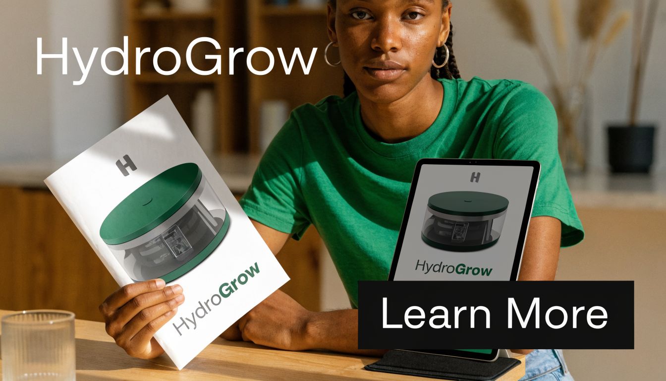
“Learn More” is the workhorse CTA for cold traffic. It doesn't force commitment too early, and that matters when you're interrupting someone mid-scroll who has never heard of your brand.
Meta advertisers overuse it on warm traffic, but for awareness and problem-aware users, it's still one of the safest call to action phrases you can run. If your creative opens with a pain point, objection, or demo, “Learn More” gives the user a low-pressure next step.
Best fit for Problem to Solution angles
This is the right CTA when your ad says, “Here's the issue you're dealing with, and here's what fixes it.” Think supplements, posture devices, skincare explainers, productivity tools, or anything with a slightly unfamiliar mechanism.
WordStream explicitly notes that a CTA shouldn't exist “on an island” and needs surrounding context. That's exactly why “Learn More” wins or loses based on the copy around it. On its own, it's generic. Framed by a strong benefit, it becomes friction reduction.
For example, these combinations usually work:
- Problem aware cold traffic: “Tired of dry skin by noon? Learn More.”
- Education angle: “See why runners are switching insoles. Learn More.”
- Social proof angle: “Why thousands switched from harsh cleaners. Learn More.”
Don't ask for a purchase when the audience is still asking, “What is this?”
Landing page fit matters too. If the click goes to a cluttered homepage, “Learn More” wastes traffic. Send it to a focused page with proof, benefits, FAQs, and a single next step. Meta can generate the click, but the page still has to cash it in.
3. Grab Yours / Get Yours
A shopper sees your ad in Stories, likes the product in two seconds, and makes the decision based on impulse. That is where “Grab Yours” and “Get Yours” earn their keep. They match fast-scroll creative better than a formal purchase CTA, especially in UGC, creator ads, and Reels where polished brand language can kill momentum.
These call to action phrases fit products with immediate visual appeal and low explanation debt. Apparel, beauty, kitchen tools, desk accessories, gifts, and trend-driven items are the usual winners. The click is driven by desire, not research.

Best fit for scarcity and FOMO
Use this CTA when the ad angle is urgency, scarcity, social proof, or exclusivity. “Yours” does useful work here. It frames the product as something the shopper already wants to own, which can lift CTR when the creative has already built enough intent.
There's a trade-off. “Grab Yours” pushes harder and usually works better for restocks, limited drops, and seasonal offers. “Get Yours” is softer, so it fits products that still need a little polish or trust. For premium brands, “Grab Yours Now” can sound too pushy and cheapen the offer.
The phrase also needs the right audience temperature. Warm retargeting and engaged video viewers usually respond better than cold traffic because the product is already familiar. If someone watched 50 percent of the demo, added to cart, or clicked through before, “Get Yours” can move them without the heavier sales pressure of “Buy Now.”
Good pairings look like this:
- Restock angle: “Back in stock. Grab Yours.”
- Creator proof angle: “This sold out twice. Get Yours.”
- Limited variant angle: “Only a few left in sage green. Grab Yours.”
- Retargeting angle: “Still thinking about it? Get Yours.”
Specificity matters here. “Grab Yours” on its own is fine, but the surrounding copy does the actual conversion work. Add the reason to act now. Limited stock, best-selling shade, restock window, creator endorsement, or seasonal cutoff. Without that context, the CTA reads like generic pressure and the ad loses credibility fast.
That's the failure mode with this category. If the offer has no real urgency, shoppers feel it. CPMs do not care that the copy sounded clever. Fake scarcity gets clicks from the wrong people, hurts conversion rate, and makes retargeting less efficient later. Use this CTA when the product is hot, the angle is clear, and the landing page can close the loop quickly.
4. Discover / Explore
Some products need exploration before they need conversion. “Discover” and “Explore” work when the user should browse a collection, compare styles, or get familiar with a category before making a decision.
That makes these useful call to action phrases for cold interest targeting, broad shopping campaigns, and collection-based ecommerce. Think fashion edits, home décor, gift guides, or product families where variety is part of the sale.
Use it when the product needs browsing room
Nike, Adidas, and lifestyle-heavy brands often lean on collection language because the user isn't always buying the exact first item they see. They're buying into an aesthetic, a use case, or a category. “Explore” fits that better than a hard sell CTA.
This is also a solid move when the creative angle is aspiration. If the ad is driven by imagery, mood, or lifestyle identity, “Discover” feels aligned. “Buy Now” in that same setup can feel too abrupt.
Good matches include:
- Collection launch: “Explore the new summer edit”
- Gift category: “Discover gifts they'll use”
- Lifestyle angle: “Explore the routine behind clearer skin”
Meta and LinkedIn-style ad systems often give advertisers a fixed set of button labels, so the actual lift usually comes from the surrounding offer framing and supporting phrase, not the button verb alone. Metadata highlights that “Learn More” is widely used for awareness, while “Download” is more associated with lead generation. The broader point applies here too. CTA choice should match funnel stage, not personal preference.
“Explore” needs the right landing page. If the click lands on a single SKU page with no browsing depth, the wording and destination are out of sync.
5. Claim Your Offer / Claim Now
A prospect sees your Meta ad with “15% off first order,” clicks, and lands on a page where the code is buried in a footer banner. CTR looks fine. Conversion rate tanks. That is usually a messaging problem, not a traffic problem.
“Claim Your Offer” works best when the ad is built around a concrete incentive and the click path delivers that incentive fast. It shifts attention toward receiving value, which is useful for first-purchase discounts, free gifts, free shipping thresholds, early-access promos, and other conversion drivers that reduce hesitation. On Meta, I use claim language most often with warm prospecting, retargeting, and offer-led campaigns where the audience already understands the product and just needs a reason to act now.
The angle matters. “Claim Now” fits FOMO, scarcity, and deadline-driven creative. “Claim Your Offer” fits a more personalized hook, especially for new-customer promos or list-growth campaigns tied to a discount. If the ad angle is Problem to Solution, claim language can still work, but only when the offer is the bridge. For example, a skincare brand can pair “Claim Your Free Trial Kit” with a risk-reduction angle. A plain “Claim Now” on a generic product ad is usually too vague to carry the click.
Specificity does the heavy lifting here. “Claim 15% Off” will usually outperform “Claim Your Discount” because the user knows exactly what they get before clicking.
Use cases that fit:
- First-order promo: “Claim 15% Off Your First Order”
- Retargeting offer: “Claim Your Free Shipping”
- Lead capture with incentive: “Claim Your Sample”
- Launch or VIP access: “Claim Early Access”
This CTA has one hard requirement. The landing page has to cash the check the ad wrote.
Show the offer above the fold. Auto-apply the code if your stack allows it. Keep the path tight, especially on mobile. If people have to search for the benefit, expect wasted spend and soft post-click metrics. WordStream's guidance on strong CTA examples and conversion-focused wording lines up with what shows up in account data. clear value and low friction usually beat clever phrasing.
If the click promises a reward, the page should deliver that reward immediately.
6. Join / Join Us / Join the Community
Not every Meta campaign should push straight to purchase. If your brand has a real identity layer, recurring use case, or community element, “Join” can outperform harder sales language because it sells belonging first.
This works well for fitness brands, beauty communities, memberships, newsletters, loyalty clubs, subscription products, and creator-led brands. The product matters, but the shared identity matters too. “Join” tells people they're entering something, not just buying something.
Best for identity and belonging angles
Use “Join Us” when the brand itself is the draw. Use “Join the Community” when customer participation is part of the value. Use plain “Join” when you want the shortest, cleanest version for email, paid social, or a hero section.
Wishpond explains that “Learn More” suits low-commitment environments, but the broader lesson is that CTA strength should match readiness. For people already leaning in, identity-based call to action phrases can do more than functional ones. They don't just promise access. They promise affiliation.
These scenarios usually fit:
- Subscription skincare or wellness: “Join the routine”
- Creator brand launch: “Join the community”
- Loyalty and SMS growth: “Join for early access”
This CTA can flop if the “community” is fake. If there's no social proof, no ongoing content, no member benefit, and no brand world, users see through it. In that case, “Sign Up” or “Get Started” may be cleaner.
I also like “Join” for retargeting users who engaged with content but didn't buy. They've shown interest in the brand, even if they're not purchase-ready. That's a better audience for belonging language than cold broad traffic.
7. See How / See the Difference
Some ads shouldn't ask for trust. They should earn it visually. “See How” and “See the Difference” are strong when the product can prove itself through demonstration, transformation, or side-by-side comparison.
That makes these call to action phrases ideal for before-and-after categories. Skincare, cleaning tools, posture products, home organization, hair tools, pet grooming, and kitchen products all benefit when the user can see the outcome.
Start with the visual proof.
Use proof led CTAs for visual products
This CTA works best with Problem to Solution creative. Show the mess, irritation, inefficiency, or frustration. Then show the fix. “See How” becomes the natural continuation of the narrative.
A few high-fit uses:
- Cleaning product: “See the grease come off”
- Skincare demo: “See how it absorbs in seconds”
- Home upgrade: “See the difference better lighting makes”
The biggest mistake here is making claims the creative doesn't support. If the ad says “See the Difference,” then the difference has to be obvious. Weak visual proof turns this CTA into empty copy.
Show the proof first. Then let the CTA finish the thought.
This CTA is also strong on landing pages with UGC, testimonial clips, and comparison visuals above the fold. If the page starts with dense text, you lose the momentum the CTA created. Keep the path visual and sequential.
8. Try Now / Try Free / Try Risk-Free
A cold prospect clicks your Meta ad, likes the promise, then stalls at the button. That usually means the CTA is asking for too much commitment too early.
“Try” works when the offer needs experience before belief. It fits products that are hard to evaluate from a single image or headline alone. Software, supplements, premium beauty, subscriptions, guided programs, and higher-consideration physical products all benefit when the CTA reduces perceived downside.
The versions are not interchangeable. “Try Now” works for instant interaction, like a demo, quiz, sample flow, or product experience that starts on click. “Try Free” handles price resistance, but only if the user can access something real without paying. “Try Risk-Free” is for trust-sensitive offers with a clear refund policy, trial period, or satisfaction guarantee.
Match the CTA to the objection and audience temperature
For colder audiences, this CTA usually performs best with a Problem to Solution or curiosity angle. The ad surfaces the pain, introduces the mechanism, then uses “Try” to lower the barrier to first action. For warm retargeting traffic, “Try Risk-Free” often does more work because the prospect already understands the product. What they need is reassurance on the decision.
A few strong pairings:
- Free app trial or SaaS tool: “Try Free”
- Quiz, estimator, or interactive demo: “Try Now”
- Guarantee-backed DTC offer: “Try Risk-Free”
The business rule is simple. Match the promise to the actual post-click experience. If “Try Free” leads to a credit card wall in step one, expect drop-off. If “Try Risk-Free” hides the return terms, expect refunds, complaints, and weaker conversion quality from your retargeting pool.
I use this family of CTAs when the job is reducing friction, not forcing urgency. That makes them a strong fit for high-CAC categories where one extra click is cheaper than pushing cold traffic straight into “Buy Now.”
Keep the page focused. Trial CTAs lose force when the landing page offers too many competing actions. One primary path, clear terms, and supporting proof usually beat a busier layout.
9. Get Started / Start Free
A cold prospect clicks your Meta ad, likes the promise, then hits a landing page that asks for too much too soon. That is where “Get Started” and “Start Free” earn their keep. They move the user into the first step without forcing purchase intent before the prospect is ready.
These CTAs work best when the click is the start of a process, not the finish line. I use them for SaaS onboarding, quote flows, guided assessments, product match quizzes, and any funnel where the first conversion creates qualified intent for sales, email, or retargeting.
Use these when the ad angle builds interest, not urgency
“Get Started” fits cold and lukewarm audiences who understand the problem but still need a low-pressure entry point. On Meta, that usually means Problem to Solution, education, or before and after angles. The ad does the persuasion. The CTA asks for the next step.
“Start Free” works better when price friction is the main blocker and the post-click experience removes cost. That makes it a strong fit for free plans, free trials, and freemium tools. If “Start Free” leads to an immediate credit card gate, expect weaker CVR and lower-quality traffic signals for your retargeting stack.
A few practical pairings:
- SaaS onboarding flow: “Get Started”
- Freemium product or free trial: “Start Free”
- Quiz, calculator, or guided recommendation tool: “Get Started”
A key advantage is audience matching. For colder traffic, “Get Started” usually beats heavier asks because it keeps commitment low while still creating momentum. For warmer users who already know the offer, “Start Free” can pull better CTR because the value exchange is clearer at a glance.
Support the button with tight microcopy. “No credit card required,” “Set up in minutes,” or “Get your recommendation first” can lift click quality because they answer the hesitation that stops the action. Keep that promise honest. If setup takes work or the free tier is limited, say so clearly and let the right users self-select.
This CTA family is less about hype and more about progression. Use it when the business goal is getting the prospect into an onboarding path you can optimize, score, and retarget, not squeezing cold traffic for an immediate sale.
10. Tap to See / Tap Now / Swipe to Shop
Desktop language in a mobile placement kills momentum. If the user is in Stories, Reels, or short-form social inventory, mobile-native call to action phrases usually feel cleaner because they match the motion the user is already making.
“Tap to See,” “Tap Now,” and “Swipe to Shop” work because they align with behavior. The user is already tapping and swiping through feed. A CTA that mirrors that habit reduces friction.

Use mobile native language on mobile native placements
These phrases are best reserved for placements where gesture language feels natural. Stories, Reels, TikTok-style creative, and vertical UGC are the obvious fit. On desktop feeds or formal landing pages, they can feel gimmicky.
They work particularly well when paired with visual direction:
- Stories product tease: “Tap to See”
- Urgent promo in vertical video: “Tap Now”
- Collection reveal or multi-product sell: “Swipe to Shop”
One underused tactic is syncing on-screen text with the CTA. If the creator says “tap to see the colors” and the caption echoes it, the instruction lands harder. Add arrows, sticker cues, or a hand movement in the creative if needed. The goal isn't cleverness. It's clarity.
This category also proves a broader point about call to action phrases. The best CTA often isn't the fanciest phrase. It's the one that feels native to the placement, the angle, and the user's immediate behavior.
Top 10 CTA Phrases Comparison
| CTA Phrase | 🔄 Implementation Complexity | ⚡ Resource Requirements | ⭐📊 Expected Outcomes | 💡 Ideal Use Cases | ⭐ Key Advantages |
|---|---|---|---|---|---|
| Shop Now / Buy Now | Low, simple button/action | Minimal, optimized product/checkout pages | High direct conversion; ~3–8% CTR (warm), 0.5–2% (cold) | Checkout-stage, warm audiences, retargeting | Direct, unambiguous, highest checkout-stage conversions |
| Learn More | Low–Medium, content required | Moderate, educational assets + follow-up (email/retargeting) | Higher CTR on cold traffic: ~2–6%; retargeting 8–12% | Awareness, storytelling, Problem→Solution, new product education | Builds trust, warms cold audiences without pressure |
| Grab Yours / Get Yours | Low, CTA + urgency cues | Low–Medium, UGC/creative + timers/stock counters | Strong social engagement: 5–9% (social); 8–14% (Reels/Stories) | FOMO drops, limited editions, creator-led social ads | Conversational, creates exclusivity and urgency |
| Discover / Explore | Low, invitation to browse | Moderate, collection pages, lifestyle visuals | Good top-of-funnel: 3–7% (cold); 6–12% (warm) | Brand-building, launches, visual discovery platforms | Curiosity-driven, reduces ad fatigue, great for catalogs |
| Claim Your [Offer] / Claim Now | Medium, offer mechanics + tracking | Medium, promo management, landing pages, email capture | High-intent traffic: 6–12% CTR; 8–15% for limited-time promos | Discounts, trials, first-purchase incentives, loyalty offers | Signals value/ownership, effective for promotional conversion |
| Join / Join Us / Join the Community | Medium–High, community setup & maintenance | High, ongoing content, moderation, member benefits | Moderate CTR (5–8%); strong long-term retention (30–40%) | Memberships, subscriptions, creator communities, loyalty programs | Builds LTV and advocacy, fosters repeat engagement |
| See How / See the Difference | Medium, requires quality visuals/video | High, video production, testimonials, proof assets | Strong with visuals: 7–12% CTR; higher engagement than text-only | Before/after demos, transformation products, comparison ads | Demonstrates results; persuasive for skeptical buyers |
| Try Now / Try Free / Try Risk-Free | Medium, trial/return logistics | Medium–High, trial systems, clear terms, support | High trial conversion: 8–15% CTR; 20–35% trial→paid (strong offers) | High-ticket items, subscriptions, products with guarantees | Lowers purchase friction via risk reversal, increases trial uptake |
| Get Started / Start Free | Low–Medium, onboarding flows | Moderate, setup guides, progress indicators | Broad performance: 6–12% CTR (varies) | Onboarding, freemium models, guided setups, beginners | Approachable and universal; good for first-time users |
| Tap to See / Tap Now / Swipe to Shop | Low, mobile gesture CTA | Moderate, mobile-optimized creatives, gesture cues | Highest mobile engagement: 12–22% (Stories); 10–18% (Reels) | Mobile-first campaigns, Stories, Reels, TikTok Shop | Native mobile language reduces friction; excellent for impulse buys |
From Phrase to Profit Turning CTAs into a System
The biggest mistake new advertisers make with call to action phrases is treating them like isolated copy tweaks. They're not. A CTA sits at the intersection of audience temperature, creative angle, placement, and landing page intent. If one of those pieces is off, the phrase won't save the campaign.
Start with audience temperature. Cold traffic usually responds better to lower-friction CTAs like “Learn More,” “Discover,” or “See How.” Those phrases buy attention without demanding commitment too early. Warm traffic is different. If the user already engaged with your ad, visited a product page, or joined a retargeting pool, stronger CTAs like “Shop Now,” “Buy Now,” or “Claim Your Offer” usually make more sense.
Then line the CTA up with the angle. FOMO creatives need urgency language like “Grab Yours” or “Claim Now.” Problem to Solution ads often need “Learn More” or “See How.” Identity creatives work better with “Join” because the user is buying affiliation as much as product. Mobile-first short-form creative often needs gesture-based CTAs like “Tap to See” because that language fits the placement.
Placement matters more than people think. A CTA that feels natural in Stories can look awkward in a desktop feed. A phrase that works on a landing page hero section may be too soft for retargeting email or too hard for cold social traffic. Matching the phrase to the environment prevents friction you don't need.
The page after the click matters just as much. If the ad says “Claim 15% Off,” the page should show the offer immediately. If the ad says “See the Difference,” the page should lead with proof, not a wall of text. If the CTA says “Get Started,” the first step should feel simple. A lot of brands blame the ad for a conversion problem that really starts on the landing page.
One more rule is worth keeping in mind. Standardized ad systems often limit the actual button labels available, which means your edge usually comes from the framing around the CTA, not just the button itself. That's why testing headline, hook, offer, and CTA as a package matters more than obsessing over one verb.
For first-time dropshippers and new ecommerce owners, this process gets messy fast. You're not just testing phrases. You're testing phrase plus angle plus audience plus creative. That's where a system helps. Social Loop AI turns a product URL into a Meta ads launch plan, builds angle-based creative batches, and maps CTAs to the right stage so you're not guessing whether your ad should say “Learn More,” “Shop Now,” or “Grab Yours.”
That's the shift that improves results. You stop treating the CTA as a button label and start using it like what it is: the final instruction before revenue.
Social Loop AI helps first-time dropshippers and new ecommerce owners turn a product URL into a practical Meta ads plan, angle-specific creatives, landing-page fixes, and matching call to action phrases for both ads and social posts. If you want a faster way to build campaigns that fit audience temperature and intent, try Social Loop AI.