Blog
Drop Shipping Advertising a Meta Ads Playbook for 2026
Published July 8, 2026
Most beginner advice on drop shipping advertising is wrong at the starting line. It tells you to hunt for a “winning product,” launch a few Meta ads, and let the algorithm figure out the rest. That approach treats ad spend like a slot machine. It also ignores the main reason most first campaigns fail: the seller never built a strategy for who the product is for, why that person should care, and what message will make them trust a new store.
If you're new, the goal isn't to “go viral.” The goal is to protect budget while learning fast. Good drop shipping advertising looks a lot more like brand building than gambling. You need a product angle, a buyer profile, a landing page that deserves paid traffic, and a testing plan that tells you what to keep, what to cut, and what to rewrite.
Table of Contents
- Why Most Drop Shipping Advertising Fails
- The Pre-Ad Strategy Your Competitors Skip
- Account Setup and Landing Page Readiness
- Creating Brand-Aware Ads That Actually Convert
- Your Round-by-Round Meta Ads Test Plan
- Post-Launch Optimization and Scaling Rules
Why Most Drop Shipping Advertising Fails
Most failing stores don't have an ad problem first. They have a positioning problem. They run traffic to a generic product page, use one weak creative, target broad interests, and hope Meta finds buyers anyway.
That hope gets expensive fast.
Industry discussion around first-time stores suggests only 1 to 5% of sellers reach a profitable store, and only 2 to 3% reach substantial profit levels, with underestimated ad cost named as a major failure point in the dropshipping success-rate discussion on Reddit. If your margin is already thin, bad customer acquisition cost doesn't just slow growth. It can erase the business before you collect enough data to improve it.
The popular “winning product” narrative causes this. It makes beginners think product selection alone carries the campaign. It doesn't. A strong product still needs the right audience and the right angle. If any one of those three is weak, performance collapses.
Practical rule: In drop shipping advertising, product, audience, and angle are one system. Don't test them as if they're separate.
A posture corrector, for example, isn't one offer. To one buyer it's back-pain relief. To another it's desk-work support. To another it's confidence and posture appearance. Same product. Different buying trigger. If you run one generic ad saying “fix your posture now,” you flatten the whole market into a single message and pay for a lot of irrelevant clicks.
This is why budget protection matters more than launch speed. Sellers who stay in the game build a repeatable testing system. They score the page before traffic, define the buyer before copy, and choose angles before campaign settings. That's also the logic behind good marketing spend optimization for paid acquisition. You don't fix waste inside Ads Manager alone. You remove it before the campaign starts.
The Pre-Ad Strategy Your Competitors Skip
The biggest difference between a real brand and a churn-and-burn store shows up before launch. A real brand knows what it wants the buyer to believe. A weak store just uploads supplier footage and writes “50% off today.”
That shortcut is why beginners burn budget on the wrong message.
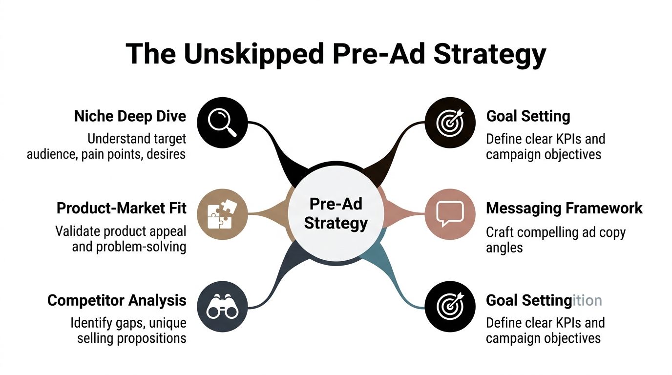
Stop thinking in products and start thinking in objections
A product doesn't sell because it exists. It sells because it resolves friction in the buyer's head. That friction might be practical, emotional, or trust-based.
A useful starting point is the 3 to 5 angle framework. One proven Meta-focused methodology uses angles such as Problem to Solution, UGC, Social Proof, FOMO, and Identity, and reports that high-performing stores using that approach can reach 15 to 20% net profit margins according to Circle Studio's breakdown of dropshipping success and creative angles.
Here's how to use those angles like a beginner who wants to act like a brand:
-
List the buyer pains
Write down the actual reasons someone would shop for the product. Not features. Reasons. For a skincare organizer, that might be clutter, wasted time, or a bathroom that feels messy. -
List the objections
Buyers usually hesitate for predictable reasons. They wonder whether the product works, whether the quality is cheap, whether shipping will take too long, or whether they even need it. -
Match one angle to one objection
Social proof can address “does this really work?” Identity can address “is this for people like me?” Problem to Solution can address urgency and usefulness. -
Give each angle a buyer profile
Your buyer persona shouldn't be “women 25 to 44.” That's ad platform language, not purchase logic. Build the profile around context, routine, pain, and intent. A clear buyer persona definition for ecommerce campaigns is important.
Build a simple angle map before you open Ads Manager
Use a grid. One column for pain point. One for audience segment. One for angle. One for promise. One for proof.
A simple version looks like this:
| Pain point | Buyer segment | Angle | Core promise | Proof element |
|---|---|---|---|---|
| Daily discomfort | Desk worker | Problem to Solution | Feel relief during long work sessions | Demo or before-and-after usage |
| Skepticism | Careful first-time buyer | Social Proof | Other buyers trust it | Reviews or UGC style testimonial |
| Self-image | Appearance-focused shopper | Identity | Look more put together and intentional | Lifestyle creative |
This exercise does two things. First, it forces sharper copy. Second, it stops you from launching five ads that all say the same thing with different colors.
A good first campaign doesn't need more creatives. It needs fewer generic ones and more intentional ones.
Before spending anything, check that each angle answers a different buying motive. If two ads attack the same pain with slightly different wording, that's not a creative strategy. That's duplication.
Account Setup and Landing Page Readiness
Beginners love talking about hooks and scaling. Most of them ignore the boring setup steps that can doom campaigns. If your tracking is broken, your domain isn't clean, or your page looks like a rushed import from a supplier feed, you won't know whether the ad failed or the store did.
That confusion is expensive in a crowded market. According to Wix's dropshipping statistics roundup, approximately one-third of all online retailers use dropshipping, and because margins are tight, customer acquisition costs directly affect profitability. That's the core pressure in drop shipping advertising. You don't have room for messy execution.
Clean setup prevents dumb problems
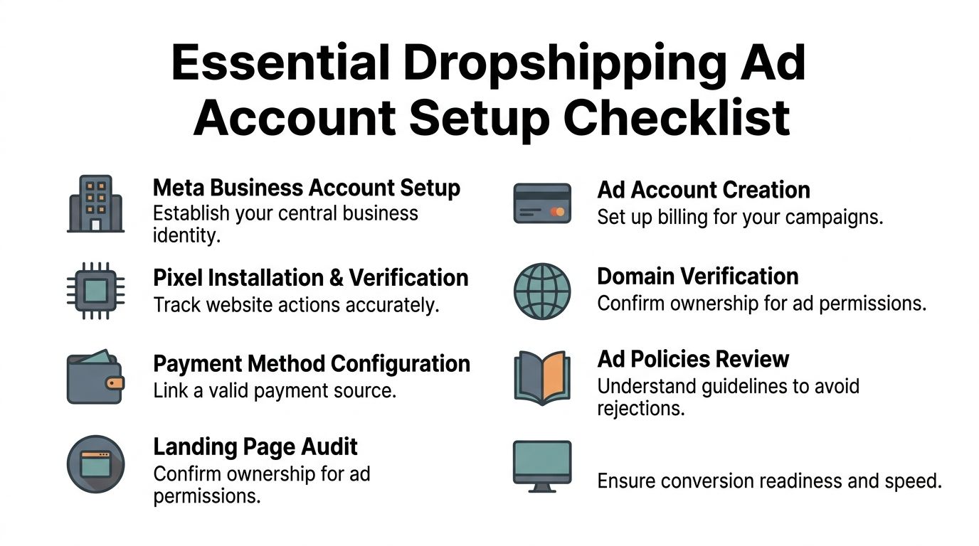
If you're using Meta, get the basics right before launch:
- Business identity: Set up your Meta Business Account with consistent business details. Use the same brand name, website, and contact information everywhere.
- Ad account and billing: Add a valid payment method early. Don't wait until launch day to discover a preventable billing hold.
- Pixel and event tracking: Install tracking correctly and verify that the key page events are firing.
- Domain verification: This reduces permission issues and improves control over your assets.
- Policy review: Many beginners get rejected for avoidable claims, low-quality pages, or sketchy creative formats.
This isn't glamorous work, but it gives you cleaner signals later. Without it, you can mistake technical failure for bad market fit.
Your product page needs to earn the click
A lot of stores send paid traffic to pages that still look untrusted. Thin descriptions. Cropped images. No shipping clarity. No return information. No reason to believe the product is worth the price.
Treat landing page readiness like a pre-launch gate, not an afterthought. If your page is weak, every click becomes less valuable.
A fast practical audit:
- Headline clarity: The page should explain the product and the primary outcome quickly.
- Visual proof: Use clean product images and show the item in use when possible.
- Price transparency: Buyers shouldn't hunt for the offer.
- Trust signals: Policies, FAQs, contact details, and checkout reassurance all matter.
- Description quality: Rewrite supplier copy. Explain use case, benefits, and who it's for.
- Mobile experience: Most first-time buyers will see your page on a phone, not a desktop monitor.
One methodology for Meta testing uses a landing-page readiness score from 0 to 100 before launch and notes a 7% reduction in conversions for every one-second page load delay in its framework, as described in the earlier Circle Studio source. The exact score matters less than the habit: don't buy traffic for an unprepared page.
If you want a standard to aim for, compare your page against strong landing page best practices for conversion-focused stores. Paid traffic should amplify a solid sales page, not expose a weak one.
Creating Brand-Aware Ads That Actually Convert
A lot of drop shipping advertising still looks like low-trust internet clutter. Loud discount text. Fake urgency. Random emojis. Choppy supplier footage. That style can get clicks, but it often attracts low-intent shoppers and creates refund-heavy customers.
Brand-aware ads do the opposite. They make the product feel considered, useful, and believable.

Use the 3x5 method to create better first tests
One of the smartest frameworks for first-time sellers is simple: pick 3 pain points and pair them with 5 creative angles. That gives you 15 original creatives, and the reason it works is straightforward. Different customers buy for different reasons. The YouTube explanation of the 3x5 framework makes that point clearly and notes that single-creative approaches underperform because one message can't speak to separate problems.
Here's what that looks like for a basic skincare fridge:
| Pain point | Angle | Ad idea |
|---|---|---|
| Products feel messy on the counter | Problem to Solution | Show cluttered sink, then neat setup with the fridge |
| Expensive skincare loses the “premium” feel | Identity | Position the product as part of a polished self-care routine |
| Buyer doubts it matters | UGC | Show a creator explaining why chilled products feel better to use |
You don't need 15 masterpiece ads. You need 15 clear hypotheses.
The first batch of creative should test beliefs, not editing styles.
What brand-aware creative looks like in practice
Brand-aware doesn't mean corporate. It means coherent. The ad should feel like it came from a business that understands the customer, not from a seller trying to unload product quickly.
A practical structure for each ad:
- Hook: Call out a pain, desire, or moment of recognition.
- Bridge: Show the product in context, not in isolation.
- Proof: Add demo footage, product use, or believable customer perspective.
- CTA: Ask for the click without sounding desperate.
Examples by angle:
-
Problem to Solution
Hook: “If your skincare routine takes over the whole bathroom counter, this fixes that.” -
UGC
Hook: “I bought this for storage. I kept it because it made my routine easier.” -
Social Proof
Hook: “The product people add once they get tired of bathroom clutter.” -
FOMO
Hook: “The upgrade many put off for too long.” -
Identity
Hook: “For people who want their routine to feel organized, not rushed.”
Notice what's missing. No fake luxury language. No vague “must-have” claims. No shouting.
A strong creative reference point helps if you're new to scripting and pacing. Watch how product stories are structured in this example:
When you review your own ads, ask one question: does this look like a real brand trying to earn trust, or a seller trying to force impulse? That distinction changes click quality.
Your Round-by-Round Meta Ads Test Plan
The fastest way to waste a Meta budget is to treat testing like gambling. Beginners do this every day. They launch too many audiences, edit too many settings, and then blame the platform when results make no sense.
A useful test plan is boring on purpose. Each round has one job. Keep the variable count low enough that you can tell what caused the result.
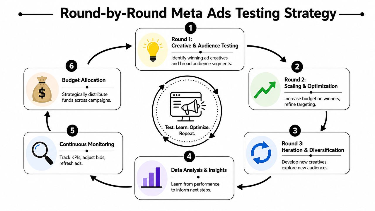
Round one is for message validation
Start by testing angles and creatives, not elaborate audience theories. If the message does not earn attention from a reasonably broad group, tighter targeting usually will not save it.
Use a small set of clearly different ads. Three to five is enough for a beginner. One ad might lead with convenience. Another might lead with appearance, routine, or a specific frustration. The goal is to learn which framing gets qualified clicks from people who fit the offer.
A simple setup works well here:
-
Pick distinct concepts
Test different meanings, not tiny cosmetic changes. A new hook is a test. A different opening scene can be a test. Changing a background color is usually noise. -
Keep spend low enough to learn cheaply
Early testing is for signal collection, not proving that a product can scale on day one. Small daily budgets are fine if they give each concept enough room to generate a real response. -
Judge fit, not vanity
A cheap click means little if the visitor bounces or looks confused on the page. Brand-aware testing asks a better question. Did this ad attract the kind of person your store is built to convert?
This round filters out weak messaging before you spend money forcing traffic into a page that was never set up to close cold visitors.
Round two is for audience confirmation
Once one or two creatives separate themselves, hold the winning message steady and test audience context. Do not rewrite the ad and change targeting at the same time. That creates messy data and expensive guesswork.
New advertisers often overbuild audiences because narrow feels safer. In practice, the cleaner approach is to compare a few audience types that map to how people experience the problem.
Useful starting buckets include:
- Problem-aware audiences: people already frustrated by the issue your product addresses
- Use-case audiences: people whose routines make the product relevant, such as travel, work, parenting, or fitness
- Adjacent-interest audiences: people who buy related items or follow similar product categories
The point is not to outsmart Meta with a giant stack of filters. The point is to confirm whether the winning angle travels well across different pockets of demand.
If a creative only works in one tiny audience, treat that as a warning sign. Real brands usually have a clearer market story than that.
Round three is for controlled scaling
Scale only after the ad is bringing in the right kind of traffic and the site is showing credible buyer behavior. If either piece is weak, more spend just buys you a faster lesson.
Use the table below to decide what deserves attention first.
| Situation | Action |
|---|---|
| Strong creative, weak page behavior | Fix the page before adding spend |
| Weak creative, decent page behavior | Rewrite hooks and reposition the offer |
| One angle clearly beats others | Build more variants from the same angle |
| One audience responds well | Expand carefully around that audience context |
Good scaling looks like extension. Keep the winning angle, then test a new opening line, a new proof segment, or a new format. Vertical video, static image, and testimonial-style creative can all carry the same core message if the message is doing the heavy lifting.
Poor scaling is emotional. One profitable day convinces a new seller to raise budgets hard, widen targeting, and launch fresh creatives all at once. After that, there is no clean read on what improved performance and what hurt it.
Change one variable at a time. If budget goes up, keep the ad and audience stable. If you introduce a new creative, keep budget and audience stable. That discipline is what makes Meta testing useful instead of expensive.
Post-Launch Optimization and Scaling Rules
Scaling does not fix a weak campaign. It magnifies whatever is already true. If the ad attracts the wrong click, or the page creates doubt, higher spend just buys more low-quality traffic.
Treat post-launch work like diagnosis, not guesswork. The goal is to find the first point where buyer intent breaks.
Read signals in sequence
Check the ad first. Then the landing page. Then the checkout path.
If the ad fails to earn clicks, the message is not pulling. If clicks come in but visitors leave fast, the page is not carrying the promise. If people view content, add to cart, or start checkout but stop before purchase, the issue usually sits in trust, pricing logic, shipping expectations, or product fit.
That order matters because many new sellers change targeting too early. They assume Meta found the wrong people, when the problem is simpler. The ad framed the product one way, and the site delivered a different experience.
Use a plain framework:
- Weak ad response: Change the hook, angle, or first three seconds.
- Healthy clicks, weak page behavior: Fix clarity, proof, page speed, or offer presentation.
- Strong interest, inconsistent sales: Review trust signals, shipping communication, returns, and whether the ad is attracting curiosity instead of purchase intent.
- One ad brings in qualified traffic: Make more versions of that message before testing a new direction.
Brand-aware advertisers stay strict here. They do not chase every metric spike. They ask whether the campaign is bringing in the kind of visitor who could buy from a real store, not just react to a flashy ad.
Scale the message before the budget
Beginners usually want to raise budget as soon as they see a good day. That is early. A better move is to prove the angle has depth.
If one message works, build three to five more ads around the same reason people buy. Keep the core promise stable and change the expression. Use a cleaner product demo. Test a testimonial-style ad. Try a founder-style voiceover. Run a static image that makes the same claim with a different proof point.
This is how brands scale with control. They strengthen a market story before they push spend.
Broadening spend too fast creates two problems at once. Performance gets less stable, and you lose your read on what worked. If budget, audience, and creative all change together, the account becomes hard to learn from.
Use this operating loop:
-
Cut clear losers fast
If an ad is spending and showing no signs of qualified interest, turn it off. -
Keep near-miss ideas alive
A flat execution does not always mean a bad angle. Rewrite the opening, tighten the offer framing, or swap the proof. -
Clone winners with purpose
Make variants that keep the same angle but present it through a new format or proof style. -
Recheck the page after every spend increase
More traffic exposes weak pages fast, especially on mobile. -
Log every test
Record the angle, hook, format, audience context, and result. That history is what keeps you from repeating the same mistake with a new ad.
One more rule matters. Scale only if the traffic looks like buyer traffic. Cheap clicks from people who never read, never scroll, and never add to cart are not a win. They are a signal that the ad is good at getting attention, not sales.
Good drop shipping advertising works like a feedback loop. Research shapes the angle. The angle shapes the ad. The ad filters traffic. Buyer behavior shows what needs work.
The stores that last are rarely the ones with the loudest launch. They are the ones that keep message, page, and offer aligned long enough to build a brand people trust.
If you want a faster way to build that system, Social Loop AI helps first-time sellers turn a product URL into a Meta ads launch plan, buyer profile, angle-based creatives, and a practical testing workflow. It's built for beginners who want to advertise like a real brand without hiring an agency.