Blog
Ads for Insurance That Actually Convert in 2026
Published August 6, 2026
You can launch an insurance campaign in a day and still feel like nothing's moving. The ad is approved, the budget is active, and the inbox is strangely quiet. That usually means the problem isn't one thing, it's the whole system, from compliance to creative to the landing page that was never ready to carry the click.
Insurance is a hard category because the money is real, the scrutiny is real, and the clicks are expensive enough that weak testing gets punished fast. A practical playbook has to respect regulation, buyer intent, and creative fatigue at the same time, or the account burns budget before it learns anything useful.
Table of Contents
- Why Most Insurance Ads Stall Before They Scale
- The Pre-Flight Compliance Checklist for Every Creative
- Five Ad Angles That Match Each Buyer's Real Objection
- Three Sample Insurance Ads You Can Model Today
- Landing Page Readiness That the Ad Cannot Save
- Measure What Matters and Read the Three-Round Test
- Your 7-Step Insurance Ads Launch Playbook
Why Most Insurance Ads Stall Before They Scale
Insurance sits in a brutal market structure. One industry review reported that property-casualty insurers spent $6.7 billion on advertising in 2018, about 2.7% of all U.S. advertising spending and roughly $20 per person in the U.S., while the top 10 insurer groups accounted for 82% of total industry ad spend. A later report on the same page noted that the five largest advertisers represented nearly 65% of all insurance advertising in 2022, and eMarketer projects U.S. insurance will spend over $14 billion on digital ads in 2026. The pattern is clear, the category is concentrated, expensive, and crowded.
Regulation, intent density, and fatigue
Those numbers matter because insurance does not behave like ecommerce. Buyers are usually not browsing casually, they are responding to a life event, a renewal window, a price shock, or a policy change. That means your ad has to do three jobs at once, it has to pass compliance, match a moment of need, and survive in a feed where audiences tire quickly.

The biggest beginner mistake is assuming a strong ecommerce pattern will translate directly. A glossy promo, a vague “save now” promise, or a broad audience stack often looks fine in the ad account, then collapses because the buyer needs more trust, more clarity, and a more specific reason to act. Insurance creative usually performs better when it is simple, direct, and anchored to one objection.
Start with the policy and the moment
Audience work starts with the policy type, not with interests. A new driver, new parent, new homeowner, small business hiring, Medicare shopper, and renewal switcher all sit in different mental states, even when they share the same platform behavior. From there, add life-stage signals, then map those signals into Meta interest clusters and lookalike seeds.
Practical rule: if you cannot describe the buyer's trigger in one sentence, the audience is too broad.
A one-page targeting brief should include the policy type, the moment of need, the likely objection, and the exclusion list. Three exclusions get missed constantly, current policyholders, recent quote requesters, and employees. Those groups can consume spend because they look relevant on paper but rarely represent fresh demand.
What a clean brief looks like
For a first launch, the brief should read like a decision memo, not a brainstorm. Pick one policy line, one buyer moment, one promise, and one audience expansion path. If the account has enough signals later, the stack can widen, but the first pass should prove the message before it tries to prove the market.
For scaling guidance tied to campaign structure, the most useful next move is often to keep the audience tighter than your instinct wants and let creative variation do the work. That is the pattern most beginners reverse, and it is a costly reversal.
How to scale Facebook ads is useful context here because it reinforces the same basic discipline, narrow enough to learn, wide enough to find signal.
The Pre-Flight Compliance Checklist for Every Creative
Most insurance ads fail before they ever have a chance to scale because the copy sounds too certain, too urgent, or too clever. In health and life insurance, state-level rules can make a statement risky even when it is technically true, and MedSupp ads add disclosure and wording limits that punish sloppy phrasing (NAIC/MedSupp compliance overview).
Check the copy before you touch the media plan
Start by scanning for words that promise certainty or create pressure. Phrases like “guaranteed approval,” “lowest price,” or any line that pushes fear, urgency, or dependence are the kinds of statements that tend to draw scrutiny. Medicare supplement ads also need to avoid wording that exaggerates benefits or implies endorsement by the federal program, and they need the required disclaimer when applicable, as noted in the same NAIC/MedSupp compliance overview.
| Vertical | Restricted Phrase | Compliant Rewrite |
|---|---|---|
| Health | “Guaranteed approval” | “See if you qualify” |
| Life | “Lowest price” | “Request a personalized quote” |
| Medicare Supplement | “Official Medicare plan” | “Not connected with or endorsed by the U. S. government or the federal Medicare program.” |
| Auto | “Everyone gets approved” | “Eligibility varies by carrier and state” |
Run the two-minute self-audit
The fastest pre-flight check is blunt. Ask whether the ad promises what the policy cannot promise, whether it pressures the viewer emotionally, and whether the wording could read as misleading to someone who already understands the product category. If any line feels like a shortcut around the truth, it is probably a rejection risk.
Practical rule: if the claim would need a footnote in a sales meeting, rewrite it before launch.
Loaded language guidance helps here because loaded phrases often sound persuasive to the marketer and suspicious to the reviewer at the same time. Keep the tone plain, specific, and calm. That usually survives review better than a dramatic hook.
Five Ad Angles That Match Each Buyer's Real Objection
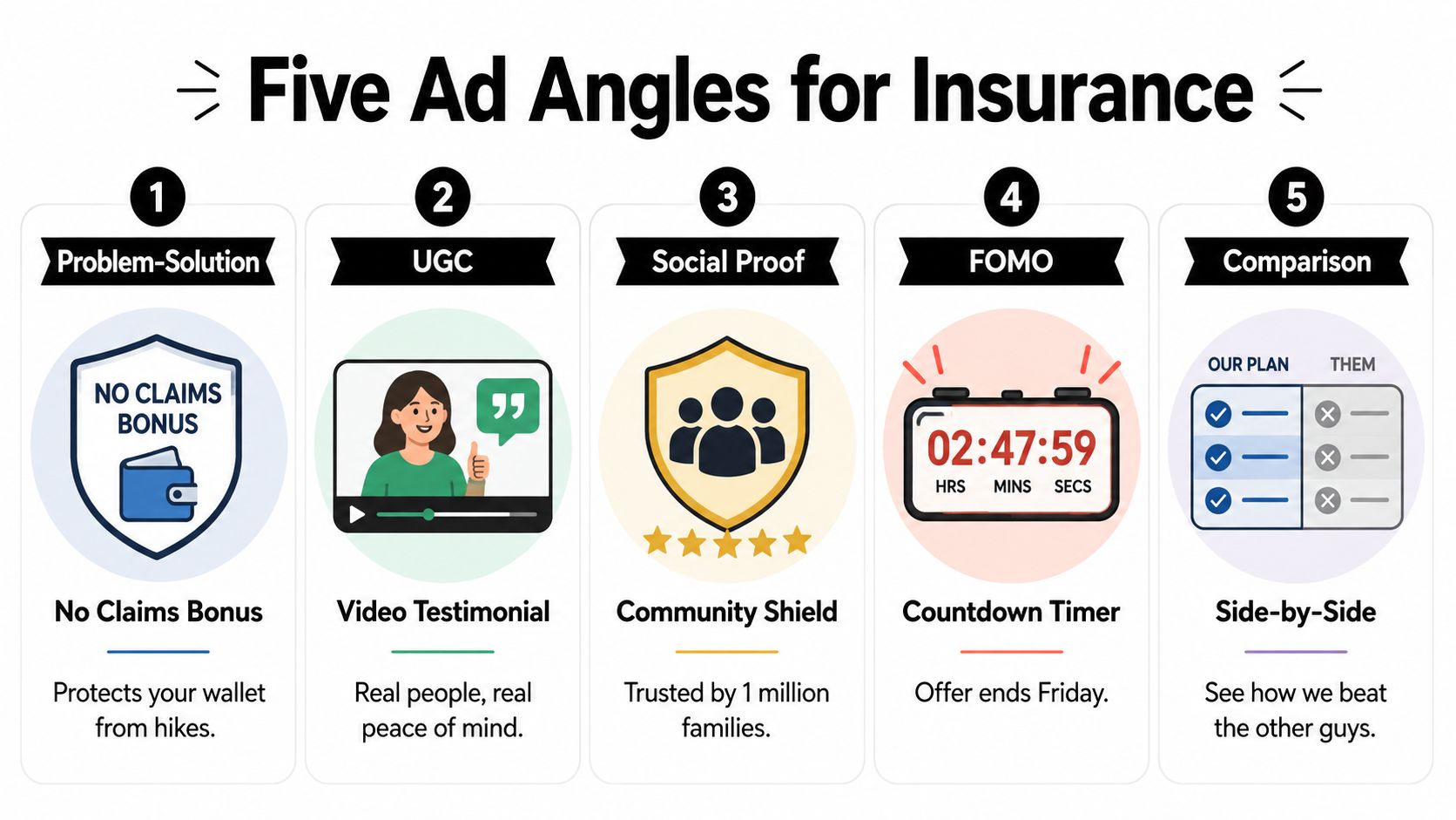
Insurance buyers are looking for relief from a specific fear, and the ad angle needs to address that fear before it asks for a quote. The five angles that are easiest to operationalize are Problem-Solution, UGC, Social Proof, FOMO, and Identity, but the useful way to think about them is by objection, not by creative style.
Match the angle to the fear
Problem-Solution works when the buyer already feels the pain. That's a strong fit for auto shoppers reacting to a premium jump, because the ad can speak to savings without overpromising. If you want a closer look at that format, see our guide to problem-solution ads. UGC is usually stronger when trust is the barrier, especially in health or life, because a person telling a plain story often feels safer than polished brand copy.
Use proof where doubt is highest
Social Proof belongs near the end of the funnel, especially in retargeting, because it reassures people who already clicked but haven't committed. FOMO can work when the offer is time-sensitive, but it falls apart fast if the deadline feels fake. Identity is the angle that often resonates with younger life-insurance shoppers, because it frames coverage as something responsible adults do rather than something anxious people buy.
Comparison is useful when the audience is already shopping alternatives. It should be narrow and factual, never boastful. For health, that usually means clarity over drama. For auto, that usually means price and convenience. For life, that usually means simplicity and trust.
Practical rule: one ad, one objection, one action.
A lot of beginners try to blend all five angles into one creative and end up with a muddled message. That makes the ad harder to approve, harder to click, and harder to remember. One angle per ad keeps the message legible long enough for Meta to learn from it.
Three Sample Insurance Ads You Can Model Today
The best insurance ads are clear enough that the right person stops scrolling, and specific enough that the wrong person moves on. The three examples below are built to be rewritten, not copied, so you can adapt them to your offer, audience, and compliance limits without guessing.
Auto insurance using a problem-solution hook
Hook, “Your premium went up, but your driving habits didn't.” Body, “If your last renewal felt unfair, compare options and see whether a better fit is available in your state. Fast quotes, plain language, no pressure.” CTA, “Check your rate.”
Visual direction should stay simple, a clean phone mockup, a dashboard, or a driver at a curb with no heavy branding clutter. The point is to name the pain without sounding accusatory. That gives the ad a better chance of getting through review and helps the buyer recognize the situation fast.
This is the kind of ad that fits cold traffic when the audience has a clear renewal trigger. The first thing to test is the opening line, because that is where thumb-stop lives or dies.
Health insurance using UGC style reassurance
Hook, “I thought health insurance would be confusing, then I compared plans side by side.” Body, “The process was simpler once I focused on coverage details that mattered to my family. If you're shopping during a life change, use a quick quote flow and keep the next step easy.” CTA, “See options.”
The visual should feel like a real person speaking on camera, not a studio testimonial. That matters because health shoppers often want reassurance before they want persuasion. A calm face, a tidy background, and one message usually outperform a crowded creative that tries to say too much.
This format is also useful when a team needs to move fast with multiple variations. Social Loop AI can generate ad batches, angle variations, and launch plans for Meta, which helps when you need a working draft before the copy is fully polished.
Life insurance using identity
Hook, “Responsible planning doesn't wait for the perfect moment.” Body, “If you've got people depending on you, a simple policy can be part of the plan. Get a quote that respects your time and explains the next step clearly.” CTA, “Get a quote.”
The visual should feel adult, calm, and unforced. No fear graphics, no distressed families, no melodrama. Identity ads work by improving the buyer's self-image rather than triggering fear.
For this one, test the promise first. Some audiences respond better to simplicity, others to family responsibility, and the creative should separate those reactions instead of blending them into one message.
Landing Page Readiness That the Ad Cannot Save
An ad's job is to earn the click. The landing page's job is to earn the quote. If the page looks generic, loads slowly, or asks for too much too soon, the best creative in the account still gets dragged down by friction.
Score the page before the first dollar
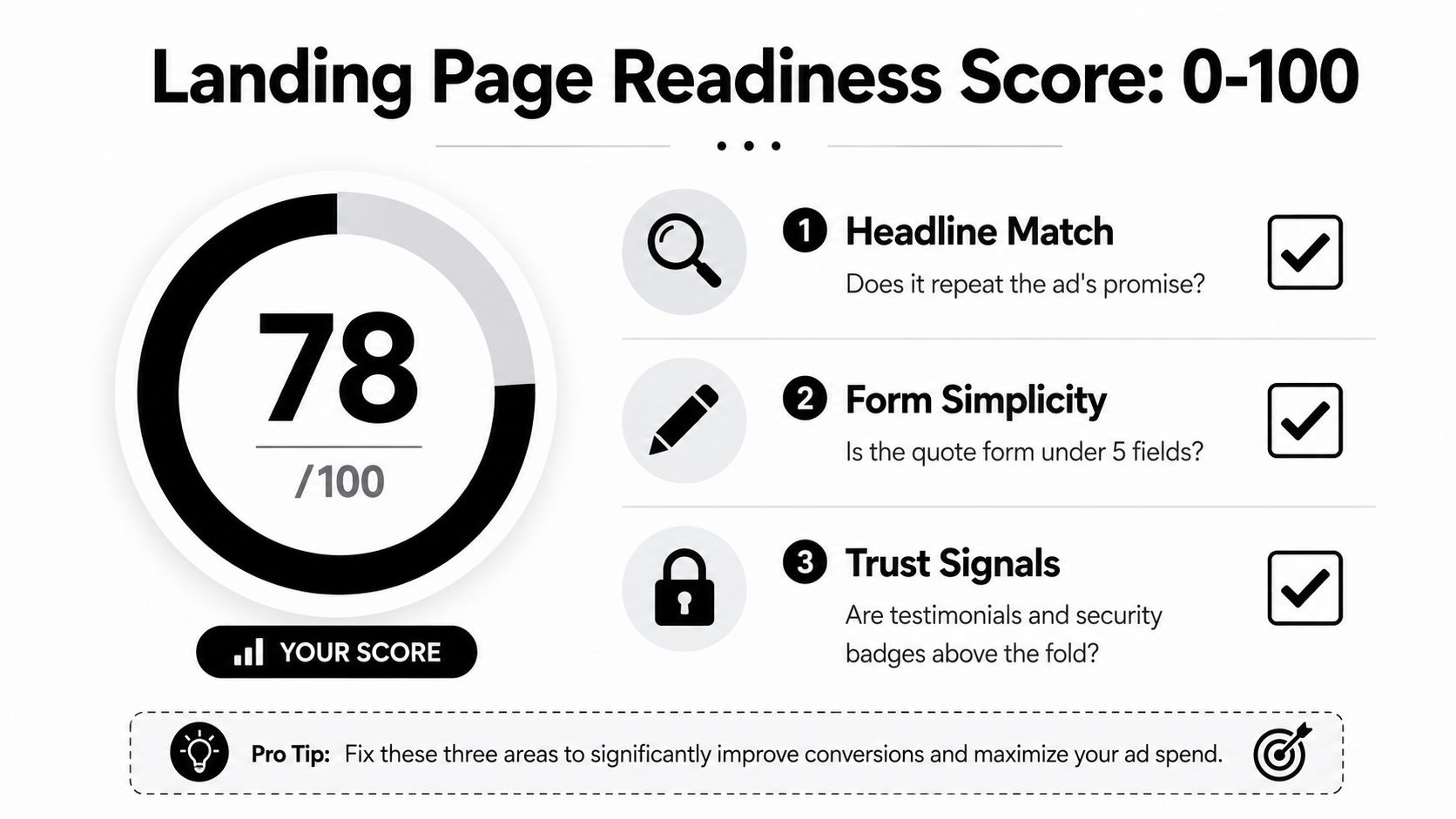
A simple readiness score can be built around clarity, form friction, and trust signals. The headline should repeat the ad's promise, the quote form should stay lean, and the page should show enough reassurance that the visitor doesn't feel trapped. If the page can't answer those three questions fast, it isn't ready.
A useful 15-minute checklist looks like this.
- Headline Match: does the page repeat the ad's promise?
- Form Simplicity: is the quote form under five fields?
- Trust Signals: are testimonials and security badges above the fold?
Fix the cheapest problems first
The fastest lift usually comes from reducing confusion, not adding more persuasion. One clean above-the-fold promise beats three competing headlines. A shorter form beats a clever form intro. Clear trust markers beat a dense wall of copy that nobody reads on mobile.
The page should make the next step obvious before the visitor starts comparing carriers.
That's especially true on cold traffic, where the ad creates curiosity but not loyalty. If the page asks for too much data too early, the visitor leaves before the system can learn anything useful. Keep the path to quote request obvious, short, and calm.
Measure What Matters and Read the Three-Round Test
Clicks are an input, not an outcome. In insurance, the metric stack that matters most is the one that tracks from thumb-stop to quote to bind, because that's where the economics become real. One benchmark framework recommends treating Cost Per Quote (CPQ), Bind Rate, and Creative Refresh Rate as core operating metrics, and it suggests a weak hook is anything below 20% to 25% thumb-stop, with insurance ads aiming for 0.8% to 1.2% CTR, 2% to 5% quote-request conversion from cold traffic, and retargeting often reaching 8% to 12% (insurance ad benchmark framework).
Read the test in three rounds
Round 1 is the angle test. You launch several angles and keep the one that earns attention without confusing the audience. Round 2 is the hook test. You keep the winning angle and swap the opening lines to see which hook holds attention. Round 3 is the scale or kill decision. You either lean into the winner, or you stop forcing a weak concept to carry the account.
Budget tier changes the setup, not the logic
A smaller budget needs less audience complexity and fewer creative branches. A larger budget can support more variants, but it still needs discipline around exclusions and measurement. The point is to learn one thing per round, not to throw five variables into the same test and guess later.
Practical rule: if you can't tell which round failed, the test was too crowded.
The cleanest read comes from separating audience, angle, and page performance. If the hook rate is weak, the creative missed. If the quote rate is weak, the page missed. If quotes come in but binds don't, the sales process or offer fit missed.
Your 7-Step Insurance Ads Launch Playbook
A first launch doesn't need a giant plan, it needs a sequence that keeps you from skipping the hard parts. Start with the buyer profile, then pick the offer, then run the compliance pass, then batch the creatives, then build the test plan, then score the landing page, and only then turn the campaign on.
- Profile the buyer. Write the policy type, the moment of need, and the likely objection in one sentence.
- Pick the offer. Keep it specific enough that a stranger can understand the next step.
- Pass compliance. Remove loaded promises, pressure language, and anything that could confuse a reviewer.
- Generate ten creatives. Spread them across three to five angles so the account has room to learn.
- Build the round-one test. Decide what wins, what pauses, and what gets rewritten before launch.
- Score the landing page. Fix headline match, form length, and trust signals first.
- Launch and watch the first read. Don't optimize everything at once.
Two signals usually justify scaling, consistent Cost Per Quote under target for seven consecutive days and a Bind Rate above benchmark. If the quote flow looks healthy but the offer keeps attracting the wrong people, pause and rewrite the message before you buy more traffic.
A practical launch doesn't need more theories. It needs a compliant hook, a clean landing page, and a test plan that tells you what to do next without burning a week on guesswork.
If you want a faster way to turn a policy page or offer into a Meta-ready test plan, Social Loop AI can help you map buyer angles, generate batch creatives, and score landing-page readiness before spend starts. It's a practical fit when you need structure more than inspiration, especially on a first insurance launch where wasted clicks get expensive fast.