Blog
Ad Templates for Facebook: A Beginner's 2026 Guide
Published July 4, 2026
You've probably done this already. You open Ads Manager, click into a new campaign, then stall at the creative step because “ad template” sounds simple until you need one that gets clicks.
Most beginners assume ad templates for Facebook are mostly a design problem. Pick a clean layout, drop in a product photo, add a discount, and launch. That's usually where the waste starts.
A template is not just a layout. It's a decision about what objection you're trying to overcome before someone scrolls away. A trust problem needs a different ad than a price problem. A “why do I need this?” problem needs a different ad than a “will this work?” problem.
That distinction matters more than most template galleries admit. Meta internal insights cited by Karola Karlson note that 68% of ad failures come from copy that doesn't resolve the viewer's specific hesitation in the first place, not from design alone, as summarized in Karola Karlson's review of Facebook ad templates.
When I look at losing ads from first-time founders, the pattern is usually obvious. The ad isn't ugly. It's just saying the wrong thing to the wrong person in the wrong format. A polished graphic can still fail if the buyer's real concern is trust and the ad only talks about features.
That's the practical way to think about ad templates for Facebook. Start with the hesitation. Choose the angle that answers it. Then shape the visual and copy around that answer. That approach keeps you from testing random designs and calling it strategy.
Table of Contents
- Introduction Beyond Just Pretty Pictures
- Choosing Your Strategic Ad Angles
- Adapting Template Layouts and Visuals
- Writing Copy That Connects and Converts
- Implementing a Budget-Aware Test Plan
- Tracking KPIs and Iterating Your Creatives
Introduction Beyond Just Pretty Pictures
The first mistake new founders make is shopping for templates the way they'd shop for a logo. They look for something modern, minimal, premium, or bold. None of those words tell you whether the ad answers the buyer's hesitation.
That's why a clean-looking ad can still underperform. The layout may be fine, but the message misses the point. If someone's worried your store looks unproven, a sleek product image with “Limited Time Offer” doesn't solve trust. If someone thinks the product is overpriced, a testimonial-only ad may not explain enough value.
What a template actually is
A useful template is a repeatable structure for one job. It might be:
- A trust template built around review language, creator-style visuals, and reassuring copy
- A price-justification template that contrasts the old pain with the new outcome
- An urgency template that works when the product is already easy to understand
- An identity template that helps the buyer see themselves as the kind of person who uses it
That's why “ad templates for Facebook” should be chosen from the inside out. Start with the buyer's objection, not the background color.
A template should tell you what to say, what to show, and what to leave out. If it only tells you where to place text, it's incomplete.
Why beginners burn budget
Most early campaigns fail because the founder tests cosmetic differences instead of strategic ones. They swap fonts, move the CTA button, or try a different stock photo, but the ad is still making the same weak argument.
That wastes time because the platform can't rescue unclear messaging. You have to decide what problem the ad is solving before Meta gets involved.
A good first campaign is usually much less creative than people expect. It's disciplined. One angle per template. One core objection per angle. One clear promise in the copy.
Practical rule: Don't ask a single ad to handle trust, price, urgency, education, and branding all at once. Pick the one hesitation that matters most and build around it.
Choosing Your Strategic Ad Angles
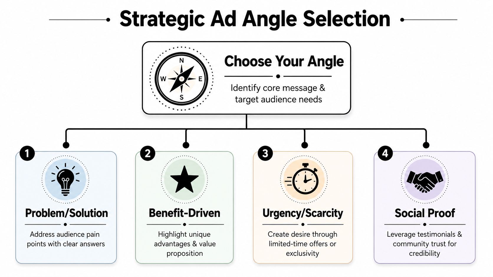
If your template doesn't start with an angle, it usually turns into a generic product post. That's where first campaigns get noisy fast. The strongest ad templates for Facebook are built around a deliberate argument, not a random format.
Campaigns using angle-tagged, objection-targeted templates achieved 22–37% higher CTR than generic templates, and templates that use social proof showed 31% higher conversion rates, according to the analysis summarized by Amplify Marketers on Meta ads creative best practices.
Match the angle to the objection
Here's the simplest way to choose.
Problem to Solution works when the buyer already feels the pain. This angle is strong for products that fix a visible annoyance or daily frustration. Think posture correctors, cleaning tools, organizers, or grooming products. The headline should name the problem plainly, then show the relief.
UGC works when the product needs to feel real, not polished. This is useful when trust is low and the founder doesn't have much brand equity yet. A handheld, casual presentation often feels more believable than a glossy studio shot.
Social Proof is the trust angle. Use it when the buyer's silent question is, “Why should I believe you?” Reviews, reactions, before-and-after framing, or creator voiceover all help here.
FOMO is for products people understand quickly. Don't use urgency to explain a confusing product. Use urgency when comprehension is already there and the buyer just needs a reason to act now.
Identity works when the product says something about the buyer. This fits skincare, fitness accessories, pet products, hobby niches, or lifestyle brands where people want to align with a type of person.
If you can't name the objection, don't pick a template yet.
Ad Angle Cheat Sheet
| Angle | What It Does | Best For Overcoming... | Example Headline |
|---|---|---|---|
| Problem to Solution | Frames the product as the direct answer to a pain point | Confusion, indifference, “why do I need this?” | Tired of pet hair everywhere? |
| UGC | Makes the ad feel native and believable | Skepticism, low trust, “is this legit?” | I didn't expect this to work |
| Social Proof | Shows others validating the product | Trust issues, fear of disappointment | Why buyers keep reordering |
| FOMO | Pushes action while interest is high | Delay, procrastination, “maybe later” | Today's bundle ends soon |
| Identity | Connects the product to self-image | Weak emotional pull, low brand attachment | For runners who hate bulky gear |
A common beginner mistake is choosing the angle they like instead of the one the buyer needs. Founders often default to Problem to Solution because it feels straightforward. If the market is skeptical, Social Proof or UGC may be the better first test.
Another mistake is combining angles too early. A UGC ad can include proof, but the backbone should still be one angle. If you mix everything together, you get muddy messaging and no clear lesson from the test.
Adapting Template Layouts and Visuals
Once the angle is set, the layout has one job. Help the message survive the mobile feed.
For Facebook feed creative, the safest starting point is 1:1 square at 1440×1440 px or 4:5 portrait at 1440×1800 px. Keep text overlays under 20% of the image area, and keep headlines at 27 characters or fewer so they're less likely to get cut off, based on the design guidance outlined in Coinis's Facebook ad design recommendations.
Use mobile-first dimensions
Most beginners over-design for desktop and under-design for the phone. On mobile, dense text blocks get skipped. Tiny comparison charts get ignored. Weak contrast dies immediately.
A practical feed template should follow a few rules:
- Use one focal point: one product, one person, or one visual claim
- Keep the top message obvious: the buyer should understand the ad without zooming in
- Avoid crowded overlays: if your image needs a paragraph, it's doing too much
- Protect the edges: logos, labels, and key text shouldn't sit too close to the border
Color helps too, but only if it supports readability. If you're choosing palette direction for your creative, this breakdown of color psychology in advertising is useful for deciding when to lean clean, urgent, calming, or high-contrast.
Good layout doesn't rescue weak positioning. It makes strong positioning easier to notice.
Make the visual style fit the angle
Many templates go wrong when the visual style and the sales argument don't match.
A Problem to Solution template usually works better with a clear demonstration, side-by-side framing, or an obvious use case. The buyer needs quick clarity.
A UGC template should not look overproduced. Slightly imperfect framing, handheld movement, and natural speech often help the ad blend into the feed in a good way.
A Social Proof template benefits from faces, reactions, review snippets, and product-in-use visuals. The point is reassurance.
For engagement-minded content, format choice matters. Facebook's average engagement rate per post is 0.15%, and 48% of Facebook users interact most with short-form video, according to the platform behavior summary in Sprout Social's Facebook stats for marketers. That doesn't mean every product needs video first. It does mean video deserves early consideration when your angle depends on demonstration, creator-style delivery, or a stronger thumb-stop.
A simple rule helps. If the product's value is obvious in a still image, test static. If the product needs context, explanation, or proof of use, test video first.
Writing Copy That Connects and Converts
The visual gets the stop. The copy decides whether the click feels worth it.
Most beginner copy fails because it sounds like a product description. Buyers don't need your catalog text in ad form. They need a reason to care now, in language that matches the angle you chose.
Build the hook first
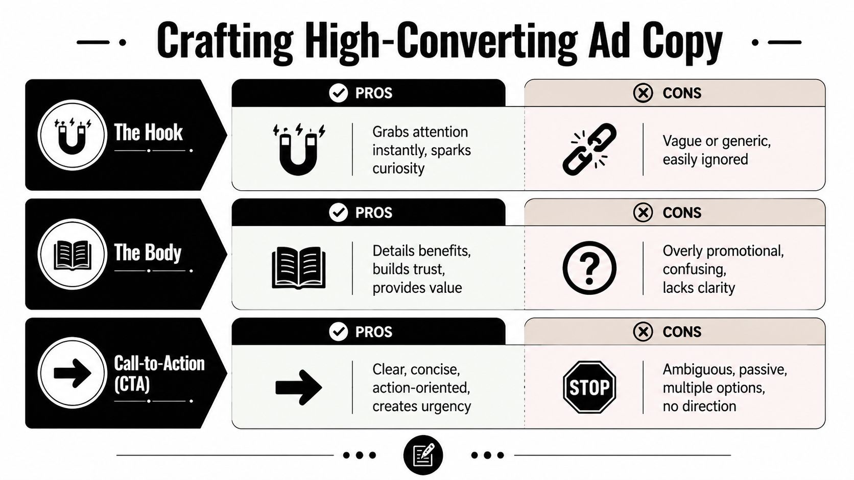
The hook should do one of three things. Name the pain, challenge a belief, or create curiosity.
Here are reliable hook formulas:
- Question hook: “Still dealing with tangled charging cables?”
- Pattern-break hook: “This looks simple, but it fixes a daily hassle.”
- Outcome hook: “Cleaner counters in less effort.”
- Skeptic hook: “I thought this was gimmicky too.”
The hook should sound like something a customer would say or think. If it sounds like a brand workshop, rewrite it.
For beginners stuck at the blank page stage, these practical ideas on how to write ad copy can help turn a product page into usable hooks and body text faster.
Don't lead with your brand story unless people already know you. Lead with the buyer's problem or desired outcome.
Write the body and CTA like a next step
Once the hook earns attention, the body needs to close the gap between interest and action. Keep it tight. Expand the claim, add one reason to believe, then direct the next move.
A useful body structure looks like this:
- Name the use case
- Explain the benefit in plain language
- Reduce doubt
- Ask for the click
Example for a kitchen organizer:
- Hook: “Tired of digging through messy drawers?”
- Body: “This insert keeps utensils sorted, visible, and easy to grab without redoing your whole kitchen.”
- CTA: “See how it fits your setup”
That CTA works better than a generic command because it continues the thought. “Shop Now” isn't wrong, but it's often lazy. Better CTAs feel specific to the angle:
- For proof ads: “Read why buyers love it”
- For demo ads: “Watch it in use”
- For urgency ads: “Claim today's offer”
- For identity ads: “Find your style”
One more copy rule matters. Don't repeat the same phrase in the image, headline, and primary text. Repetition like that feels blunt and usually weakens the ad.
Implementing a Budget-Aware Test Plan
The fastest way to waste money is to launch one ad, stare at it, panic, then change five things at once.
A better approach is controlled comparison. Build a small set of distinct concepts, let them run long enough to reveal a pattern, then improve the winner. According to the A/B testing guidance already cited earlier, developing 5 distinct designs in 3 sizes and testing different messaging angles, not just color changes, increased conversion rates by 28–42% among first-time dropshippers.
Test angles before polishing winners
Your first round should compare arguments, not tiny design tweaks.
A practical first batch looks like this:
- Three angles: for example Problem to Solution, UGC, and Social Proof
- One clear template per angle: no mixed messaging
- Consistent offer and audience: don't change the product promise mid-test
- Simple landing page path: product page or a focused offer page
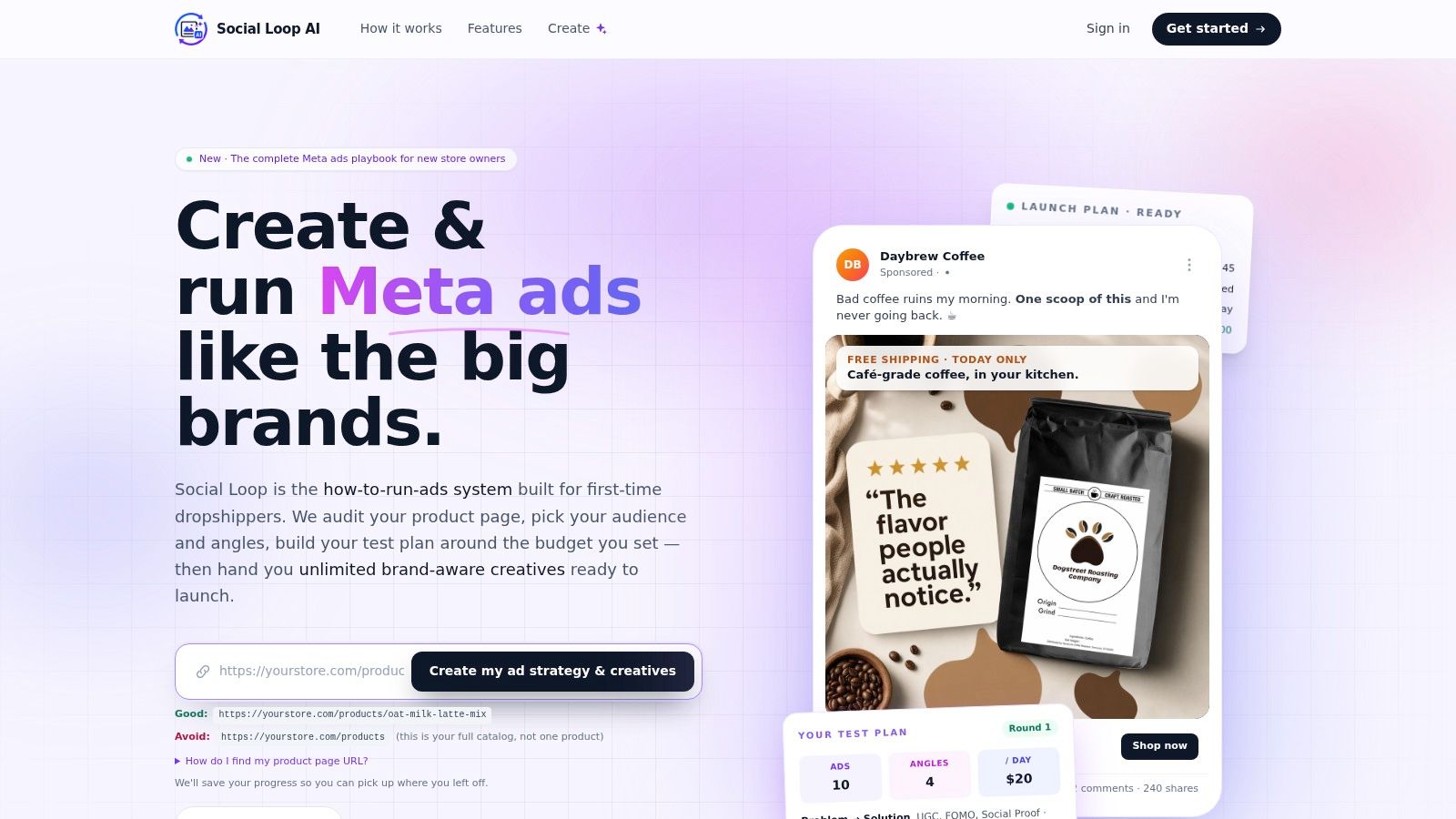
Structure helps. Some founders use spreadsheets and manual naming systems. Others use tools that organize the testing sequence. Social Loop AI's round-robin testing approach is one example of turning a budget into a planned set of creative rounds rather than making changes ad hoc.
Keep your test clean
Founders often think they're testing angles, but they're really testing chaos. One ad has a different offer, another has different copy length, and a third uses a different product image. That makes the result hard to trust.
Use this checklist before launch:
- Keep the offer identical: same product, same promotion, same destination page
- Change one strategic variable: angle first, then format, then hook
- Name each ad clearly: “UGC trust,” “Problem mess fix,” “Proof review”
- Prepare replacements early: if one direction shows promise, you'll want fresh variants ready
Treat your first test like research you're paying for. If the setup is sloppy, the lesson will be sloppy too.
A clean test gives you something more valuable than a single winner. It tells you what kind of argument your market responds to.
Tracking KPIs and Iterating Your Creatives
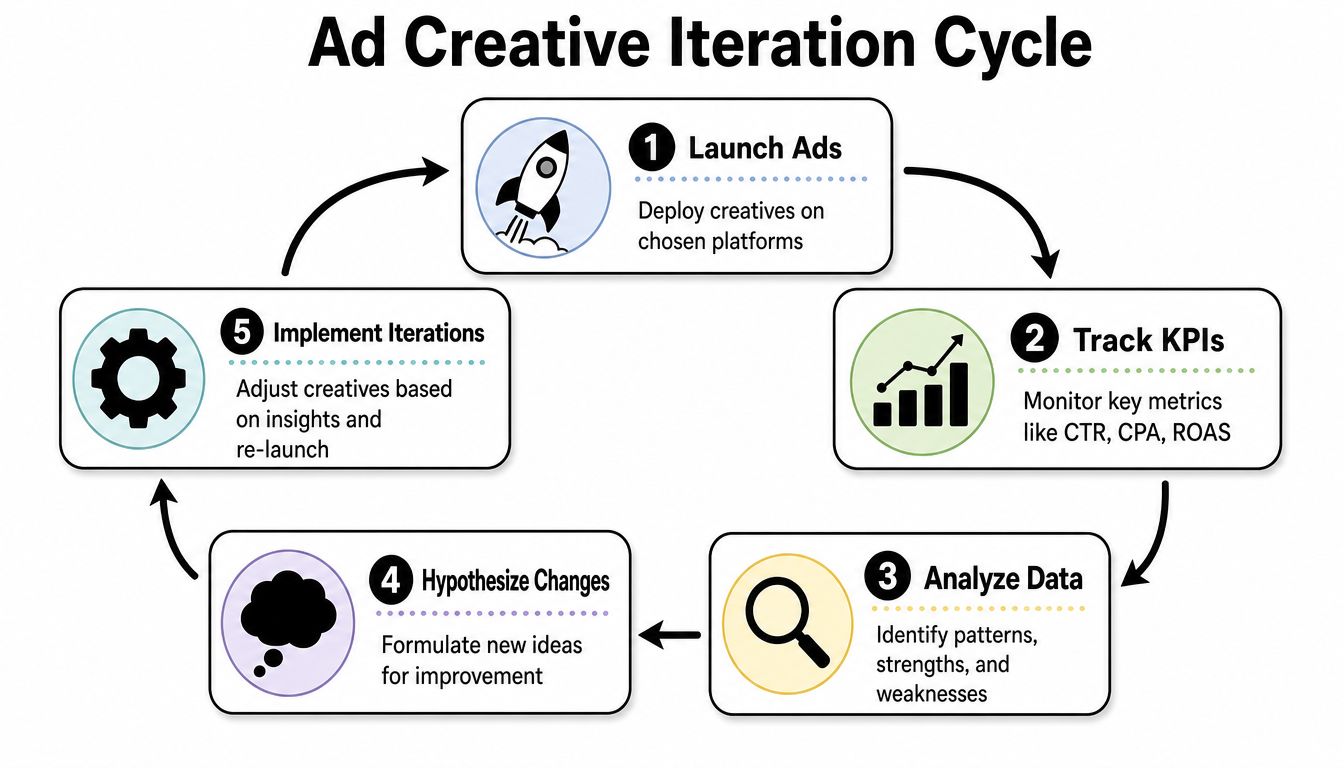
Once the campaign is live, don't stare at every metric in Ads Manager. Start with the signals that tell you whether the ad itself is doing its job.
For Facebook traffic campaigns in 2025, the average CTR across industries is 1.71%, and for lead-generation campaigns the average CTR is 2.59%, according to LocaliQ's Facebook advertising benchmarks.
Read the first signals correctly
Start with three beginner-friendly checks:
- CTR: tells you whether people find the ad compelling enough to click
- CPC: helps you see whether clicks are coming efficiently
- Conversions: tells you whether the traffic turns into action
Here's the simple read. If CTR is weak, your problem is usually the creative angle, hook, or visual. If CTR looks healthy but conversions are weak, the landing page, offer clarity, or product trust probably needs work.
This walkthrough adds useful context on the reporting cycle and what to review after launch:
Use results to decide what to change
Don't rebuild everything after a bad result. Match the change to the signal.
| What you see | Likely issue | What to change first |
|---|---|---|
| Low CTR | Weak hook, weak angle, poor visual stop power | New angle or stronger opening visual |
| Decent CTR, low conversions | Landing page mismatch or weak product proof | Tighten product page and offer presentation |
| Early clicks, then drop-off | Creative fatigue or repeated message | Rotate in fresh variants |
| Lots of engagement, weak sales | Ad is interesting but not persuasive | Sharpen benefit and CTA |
The job isn't to make one perfect ad. The job is to keep learning faster than you spend.
That mindset is what separates random testing from actual media buying. Strong ad templates for Facebook aren't static assets you set and forget. They're working hypotheses. You launch them, read the response, and improve the next round with intent.
If you want a simpler way to do that, Social Loop AI is built for first-time founders who need a clear Meta launch plan, angle-based creatives, and a structured test workflow without hiring an agency.