Blog
Color Psychology in Advertising: Boost Your Ad Impact
Published July 2, 2026
Red buttons don't print money. Blue backgrounds don't automatically create trust. And your personal favorite color has almost nothing to do with whether a Meta ad sells.
That's the biggest problem with most advice on color psychology in advertising. It turns a useful strategic tool into a cartoon. New founders get told to use a "high-converting color," copy a swipe file, and hope the algorithm does the rest. Then they launch ads that look loud, mismatched, or off-brand, and they burn budget learning a lesson they could've avoided.
Color matters a lot. In fact, 85% of consumers cite color as the primary reason they buy a product, and color can increase brand recognition by up to 80%, according to these compiled color psychology findings. But that doesn't mean there's one best palette for every ad. It means your colors need to match the product, the promise, and the person seeing the ad.
If you're launching your first e-commerce campaign, that's good news. You don't need a design degree. You need a practical way to pick colors that support your ad angle, keep your creative clear, and give you something testable without wasting a week in Canva.
Table of Contents
- Your Favorite Color Won't Boost Your Sales
- What Is Color Psychology in Advertising Really
- The Ad Maker's Quick-Reference Color Guide
- The Biggest Color Mistake New Advertisers Make
- Matching Your Palette to Your Ad Angle
- From Palette to Pixels Practical Ad Design Rules
- Start Painting Your Path to Better Ads
Your Favorite Color Won't Boost Your Sales
Most new advertisers make color decisions like shoppers decorating a bedroom. They pick what looks nice to them, what feels trendy, or what they saw in another brand's ad library. That's backward.
In ads, color isn't decoration. It's part of the sales message. A strong palette can make urgency feel urgent, make a testimonial feel believable, or make a premium offer feel expensive before anyone reads the headline. A weak palette does the opposite. It creates friction, confusion, or the sense that the product and creative don't belong together.
The popular shortcut is to ask, "What color converts best?" That's the wrong question. The better question is, "What color supports this angle for this audience?" A skincare ad built around calm, routine, and trust shouldn't look like a flash-sale supplement ad. A limited-stock gadget launch shouldn't use the same soft palette you'd use for a wellness subscription.
Practical rule: don't choose your ad palette from a generic color chart first. Choose the angle first, then pick colors that amplify that angle.
That shift saves money. It keeps you from rebuilding creatives after launch because the ad "looked good" but didn't feel credible. It also gives you a better way to test. Instead of random color swaps, you can test a deliberate hypothesis. For example, "Will a warmer urgency palette improve this scarcity angle?" That's useful. "Let's make the button red because someone on X said red wins" isn't.
If you're new to Meta ads, keep this in mind: color psychology in advertising works best when it's tied to intent. Not taste. Not hacks. Not internet folklore.
What Is Color Psychology in Advertising Really
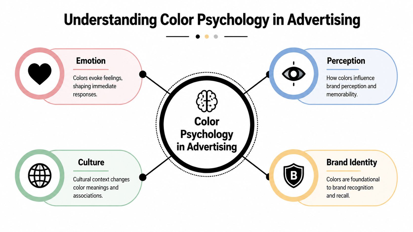
Color psychology in advertising is the study of how color shapes emotion, perception, and action inside a selling environment. The easiest way to think about it is this: color is a visual dialect. Before your copy explains the offer, color already tells the viewer what kind of message they're about to receive.
Color works before copy does
People don't read ads in a careful, linear way. They scan. They react. They decide whether something feels relevant in a split second. According to Printivity's overview of color in marketing, up to 90% of rapid purchasing decisions are based on the first visual impression, where color contributes the dominant factor. That's why a mismatched palette can sink a good offer before the body copy gets a chance.
This is also why beginners should treat color as part of persuasion, not just design polish. If you want a better framework for that side of creative strategy, these ad persuasion techniques for beginners pair well with color decisions because they help you match emotional cues to the actual sales argument.
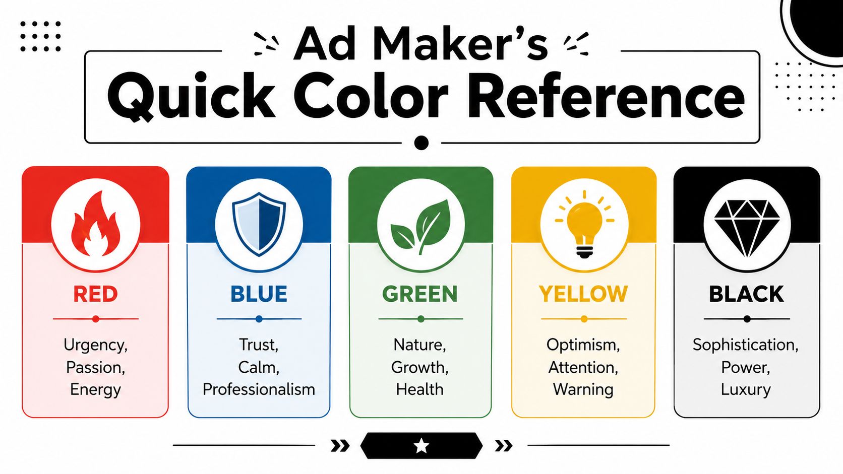
A few associations are common enough to be useful. Blue often signals trust. Red often signals energy or urgency. Green often signals health or growth. But those patterns are starting points, not laws.
Context changes meaning
The most useful idea here is color-in-context. The same hue can work brilliantly in one ad and fail in another because the product category, audience expectations, and market all change what that color says.
A saturated red can help a flash discount creative feel immediate. The same red can make a premium skincare ad look aggressive or cheap. Green can support an organic food product, but a different shade of green in a finance product might signal savings, safety, or feel dated depending on execution.
Color doesn't mean one thing. It means something specific inside a specific sales situation.
That matters even more if you sell across markets. Cultural interpretation changes color meaning fast. So does brand identity. If your store already uses a recognizable palette, your ad creative should usually stay close enough to feel like the same business. Otherwise the click and the landing page feel disconnected, and trust drops.
The point isn't to memorize a secret code. It's to read color the way buyers do. As emotional shorthand, category signal, and brand cue, all at once.
The Ad Maker's Quick-Reference Color Guide
When you're building your first ad batch, you don't need a giant theory lesson. You need a fast reference that tells you what each color tends to signal, where it usually helps, and where it can backfire.
A practical cheat sheet
Here are the colors most beginners reach for in Western ad creative.
| Color | Common cue | Best use in ads | Watch out |
|---|---|---|---|
| Red | urgency, excitement, action | flash sales, scarcity hooks, problem-solution creatives that need energy | too much red can feel pushy, spammy, or discount-heavy |
| Blue | trust, calm, reliability | finance, tech, subscriptions, products that need reassurance | pale or generic blue can look corporate and forgettable |
| Green | health, growth, nature | wellness, eco products, clean ingredients, savings angles | the wrong green can look cheap or dated |
| Yellow | attention, optimism, visibility | playful offers, callouts, bundles, youthful brands | hard to read if overused, and can feel noisy fast |
| Orange | momentum, friendliness, urgency | impulse products, deal framing, energetic CTAs | can feel low-end if paired with weak typography |
| Purple | creativity, richness, uniqueness | beauty, self-expression, premium accessories | can feel theatrical if the product isn't distinctive |
| Black | sophistication, power, luxury | premium fashion, minimalist beauty, high-ticket positioning | too much black can reduce warmth and approachability |
| White | simplicity, clarity, cleanliness | wellness, tech, DTC brands that want breathing room | too much white can make an ad disappear in the feed |
A few emotional signals are backed by measured responses. In a survey cited by Color Institute, blue triggered trust associations in 74% of people, red evoked excitement in 71%, and green was strongly linked to health in 82%. That's useful directional guidance, especially when you're choosing between a few plausible palette directions.
Later in the build process, it helps to see someone explain these choices visually. This short video does that well:
How to use the guide without overthinking it
Treat the table as a filter, not a formula.
If you're selling a posture corrector, red or orange can support a pain-point creative that needs motion and tension. If you're selling a sleep mask, those same colors might fight the offer. Soft neutrals, dark blue, or muted green would probably support the promise better.
Use this sequence when you're stuck:
- Start with the promise: ask what emotional state the ad needs to create first.
- Match the category: check what buyers already expect from products like yours.
- Protect readability: make sure the text, product, and CTA still stand out.
- Avoid forced symbolism: if the color meaning feels too obvious, it usually looks amateur.
Good creative rarely screams, "Look, I used color psychology." It just feels coherent.
The Biggest Color Mistake New Advertisers Make
The worst color mistake isn't using the wrong shade of blue. It's believing color rules are universal.
That belief leads beginners into lazy decisions. They hear that one color "works," apply it across every product, and then wonder why their ad for organic tea looks like a clearance banner or why their premium watch ad feels like a sportsbook promo.
Why generic color charts fail
Color meanings aren't fixed. They're shaped by culture, category, and brand congruity. The American Marketing Association's guidance on color psychology warns against hard-and-fast rules and notes that color value is layered, with effectiveness hinging on cultural context and brand fit rather than fixed hues.
One simple example makes the point. White often signals purity or cleanliness in Western branding. In parts of Asia, white can carry mourning associations. That's a huge difference. If you're running global campaigns, a palette that feels fresh in one market can feel wrong in another.
The same thing happens within product categories. Green can mean sustainability, wellness, money, freshness, or low-cost depending on the offer and design treatment. A matte green on refillable cleaning products can feel modern. A neon green on a luxury leather bag usually won't.
If a color choice needs a long explanation, buyers won't give you the chance to explain it.
What to ask instead
A stronger decision process is simple:
- Does this color fit the product category? Buyers compare you to the options already in their heads.
- Does it fit the angle? Urgency, trust, proof, premium, and playfulness don't want the same palette.
- Does it fit the audience? Age, market, and buying motivation all influence how colors land.
- Does it fit the landing page? If the ad and product page feel disconnected, conversion usually gets harder.
That's why "best converting color" advice wastes time. You're not looking for a universal winner. You're looking for visual congruity. The ad should feel like the natural expression of the product promise.
Matching Your Palette to Your Ad Angle
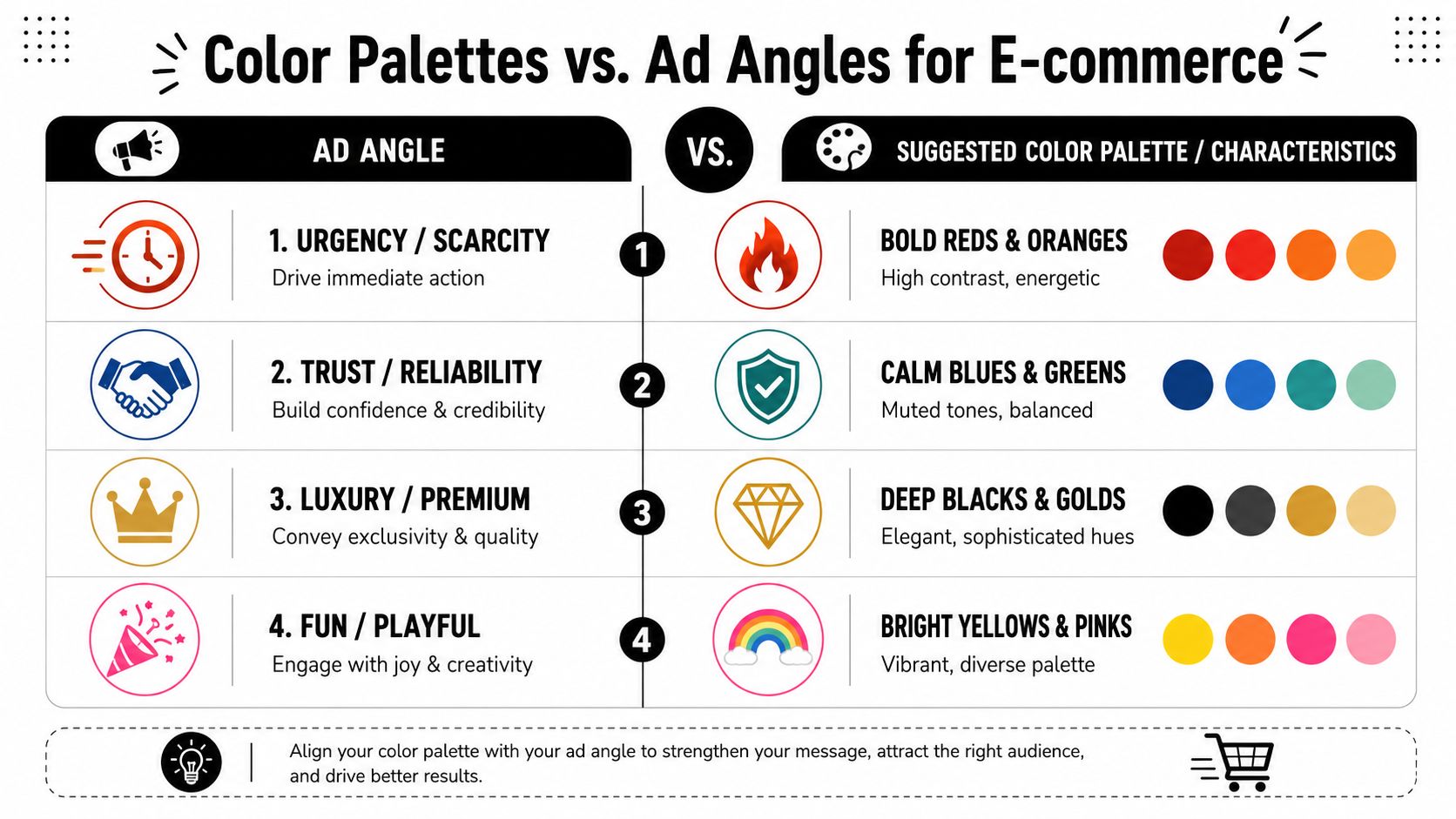
Color psychology in advertising becomes useful for actual campaign building. Don't start with a color wheel. Start with the angle you're trying to push.
FOMO and problem-solution ads
If the ad angle is urgency, scarcity, or immediate pain relief, warmer hues usually do the heavy lifting. UniAthena's digital advertising overview notes that warm hues such as red and orange should be used to trigger urgency for FOMO angles, while cool hues are better suited to trust-driven narratives.
That doesn't mean flooding the whole creative with red. It usually works better when warm color appears in the tension points:
- Headline accent: words like "today," "limited," or "selling fast"
- Offer framing: discount tag, timer motif, or stock warning
- CTA support: a contrasting action area that feels active, not passive
For ad-angle planning, it also helps to define the buyer first. This buyer persona definition guide is useful because urgency looks different for a budget shopper than it does for a status-driven buyer.
UGC and social proof ads
User-generated content and social proof creatives usually perform better when color steps back and credibility steps forward. Cool tones, neutrals, and natural-looking product colors often work because they don't make the ad feel overproduced.
Think about what the buyer needs to believe in a UGC ad. They need to trust the person, the use case, and the result. A loud palette can interfere with that. Blue, green, gray, beige, and white often help because they create stability around the testimonial instead of competing with it.
A good rule for these ads: keep the palette supportive, not dominant. Let the face, review snippet, or demonstration be the visual hero.
In proof-led creatives, the most persuasive color choice is often the one that gets out of the way.
Identity and premium angles
Identity ads sell belonging. Premium ads sell status, taste, or superior quality. Both need tighter control.
For identity-led creative, color should mirror the tribe you're inviting the buyer into. Earthy neutrals may fit outdoor or minimalist brands. Bright, expressive combinations may fit playful beauty or creator-led products. The palette has to feel native to that world.
For premium angles, restraint matters more than novelty. Black, white, deep neutrals, muted metallic cues, and generous spacing often do more than bright conversion colors. If the product is expensive, the creative should signal confidence, not desperation. The fastest way to cheapen a premium ad is to decorate it like a sale flyer.
From Palette to Pixels Practical Ad Design Rules
A clean palette still loses if the ad is hard to scan. That is what burns budget in first campaigns. The problem is usually execution: too many highlight colors, weak CTA contrast, or a test setup that changes three variables at once.
Use fewer colors than you want
New e-commerce founders usually overdecorate early creatives. A sale badge gets one color. The headline gets another. The CTA gets a third. Then the testimonial box, discount sticker, and background all ask for attention at the same time.
Keep stricter roles.
Use one dominant brand color, one support color, and one action color. That is enough for most static ads. If everything is trying to signal urgency or importance, the buyer stops knowing where to look first.
For FOMO ads, this matters even more. Urgency works when the eye finds the offer fast. For UGC and social proof ads, restraint helps the review, face, or product demo stay in focus. If you want references for simple creative layouts that keep color under control, these static ad examples for Meta advertisers are a solid place to start.
CTA contrast beats color myths
Founders waste time debating the "best" CTA color. The useful question is simpler: can someone spot the action in a one-second mobile scroll?
Contrast usually decides that. A warm CTA on a cool background often works. A dark CTA block on a bright creative can work too. The winning choice depends on the rest of the ad, not on a universal rule about red, green, or orange.
Check these before launch:
- Button separation: the CTA should not blend into the product shot or background.
- Text clarity: avoid weak pairings like light gray on white or white on yellow.
- Scroll test: shrink the ad to mobile size and look at it for one second. The next step should still be obvious.
A beginner Meta testing plan
Color testing should be boring. That is how you get a useful read.
Use one angle, one creative concept, and one color change. For a FOMO ad, test the urgency accent or CTA color. For a UGC ad, test whether a softer background improves trust and readability. For a social proof ad, test the highlight color behind the review snippet, not the whole palette.
Use this setup:
- Build one control ad with your current best palette.
- Duplicate it once and change one color choice only.
- Keep the hook, copy, image, offer, audience, and placements the same.
- Label the ads clearly in Ads Manager so the test is easy to read later.
- Review the creative before judging the result. A losing variant often failed because the contrast got worse, not because that color "doesn't convert."
I usually tell founders to start with CTA color first, then accent color second. Full palette tests are better saved for later, once the angle itself has proven it can get clicks or hold attention.
Start Painting Your Path to Better Ads
The right takeaway isn't "use red" or "trust blue." It's this: the best color for an ad is the one that supports the job that ad needs to do.
That's the shift new advertisers need to make. Stop asking which color converts best in general. Ask which color makes this angle clearer, this product more believable, and this next click easier. When you think that way, color psychology in advertising stops being vague theory and becomes a budget-safe decision tool.
Keep your first round simple. Pick one product. Choose one angle. Build one palette that fits it. Then test one color variable, not five. You're not trying to become a brand strategist overnight. You're trying to launch a cleaner first campaign and learn from real buyer behavior.
Most beginners don't need more hacks. They need a repeatable process. Color can absolutely improve ad performance, but only when it's used with discipline, context, and restraint.
If you want a faster way to turn a product page into a usable Meta ads plan, Social Loop AI helps first-time e-commerce founders choose angles, define buyer profiles, build brand-aware creatives, and map a budget into a practical testing workflow without hiring an agency.