Blog
Ecommerce Product Launch Strategy: A Bootstrapper's Guide
Published June 30, 2026
Most product launch advice is built for teams with time, cash, and a research budget. It tells you to run surveys, build a waitlist, interview prospects, and polish every asset before you spend on traffic. That sounds sensible. It also breaks down fast when you're a first-time dropshipper trying to validate a product without sinking money into guesses.
That gap matters because data shows 70% of new ecommerce launches fail due to poor market fit, and many guides assume founders can afford pre-launch research that small stores can't (practical validation notes from Blazon Agency). If you're bootstrapping, you need a product launch strategy that uses the market itself as your feedback loop.
The better approach is simpler. Build a solid product page, define a few audience hypotheses, create several clear ad angles, and run small live Meta tests. Then let clicks, add-to-carts, and purchases tell you what's real. That isn't reckless. It's often the cheapest honest signal you can get.
Table of Contents
- Why Most Product Launches Fail and Yours Wont
- The Pre-Launch Audit Before You Spend a Dollar
- Choosing Ad Angles and Crafting Test Creatives
- The Round-by-Round Meta Ad Testing Playbook
- Interpreting Early Results and Making Scaling Decisions
- Beyond the Launch Your First 30 Days of Growth
Why Most Product Launches Fail and Yours Wont
The ugly truth is that most launches don't fail because the founder didn't work hard enough. They fail because the product, audience, message, and offer never lined up in the first place.
Harvard Business School notes that about 95% of all new products launched each year ultimately fail to achieve sustainable market traction, with approximately 60% failing even before they reach the market (reported in G2's product launch statistics roundup). That's the part most beginners need to understand early. Launching isn't the hard part. Launching something people want, with messaging they instantly understand, is the hard part.
The common answer is "do more research first." Sometimes that's right. But for a new ecommerce founder, that advice can become a trap. You spend weeks writing survey questions, reading competitor reviews, and debating who your ideal buyer is, while never putting a real offer in front of real shoppers.
Practical rule: A product launch strategy for a small store should reduce guessing, not create more expensive ways to guess.
A leaner method works better for beginners. Treat your first launch like a controlled test, not a grand opening. Your job is not to prove you're right. Your job is to find out where you're wrong while the budget is still small.
Three failure patterns show up over and over:
- Weak market fit: The product solves a problem buyers don't care enough about.
- Wrong audience: The ad reaches people who can click but have no reason to buy.
- Bad translation: The product might be useful, but the page and creative fail to make the value obvious.
That last point gets missed all the time. New founders blame Meta when the landing page is vague, the offer is generic, and the creative leads with features instead of outcomes.
A stronger launch starts with one shift in mindset. Don't ask, "How do I launch this product?" Ask, "What is the cheapest reliable way to learn whether strangers want this product?" Once you work from that question, live micro-testing makes sense. You stop chasing perfect preparation and start building evidence.
The Pre-Launch Audit Before You Spend a Dollar
Before any ad goes live, fix the things that burn budget. Traffic doesn't rescue a weak page. It exposes it.
Start with the page, not the ads
Most beginners obsess over targeting and barely review the page they're sending people to. That's backwards. If the product page is unclear, slow, or unconvincing on mobile, ad performance will look worse than the product deserves.
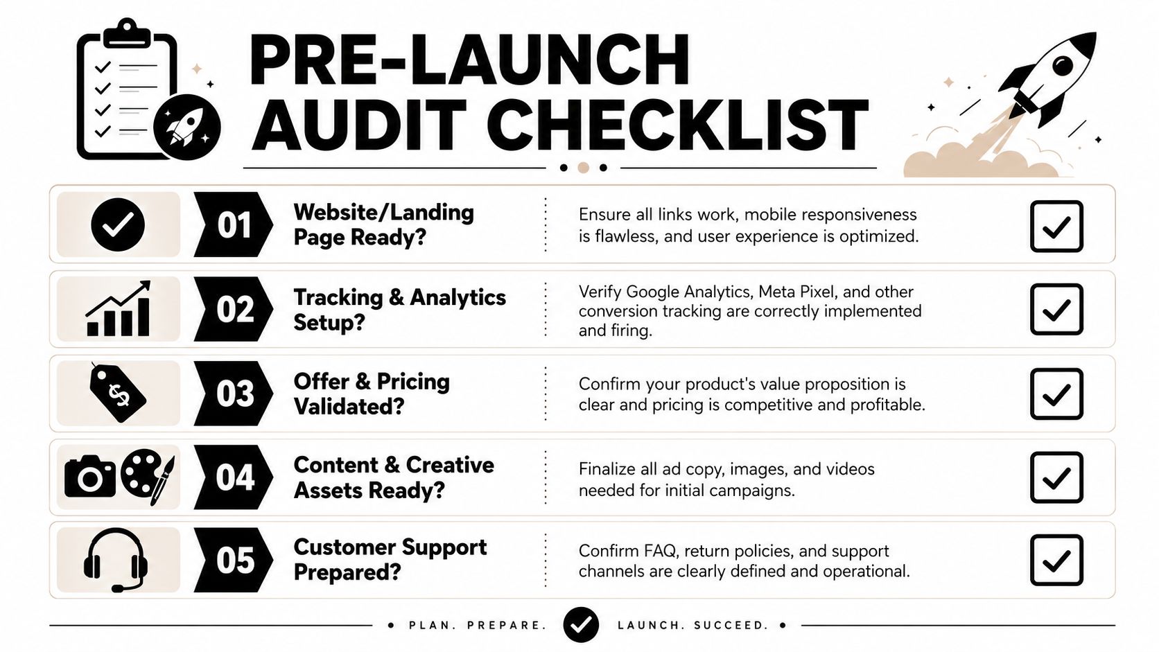
Run this audit before you touch Ads Manager:
-
Headline clarity
Can a first-time visitor understand what the product does in seconds? Avoid clever copy. Lead with the core outcome. -
Visual proof
Show the product in use, not just floating on a white background. Buyers need context. If it's a kitchen tool, show it in a kitchen. If it's a posture device, show it being worn. -
Offer logic
Make the price, shipping expectations, returns, and what's included easy to see. Hidden friction kills trust. -
Trust elements
Put reviews, guarantees, security cues, and policy links where buyers can find them. Trust signals don't help if they're buried in the footer. -
Mobile checkout flow
Test the entire path on your phone. Add to cart, start checkout, and look for friction. Broken buttons and awkward form fields are expensive.
A clean page doesn't need heavy design. It needs order. Hero section, benefits, proof, objections, offer, checkout path. That's enough.
If you want a more detailed breakdown of page fixes before paid traffic, this guide to landing page conversion optimization is a useful companion.
If your product page makes the shopper work to understand the value, the ad account takes the blame for a page problem.
Build a buyer profile you can actually target
You don't need a polished persona document. You need a practical buyer profile that helps you choose interests, hooks, and creative language.
Write down five things:
- Core pain point: What frustration makes someone care right now?
- Desired outcome: What change are they hoping for?
- Buying trigger: What event pushes them from browsing to buying?
- Likely objection: What makes them hesitate?
- Identity cue: How do they see themselves? Busy parent, gym regular, pet owner, tidy-home person, gift buyer.
Many stores tend to drift into fluff. "Women aged 25 to 44 who like wellness" isn't a buyer profile. "Women who work at a desk all day and want relief without adding another long routine" is closer. That language turns into ads.
Use hypotheses, not certainty. You don't know the winner yet. You're preparing angles to test.
A practical pre-launch audit also includes setup checks:
- Tracking installed: Make sure your Meta Pixel and analytics are firing.
- Creative assets ready: Have multiple images or videos, not one hero ad.
- Support basics covered: FAQ, shipping answers, and return policy should be visible.
- Pricing sanity check: The offer has to feel coherent next to the problem it solves.
The point isn't to perfect the store. It's to remove obvious failure points before you ask traffic to judge the product.
Choosing Ad Angles and Crafting Test Creatives
A lot of new founders freeze at this stage because they think they need to "make ads." That's too vague. What you really need is a small set of angles. An angle is the frame you use to make the product matter to a specific buyer.
A strong product launch strategy doesn't rely on one clever creative. It builds several message hypotheses and lets the market sort them. That's also why high-performing firms derive 49% of total sales from products launched within the last five years, versus 22% for other firms, and that difference is tied to clear value proposition and audience-focused messaging (ScienceDirect summary here).
Pick a small set of angles
For a first launch, three to five angles is enough. More than that usually means you're guessing too broadly.
Here are the most useful ones for beginner ecommerce tests:
-
Problem to solution
Best when the product solves a visible frustration. The buyer should instantly recognize the pain. -
Social proof or UGC style
Best when the product benefits from demonstration and relatability. This doesn't mean inventing testimonials. It means showing how a real person would talk about using it. -
FOMO
Best for trend-driven, giftable, or impulse-friendly products. The message is about missing out on convenience, timing, or momentum. -
Identity
Best when buyers use products to express who they are. Think organized people, pet lovers, home aesthetics buyers, fitness-focused shoppers. -
Objection reversal
Best when you already know the main hesitation, such as setup time, comfort, mess, or durability.
Keep each angle tied to one emotional job. If one ad tries to be urgent, informative, social-proof heavy, and aesthetic at the same time, it usually gets muddy.
Pasteable creative templates
Use simple structure. Hook, body, CTA.
| Angle | Hook | Body | CTA |
|---|---|---|---|
| Problem to solution | Still dealing with [specific problem]? | [Product name] helps you [desired outcome] without [common frustration]. Designed for [buyer type] who wants [clear benefit]. | See how it works |
| Social proof or UGC style | I didn't expect this to be so useful. | Started using [product] for [situation], and the biggest difference is [specific result]. The best part is [ease, comfort, speed, convenience]. | Try it for yourself |
| FOMO | This is the kind of product you wish you found sooner. | If you care about [benefit], this solves [pain point] in a way that's simple and easy to use. Great for [use case or moment]. | Get yours now |
| Identity | For people who take [identity/value] seriously. | [Product] fits into a routine built around [identity goal]. Clean, useful, and made for people who don't want [bad alternative]. | Shop the product |
| Objection reversal | Thought this would be [common objection]? Same concern. | What changes minds is how [product] handles [specific concern]. Easy to use, clear purpose, less friction than expected. | See the details |
Write like a customer speaks, not like a product catalog. Short words win. Concrete scenes win. "Stops your bag from turning into a mess" beats "optimizes personal organization."
Use UGC style without faking social proof
A lot of beginners cross the line here. They think UGC means pretending the product is already viral. Don't do that. If you don't have real reviews yet, use creator-style demonstrations, first-use reactions, or simple voiceover walkthroughs.
A practical reference for building this kind of content is this guide on how to make UGC.
Video often carries product understanding better than static images, especially for a new item people haven't seen before. This walkthrough is useful if you're still learning how to turn a product angle into ad-ready creative:
Good creatives don't try to say everything. They make one buyer feel, "That's for me."
When you finish this step, you shouldn't have "ads." You should have a stack of testable claims about what matters most to different buyers.
The Round-by-Round Meta Ad Testing Playbook
Now, the launch stops being theoretical. You have a page, a buyer profile, and several angles. Now you need a test structure that teaches you something quickly without spreading the budget too thin.
How to structure the first round
Keep the campaign simple. Use a conversions objective if your store and tracking are ready. Build separate ad sets for distinct audience ideas, then place different angles inside each ad set. You're trying to answer two questions at once: who responds, and what message makes them respond.
A workable first-round setup looks like this:
- One campaign: Keep the objective consistent.
- Several ad sets: Each one reflects a different audience hypothesis.
- Several ads per ad set: Each ad represents a different angle, not minor wording changes.
- One clear destination: Send everything to the same product page so the comparison stays clean.
Audience separation matters. Don't cram all buyer types into one bucket and hope Meta sorts it out. If you believe desk workers, gym-goers, and gift buyers might all care, treat them as separate tests.
A lot of first-time advertisers waste money by changing too much, too often. Let a round run long enough to reveal a pattern, then make one meaningful change at a time. If you swap audience, creative, landing page, and offer all at once, you won't know what caused the result.
For a cleaner workflow when you're comparing combinations, this guide to round-robin testing is worth using as a reference.
Meta Ad Testing Matrix
Build the plan before you launch. Even a simple table can prevent sloppy testing.
| Ad Set / Audience | Ad 1 (Angle: Problem/Solution) | Ad 2 (Angle: Social Proof) | Ad 3 (Angle: FOMO) |
|---|---|---|---|
| Audience A | Version A1 | Version A2 | Version A3 |
| Audience B | Version B1 | Version B2 | Version B3 |
| Audience C | Version C1 | Version C2 | Version C3 |
This matrix does two things. First, it forces discipline. Second, it makes results readable. If one audience clicks but doesn't buy, that's a different problem from an audience that ignores the ad entirely.
What to change between rounds
Treat each round like a decision cycle.
Round one should test broad message fit. You're learning which audience-angle combinations deserve more attention.
Round two should narrow the field. Cut obvious losers. Keep the best audience-angle pairings. Improve hooks, visuals, or first lines rather than rebuilding from scratch.
Round three is for refinement. At this stage, many stores start seeing whether the issue is still creative, or whether the page and offer now deserve the blame.
A few rules keep the process honest:
- Don't rescue weak ads with constant edits: If an angle doesn't connect, pause it.
- Don't judge from one metric alone: Clicks matter, but so do on-page actions.
- Don't scale confusion: If an ad gets attention but attracts the wrong buyer, more spend won't fix that.
Field note: The goal of early testing isn't to find a winner you can marry. It's to find a winner worth challenging in the next round.
The most useful product launch strategy for beginners isn't glamorous. It's structured repetition. Launch a round, read the signals, tighten the variables, and go again.
Interpreting Early Results and Making Scaling Decisions
Once the tests are running, most beginners look at the dashboard and either panic or get overexcited. Neither helps. Early data is only useful if you read it in sequence.

Successful launches hinge on tracking measurable KPIs like leads generated and click-through rates in real time, and brands that monitor conversion rates per ad round can scale winners and pause losers faster (Crayon's KPI article). That's the mindset you want. Read the account as a set of signals, not as a source of emotional reassurance.
Read the funnel in order
Start with CTR. A low CTR usually points to a creative or audience problem. The product may still be fine, but the ad isn't making people care enough to click.
Then look at what happens after the click. If CTR is healthy but purchases don't follow, the friction is often on the page. Common culprits are weak value explanation, shaky trust, unclear shipping terms, or a mismatch between ad promise and landing page reality.
Then review cost per purchase and ROAS. These are the hardest metrics to earn and the easiest to misread too early. Use them with context. One sale doesn't prove a campaign is cracked. No sales doesn't always mean the product is dead. The pattern across ad rounds matters more than any single moment.
A simple way to read outcomes:
- Bad CTR, bad conversion: Wrong angle or wrong audience.
- Good CTR, bad conversion: Ad promise is stronger than the page or offer.
- Mixed CTR, some purchases: There may be one workable segment worth isolating.
- Strong engagement, weak buying intent: People like the content but don't want the product enough.
Kill, keep, or scale
You need rules. Otherwise you start making decisions based on hope.
Use this framework:
| Decision | What you're seeing | What to do next |
|---|---|---|
| Kill | Weak CTR and no meaningful downstream action | Pause the ad or audience. Don't rewrite endlessly. |
| Keep testing | Some signs of interest but inconsistent buying behavior | Adjust one variable. Try a sharper hook, better product demo, or tighter audience. |
| Scale carefully | Repeated purchases or strong buying signals across a round | Increase budget in steps, duplicate into nearby audiences, or expand winning creative variants. |
Scaling too early is one of the easiest ways to ruin a decent test. If a combination is working, protect the variables that made it work. Expand around the winner. Don't replace the whole structure.
The best early scaling decision is usually boring. Keep the winning message, keep the winning page, and widen reach one controlled move at a time.
Also watch comments, messages, and post-click behavior. Buyers will tell you where the friction is. If people keep asking the same question in comments, that's not noise. That's missing sales copy.
Beyond the Launch Your First 30 Days of Growth
The first sale doesn't prove the system. The first month does. After launch, your job changes from validation to controlled expansion.
Protect what worked
The best next move is usually gradual. The success rate for tech product launches is around 40%, and that probability increases when teams avoid a single communication channel and launch gradually through phased rollouts to specific user segments (OpenHunts summary). That lesson applies well to ecommerce. Don't bet everything on one ad, one audience, or one burst of spend.
Keep your winning ad set stable while you test nearby variations:
- Add retargeting: Reach site visitors, cart abandoners, and engaged viewers with tighter copy.
- Expand laterally: Test adjacent audiences that resemble your early responders.
- Refresh creatively: Keep the core angle, but change the hook, visual, or format before fatigue sets in.
Use feedback to sharpen the offer
Your first buyers are useful for more than revenue. They give you the language to improve the product page and ads.
Look for patterns in:
- Questions before purchase: These usually point to weak copy.
- Refund or hesitation reasons: These expose offer mismatches.
- Positive reactions: These often reveal the true value prop better than your original copy did.
A durable product launch strategy isn't one launch event. It's a loop. Test, read, refine, retest. The stores that survive aren't the ones with the fanciest launch deck. They're the ones that keep learning faster than they spend.
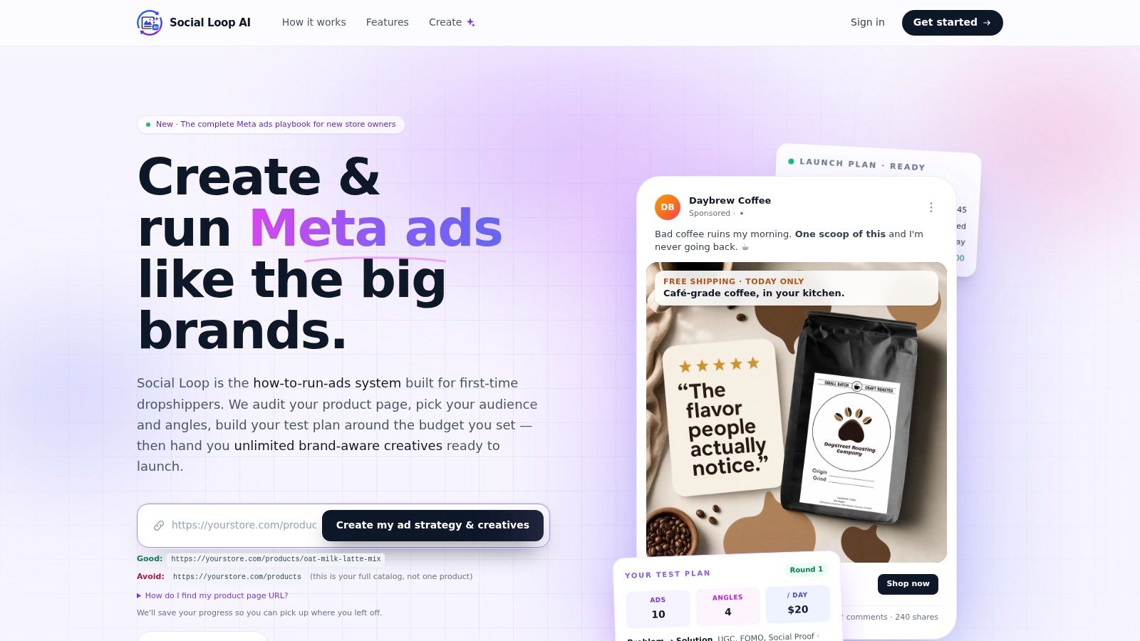
If you want a faster way to turn a product URL into a practical Meta launch plan, Social Loop AI helps first-time dropshippers build buyer profiles, choose ad angles, audit landing pages, and create brand-aware test creatives without hiring an agency. It's built for founders who need a repeatable system, not more theory.