Blog
Mobile Responsiveness Check: A Practical Ecommerce Guide
Published August 12, 2026

Your homepage looked fine on desktop, but on a phone the main button sat under the fold, a product image spilled past the edge, and the checkout field refused to open the keyboard. That's the kind of mobile problem that costs sales, because the page still “loads” and the layout still seems usable at first glance.
A solid mobile responsiveness check is not a single resize test. It's a layered workflow that starts in design review, moves through browser DevTools, gets confirmed on real devices, and finishes with automated regression checks plus accessibility and performance audits for issues viewport resizing can miss, especially layout stability, text readability, touch-target size, form behavior, media scaling, keyboard interaction, and horizontal scrolling (QABattle, Qualiti).
Table of Contents
- Why a Layered Mobile Responsiveness Check Matters
- Manual Testing with Browser DevTools
- Automated Tools and What They Catch
- Common Mobile Issues That Kill Ecommerce Conversions
- Quick Fixes for Shopify and WooCommerce Stores
- Re-Checking After Changes and Preventing Regressions
Why a Layered Mobile Responsiveness Check Matters
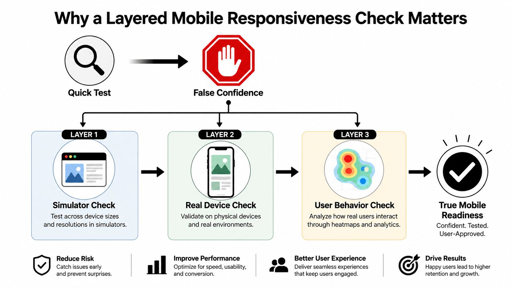
A quick mobile test can create false confidence because it usually checks appearance, not behavior. I've seen pages look fine in a resized browser while a menu misfires, a form field hides behind the keyboard, or a product card shifts at one awkward breakpoint. The failures that matter most are the ones that affect buying, layout stability, readability, tap accuracy, and horizontal scroll.
Simulator Check
Start with the layout plan itself. Review the breakpoints, the content priority, and what should happen to the header, product gallery, filters, and checkout steps as the screen narrows. If the mobile plan is vague, every later test gets noisy because you are guessing at intended behavior instead of checking it.
Use browser DevTools to scan those layouts at the widths customers hit. A simple resize can hide logic errors, so drag the viewport edge slowly and watch for elements that slip, wrap, overlap, or trigger side scrolling at certain widths or orientations. That habit catches breakpoint bugs a store owner can miss in a five-second glance.
Real Device Check
Emulation helps, but it is still not the same as a phone in a hand. Real devices expose browser quirks, touch behavior, scrolling feel, and keyboard interactions that desktop simulation can smooth over. That difference matters on storefronts, because a cart drawer or filter panel that looks fine in Chrome can behave differently on Safari or under mobile network conditions (Qualiti).
The practical rule is simple. If a change touches product pages, checkout, navigation, or any tap-driven flow, do not stop at a simulator.
User Behavior Check
The last layer asks a different question, can someone finish the task quickly. Exercise the actual path a buyer takes, from landing page to product page to cart to checkout, and make sure each tap target works cleanly in mobile mode. Keyboard interaction, zoom behavior, and mobile navigation need to be confirmed on hardware, not assumed from desktop previews (Qualiti).
For store owners who need a practical next step, begin with DevTools if the site is still being shaped, then move to real devices once the core layout looks stable. If mobile traffic is already coming in, treat real-device validation as required and add automated checks after the experience is clean.
Manual Testing with Browser DevTools
A storefront can look fine on desktop and still fall apart the moment you shrink it. Chrome DevTools catches those failures quickly, especially the ones tied to layout, spacing, and hidden overflow. Open Device Mode, switch to responsive view, and work through widths that force different layout states, 320px, 375px, 414px, and 768px. Those sizes expose cramped product cards, stacked nav menus, and checkout fields that stop lining up once the screen gets narrow.
The width is only part of the check. Drag the viewport edge slowly instead of jumping straight between presets, because a lot of ecommerce bugs show up a few pixels before or after a breakpoint. A card can look correct at the exact breakpoint and still clip text, shift a button, or push the page wider during the transition.
What to test first
Start with the pages that carry revenue and friction.
- Product pages need image scaling, gallery controls, variant pickers, and CTA buttons to stay usable.
- Checkout flows need form fields, address inputs, keyboard behavior, and error states to stay readable.
- Navigation menus need to open, close, and scroll without trapping the user in an overlay.
Turn on touch emulation, then use the page. Tap the menu, filters, quantity controls, add-to-cart buttons, and any sticky footer CTA. A storefront that only looks right in a screenshot can still be annoying to use if taps land too close together or panels cover the controls people need next.
Diagnostic habit: If you see a horizontal scrollbar, inspect the widest element first. It is usually a fixed-width image, banner, card, or form container forcing the page wider than the screen.
Text size and tap spacing deserve a close look. A mobile checkout can appear clean while still feeling awkward if buttons sit too close together or labels wrap badly on small screens. That is why the visual pass has to stay paired with interaction testing. A quick scan is useful, but it does not tell you whether the flow still works under pressure.
For a practical companion checklist while you clean up mobile landing pages, this mobile landing page optimization resource keeps the focus on action paths instead of surface polish.
Automated Tools and What They Catch
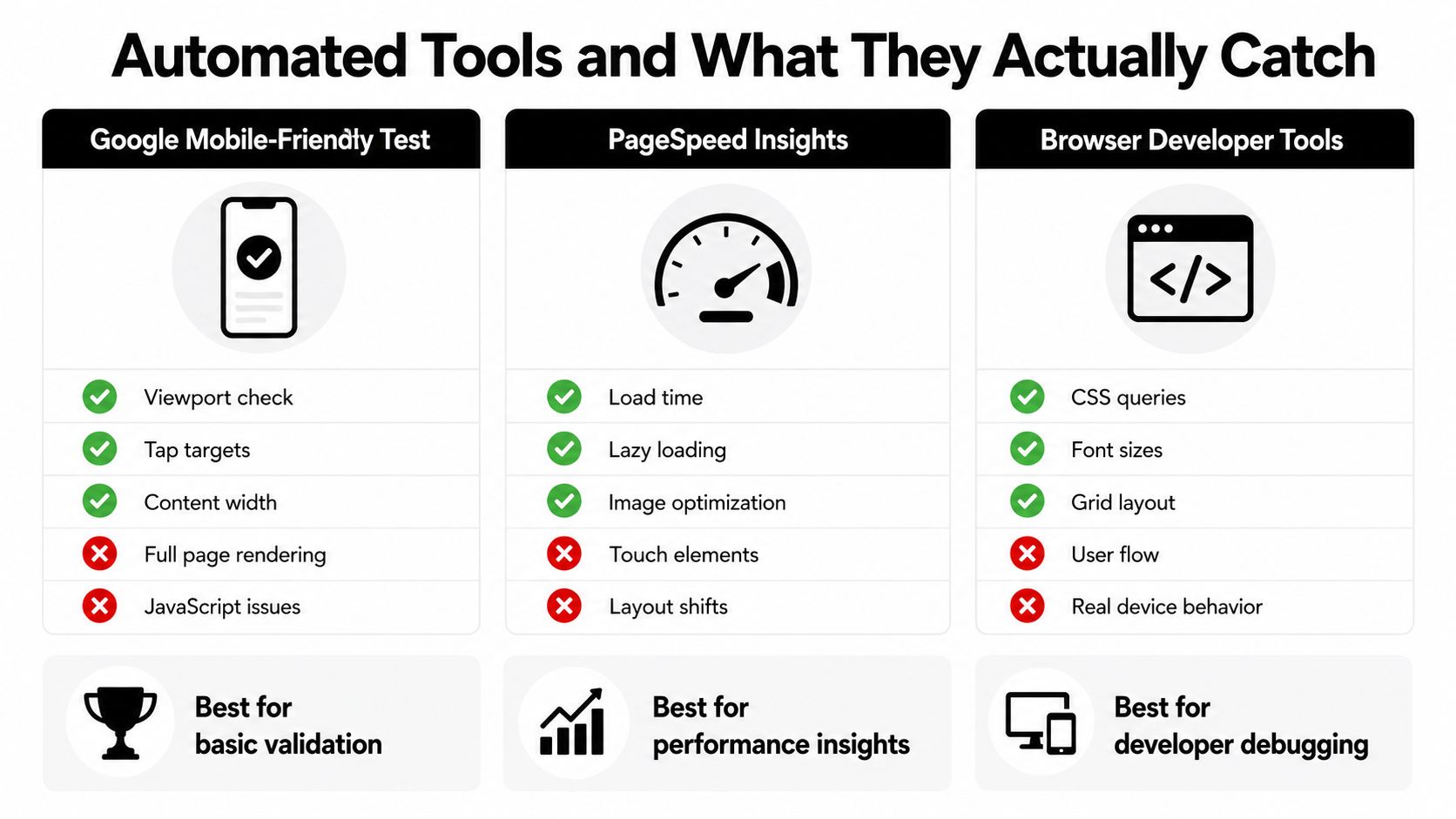
Automation earns its place when you need fast validation and repeatable regression checks. It does not replace interaction testing, because screenshot tools and audit engines cannot fully validate touch behavior, browser quirks, or the lived experience of a buyer moving through a storefront. The strongest setup uses automation for the checks it handles well, then hands the tricky parts to a real device.
Google Mobile-Friendly Test is useful for a basic sanity pass. It can quickly surface viewport and content-width problems, which matters when you need to confirm a page is not obviously broken. PageSpeed Insights and Lighthouse are more useful for performance and layout-related audits, so they help when loading, image handling, or shifting content is hurting the mobile experience.
Browser developer tools are still the quickest way to inspect CSS queries, font sizing, and grid behavior. They are also the easiest place to spot the kind of style-level issue that creates a bad mobile view without any server-side trouble. What they miss is the full user flow, because a layout can appear correct while the interaction model still fails on a phone.
Where automation fits
Use automated screenshot comparisons after theme changes, plugin updates, or design edits. They are especially useful for catching a button that moved, a section that collapsed, or a product template that rendered differently after a release. That makes them a regression net, not the final sign-off.
Some teams also use responsive testing platforms that combine device previews with real-device access. A workflow built around Qualiti is helpful when you need to compare screen sizes and then confirm the same page on an actual handset. Choose the tool that helps you verify the issue you are chasing, not the one with the longest feature list.
Social Loop AI also fits this workflow as a supporting option for ecommerce owners, because it includes preview views for desktop, tablet, and mobile so you can verify how content appears across screen sizes before you launch changes.
Automated checks are best treated as a gate, not a guarantee.
The right question is not whether a tool is best. It is whether it catches the problem class you keep shipping by accident. For mobile responsiveness, that usually means combining a quick automated pass with a manual browser audit and at least one real-device review.
Common Mobile Issues That Kill Ecommerce Conversions
A mobile store can look fine at a glance and still bleed conversions in small, frustrating ways. A product page loads, the layout seems intact, then a shopper hits a tiny button, a shifted image, or a form field that fights the keyboard. Those failures do not always look broken in a screenshot, but they interrupt the path to checkout.
Layout and media problems
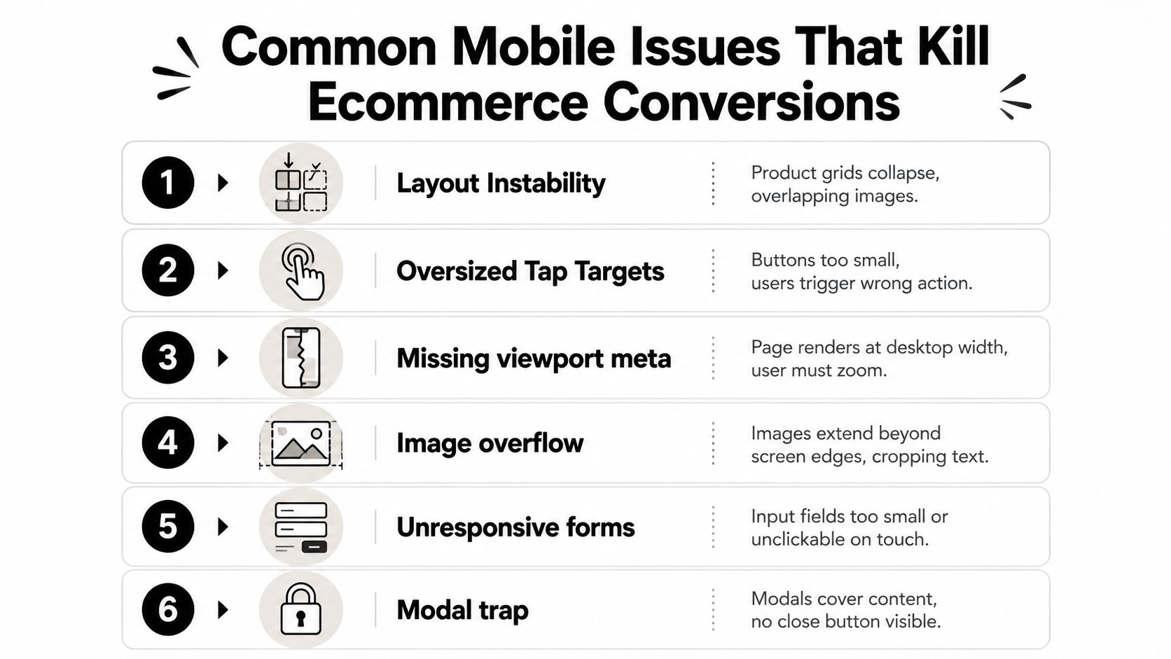
Layout instability usually shows up first in collection grids and product galleries. A card can jump to a new row too early, an image can overlap the description, or a sticky element can cover the CTA as the screen gets narrower. The cause is often a breakpoint mismatch, but fixed widths, inconsistent aspect ratios, and theme sections that were never built to reflow cleanly on mobile can create the same mess.
Image overflow is easy to spot once you know what to look for, and easy to miss if you only check the top of the page. If a product image or banner pushes beyond the viewport, inspect the container width, the image sizing rules, and whether the theme is still assuming a desktop screen. The same root cause often shows up as horizontal scrolling, which usually means one element is wider than the available screen space.
Interaction failures
Oversized tap targets can make a design look tidy in a screenshot while still feeling awkward on a phone. A button that is too small, or too close to the next action, leads to mis-taps inside menus, filters, and variant selectors. That is why tap-target checks belong in every mobile responsiveness check, not just in accessibility reviews.
Unresponsive forms hurt checkout more than decorative issues ever will. A field that does not focus, a label that drops under the keyboard, or an error message that disappears behind the browser chrome makes the store feel unreliable. Real-device testing catches these failures better than emulators, because the mobile keyboard and browser UI change the available space in ways a desktop preview does not fully mimic.
Navigation and modal traps
Navigation failures often come from overlays built for desktop convenience. A menu opens but does not close cleanly, or a modal blocks the page without a clear exit path. Once that happens, users are not exploring, they are stuck.
Missing viewport meta is a basic failure, but live stores still ship it. The page renders like a desktop layout on a small screen, text becomes tiny, and shoppers have to pinch and zoom just to read. Treat that as a foundation problem before you touch spacing, colors, or content hierarchy.
For broader product-page cleanup, the guidance in this product page optimization guide helps keep the diagnosis tied to purchase intent instead of isolated design defects.
Quick Fixes for Shopify and WooCommerce Stores
Shopify and WooCommerce stores usually fail in different places, but the fixes overlap more than many owners expect. Start with the layout source, not with patching symptoms page by page. If the theme is fighting mobile behavior across the store, one targeted override often saves more time than a long list of random tweaks.
Shopify fixes that usually pay off
In Shopify, open the theme customizer and preview the problem page at mobile widths. Adjust section padding, reorder content blocks if the product detail page is too tall, and check whether the hero, gallery, and CTA still work once everything is stacked. That matters most in themes like Dawn or Debut, where mobile spacing can look fine until a product page fills up with content.
If image overflow is the problem, use a scoped CSS override instead of changing every image setting by hand. The goal is simple. Keep media inside its container and let it scale naturally. For tap targets, increase button padding and give menu items enough separation so thumbs can hit them cleanly.
Quick win: Fix the first screen customers see on mobile before you touch the rest of the page. If the CTA, price, and gallery are wrong there, the rest of the scroll barely matters.
WooCommerce fixes that tend to unblock checkout
WooCommerce problems often come from plugin conflicts or page builders that were never tested against real mobile checkout behavior. Start by isolating the checkout template, then test product gallery controls, form field spacing, and any sticky cart or bundle plugin that adds extra complexity. Elementor and WPBakery can both produce strong desktop layouts while squeezing mobile form sections into something awkward.
For broader cleanup, make sure the viewport meta tag is present, responsive images are being served properly, and typography scales fluidly instead of relying on one small-screen font size. If a theme or plugin keeps bringing back the same bug, hand it to a developer instead of stacking more fixes on top of it.
A useful decision rule is simple. If the issue is spacing, stacking, or image containment, you can often solve it in theme settings or with a small CSS patch. If the issue is checkout logic, plugin behavior, or device-specific interaction, hand it off before you create a second problem while fixing the first.
Re-Checking After Changes and Preventing Regressions
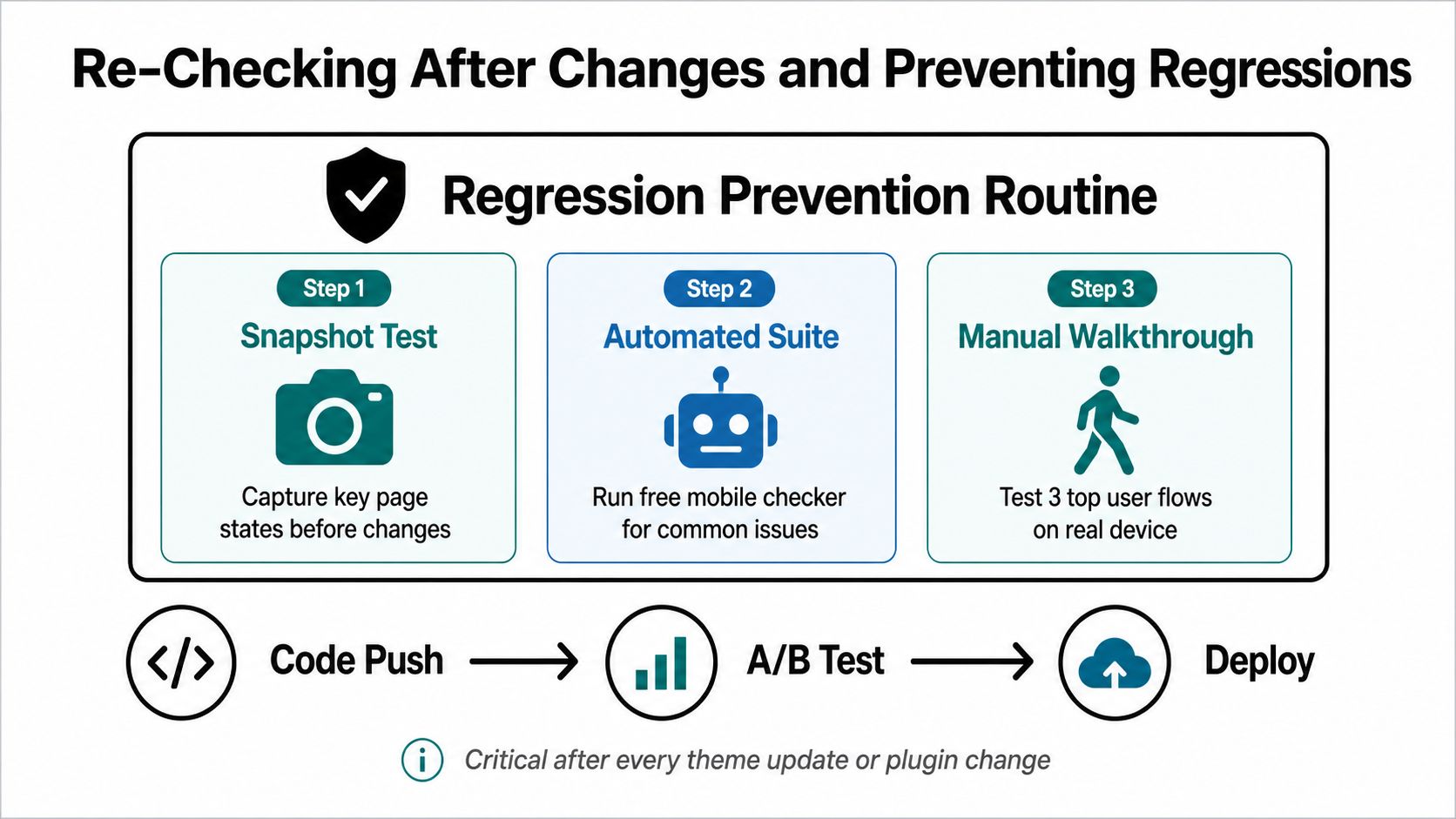
A mobile fix that is never re-checked usually comes back as a fresh bug after the next theme update, app install, or checkout tweak. A better routine is simple and repeatable, snapshot the page before you touch it, run an automated pass after the change, then walk the store on a real phone. That sequence catches layout drift and interaction problems, which is where emulation often looks fine and real users still hit friction.
A lightweight re-check routine
Use the same three paths every time, homepage, product page, checkout. Check each one in DevTools first, then on a real device, then again after any plugin or theme change. Keeping the sequence short makes it realistic to repeat, instead of turning it into a task you only remember when a launch is already strained.
The goal is not exhaustive testing. It is catching the breakpoints that affect conversion before customers do. If you need a broader experimentation framework around these updates, the approach in this multivariate testing resource fits once the mobile baseline is stable.
Write down what good looks like for your store. Keep a short note on the breakpoints, pages, and device behavior you have already verified, so the next change is checked against a known state instead of guesswork.
A store with a written mobile baseline fixes faster because nobody has to rediscover the same bugs.
Tie the audit schedule to your update cadence. After theme changes, plugin installs, or major product-page edits, run the quick check again. If the store stays stable, keep using a real device on a regular cadence and let automation flag the subtle regressions that creep in after later edits.
Social Loop AI helps ecommerce owners turn a product page into a launch plan, and that includes checking how the content appears in desktop, tablet, and mobile previews before campaigns go live. If you are already tuning pages for mobile buyers, visit Social Loop AI to see how its workflow can support your next product launch and catch weak page presentation before you spend on ads.