Blog
How to Write Landing Page Copy: 2026 Guide for Ecommerce
Published August 2, 2026
You've got clicks from your first Meta ad, maybe even a few add-to-carts, but the sale still isn't happening. The ad looks solid, the product is real, and the page isn't ugly. The problem is usually simpler and harsher, the visitor doesn't see an immediate reason to care, so they leave before the page ever has a chance to persuade them.
Good landing page copy does one job fast, it bridges the promise in the ad to the next logical step on the page. That's why copy matters more than design for landing page success, and why the first headline, subheadline, and CTA have to do the heavy lifting before a cold shopper starts scanning for excuses to bounce, especially when the median visitor only spends 2.6 seconds reading the headline and makes a stay-or-leave call within 3 seconds of landing, with benefit-driven headlines of 6–10 words converting 28% higher than vague or overly long ones (Unbounce).
Table of Contents
- Why Your First Meta Ad Visitor Leaves in 3 Seconds
- Headline Formulas That Stop the Scroll
- Hero Section Scripts for Immediate Value Clarity
- Benefit-First Body Copy That Speaks to Skeptical Shoppers
- Objection Handling and Trust-Building Tactics
- Call-To-Action Copy That Converts Without Pressure
- Mobile-First Tweaks and Your A/B Testing Plan
Why Your First Meta Ad Visitor Leaves in 3 Seconds
You launch a new product with a small Meta budget. The ad gets clicks, the CPM looks tolerable, and your phone keeps refreshing. Then the landing page receives traffic, and the numbers flatten because the page opens like a brochure instead of a direct answer to the ad promise.
That early exit is usually a message match problem, not a design problem. Unbounce notes that copy carries more weight than design on landing page performance, and that finding lines up with what I see in small Meta funnels every week, the visitor is looking for relevance first, then proof, then a path to act. Unbounce
Practical rule: if the first screen doesn't answer “What's in it for me?”, the rest of the page is already fighting uphill.
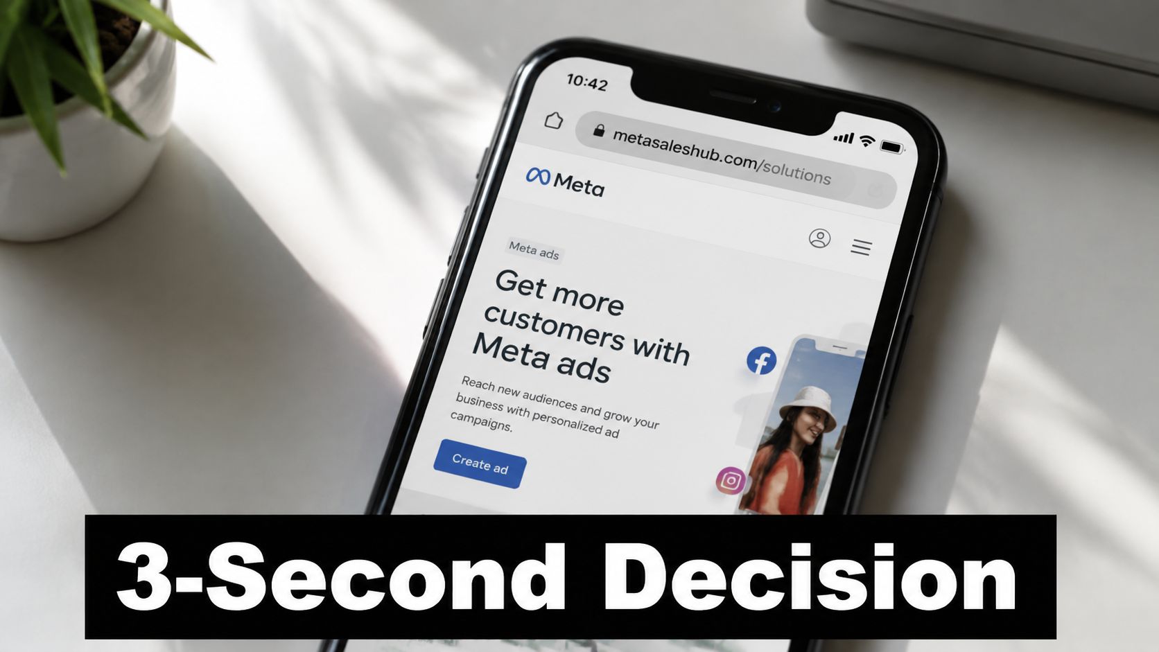
The mental model that works best is simple. Your landing page is a continuation of the click, so the promise in the ad and the promise on the page need to sound like they belong to the same campaign. If your ad says “fewer leaks on rainy runs,” opening the page with “premium outerwear for modern lifestyles” creates friction before the visitor has even read the first line.
A cleaner version would be direct. “Stay dry on rainy runs.” “Lightweight shell that blocks wind and water.” “Built for runners who hate bulky rain gear.” Those lines do the job because they echo the ad, clarify the outcome, and reduce the amount of interpretation required.
For new ecommerce brands, that matters even more because first-time buyers are cautious. They are not rewarding clever phrasing, they are rewarding clarity, fast proof, and a low-friction next step. If the page makes them work to figure out what you sell, they will leave and keep scrolling on Instagram or Facebook.
Use this internal reference when you tighten the funnel further, because bounce issues often start before the first paragraph does: how to reduce bounce rate. The fix is usually the same, lead with the benefit, keep the promise consistent, and cut any sentence that makes a cold visitor stop and think too hard.
Headline Formulas That Stop the Scroll
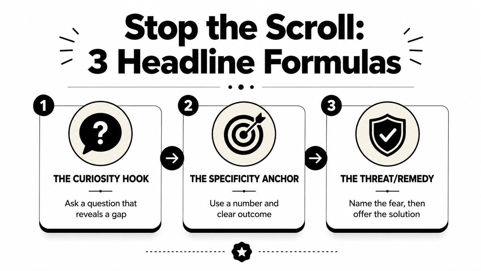
A headline has one job, earn the next 2 seconds of attention. In a Meta funnel, that means the headline has to feel like the ad kept talking, not like the visitor hit a new pitch on a different page. Strong ecommerce headlines do not try to sound clever, they make the benefit obvious enough that the visitor does not have to interpret it.
Formula 1, result without pain
Use this when the buyer already knows the pain point and is trying to avoid a bad trade-off.
Get [Result] Without [Pain]
Example for a dropshipping product launch, Get Dry Feet Without Heavy Boots.
That works because it sets up the outcome and removes the trade-off. If you are selling a kitchen gadget, a skincare tool, or a sleep accessory, this structure keeps the promise grounded in the customer's life, not in your product's features. It also keeps the ad and the landing page on the same message, which matters when the visitor is comparing your claim to the exact promise they just clicked.
Formula 2, curiosity with a specific gap
This one fits a buyer who is interested but not fully convinced.
The [Number] Mistake Most [Audience] Make
Example, The 3 Mistakes New Pet Owners Make with Odor Control.
The point is not the number itself. The point is that the headline signals a gap in knowledge, then invites the reader to keep going to close it. If your Meta creative already framed the problem, this style can deepen the click without sounding salesy. It also works well for small-budget tests because you can swap the audience detail or mistake angle without rewriting the whole page.
Formula 3, identity plus outcome
Use this when the ad speaks to a clear type of buyer.
For [Specific Type] Who Want [Desired Outcome]
Example, For Busy Parents Who Want Faster Weeknight Dinners.
This formula works because it calls out the reader's identity first. A first-time visitor may not know your brand, but they know whether the page sounds like it was written for them. That is useful in a paid social funnel, where the ad often does the hard work of targeting and the headline just needs to confirm, fast, that the click was right.
Benefit-driven headlines of 6–10 words convert 28% higher than vague or overly long headlines, according to the dataset cited by Roast.page and summarized in the brief. That does not mean every winning headline has to be six words exactly. It means the best ones usually avoid meandering setup, brand poetry, and feature dumps.
“Say the payoff fast, then earn the details below.”
A simple self-check helps here. If your headline could fit ten different products, it is too vague. If it only makes sense after two more paragraphs, it is too late. For a small-budget Meta test, I usually start with one headline that mirrors the ad promise, one that adds a concrete outcome, and one that names the buyer type, then I watch which version gets the cleanest scroll depth and click-through from the same traffic.
Hero Section Scripts for Immediate Value Clarity
The hero section should feel like the page is finishing the sentence the ad started. If the headline earned the click, the subheadline should make the offer unmistakable and the visual should reduce doubt rather than add clutter.
A strong hero block usually needs three parts, a headline, a short support line, and one visual that makes the product feel real. For mobile traffic, that entire package has to fit into a glance without forcing endless scrolling, and concise pages often win because pages with fewer than 100 words convert 50% better than pages with more than 500 words (Shopify via Involve.me).
Pasteable hero script
Headline: [Primary benefit tied to the ad promise]
Subheadline: [Product name] helps [specific audience] [achieve outcome] without [main friction].
Proof cue: Used by [relevant social proof cue], or [review signal], or [brief trust marker].
Visual cue: product shot, UGC clip, or short demo showing the promise in motion.
For example, a skincare brand could write, Clearer-looking skin without a 10-step routine, then follow with, [Product Name] helps busy shoppers simplify nightly care without adding another complicated product to the shelf. The visual should show the product in use, not parked like packaging on a white background.
The key is message match. A paid social visitor already saw a promise in the ad, so the hero has to echo that promise in cleaner language, not reset the conversation. If the ad led with a problem, the hero shouldn't lead with a company history paragraph or a vague lifestyle banner.
A useful editing rule is to remove every sentence that doesn't move the visitor one step closer to understanding what the product does, who it's for, and why they should trust it. That's especially important for first-time buyers, because the hero is often the only section they fully read before deciding whether the rest of the page deserves attention.
Benefit-First Body Copy That Speaks to Skeptical Shoppers
A shopper who just clicked from a Meta ad is not looking for more product jargon. They want to know whether the thing in the ad solves their problem, fits their routine, and feels worth the risk. Benefit-first copy does that work faster than a feature list because it translates product detail into personal value.
Feature to benefit translation
Use this pattern whenever your draft starts reading like a catalog.
Feature
Waterproof jacket
Benefit
Stay dry and comfortable on any trail
Emotional payoff
Confidence for your next adventure
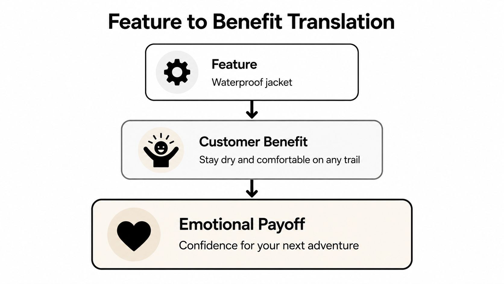
That structure keeps the copy from getting stuck in product specs. A battery life claim matters less than what it lets the buyer do, and a material spec matters less than how it changes the experience of using the product. If the ad promised easier mornings, the body copy should show exactly how the product makes mornings easier, not wander into technical detail.
Reading level matters too. Research from the Nielsen Norman Group found that people read web pages in an F-shaped pattern and usually scan for the quickest path to useful information (Involve.me summary of Unbounce benchmark data). On a landing page, that means plain language has a real advantage. A shopper can understand it faster, trust it sooner, and keep moving toward the buy button instead of pausing to decode the sentence.
For a skeptical shopper, the best body copy reads like a calm explanation, not a pitch. Short paragraphs, specific verbs, and plain language usually beat polished but dense prose because the visitor can process them quickly on a phone, while standing in line, or while half-watching another video. That matters even more in small-budget Meta funnels, where each click is expensive and the page has to carry the conversation the ad started.
A fast editing pass helps. Replace passive phrasing, cut any sentence that repeats the headline, and remove feature bullets that do not affect the buying decision. If a line does not help the reader picture the outcome, handle a common doubt, or connect back to the ad promise, it belongs somewhere else or nowhere at all.
Objection Handling and Trust-Building Tactics
Cold traffic doesn't need more enthusiasm, it needs fewer reasons to hesitate. On a short ecommerce page, you usually don't solve every objection, you solve the ones that block the next click.
Prioritize the objections that stop first-time buyers
For new brands, the usual high-friction questions are straightforward, shipping, quality, and price. But the order matters. If the ad already positioned the product as premium, price may be less important than trust. If the product solves a familiar problem, quality and delivery expectations may matter more than extra brand storytelling.
Practical rule: answer the objection that would make a cautious buyer close the tab, not the objection that only a copywriter notices.
One practical sequence is this, promise, proof, then reassurance. Start by restating the core benefit in plain language, follow with a trust element that feels relevant to the claim, and close with an FAQ-style line that removes the most obvious worry. That can be a review snippet, a real photo, a usage demo, or a concise guarantee, depending on what your offer can support.
Build trust without crowding the page
Social proof works best when it reinforces the same outcome your headline promised. A review about fast shipping is helpful if delivery is the concern. A testimonial about comfort is useful if the page sells wearability. A random five-star badge with no context usually just adds noise.
The goal is to reduce uncertainty, not to collect every possible proof point and stack them into a wall of badges. Keep the trust cues close to the claim they support, then let the page keep moving toward the CTA. If you have a short page, one strong testimonial often beats three generic ones because specificity reads as believable.
For first-time ecommerce brands, trust-building is really about sequencing. Put the strongest reassurance near the top, answer the biggest doubt in the middle, and leave the page with one clear path forward. That structure feels calmer than a page that shouts reassurance everywhere and still doesn't say what happens next.
Call-To-Action Copy That Converts Without Pressure
A CTA should feel like the next obvious step, not a demand. If the ad set the expectation and the page proved the value, the button copy just needs to make the motion easy.
Match the CTA to the buyer's readiness
Use a softer CTA when the visitor is still evaluating.
See How It Works works well when the ad started with education or curiosity.
Use a value-forward CTA when the visitor wants a low-risk next step.
Get Your Free Guide fits lead capture or pre-sell flows.
Use a direct CTA when the page has done enough persuasion for a purchase.
Add to Cart is clear, familiar, and action-oriented.
Avoid vague labels like Submit, because they hide the outcome. The visitor should know what clicking means, what they'll get, and whether there's any commitment attached to the button.
Microcopy matters too. A short reassurance line below the CTA can reduce hesitation if it speaks to the actual friction, not a generic promise. That might mean clarifying shipping, payments, or access, depending on the offer and the page goal.
For stronger CTA phrasing and alternate button ideas, this reference is useful: call-to-action phrases. Use it as a word bank, then keep the final wording consistent with the promise already made above the fold.
Run a simple A/B test
Split traffic evenly between two CTA variants. Keep everything else fixed, then track conversion rate, time on page, and bounce rate for a clean read. If one version wins on actual conversions and doesn't hurt engagement, keep it.
Don't test too many variables at once on a small budget. A clear two-option test teaches more than a messy page full of competing experiments. On low-volume Meta funnels, the cleanest test usually starts with the headline or the button copy, not with a full redesign.
A useful rule is to write the CTA last, after the headline, hero, and body copy are locked. The button should complete the message, not invent a new one. When the CTA sounds like the rest of the page, the whole funnel feels coherent instead of stitched together.
Mobile-First Tweaks and Your A/B Testing Plan
Most Meta ad traffic lands on a phone, so the landing page has to hold up in a one-thumb scroll. If the first screen feels cramped, slow, or hard to read, the visitor usually leaves before the offer gets a fair look. That gap between the ad promise and the mobile page is where a lot of small funnels lose money.
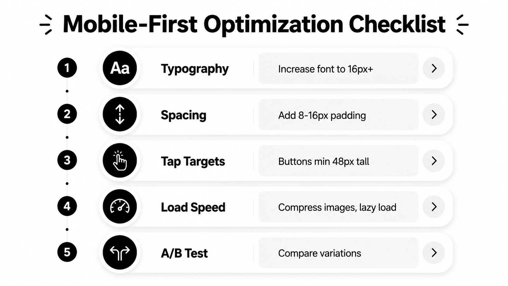
Five mobile-first tweaks
Typography. Make the text large enough to scan without pinching or zooming, and keep the value proposition easy to spot above the fold.
Spacing. Give headlines, bullets, and buttons room to breathe so the page feels deliberate instead of crowded.
Tap targets. Buttons and links need enough space around them for fast taps, especially on a small screen where accidental clicks frustrate buyers.
Load speed. Compress images, cut extra visual clutter, and keep the first screen light so the page shows value quickly.
A/B testing. Change one thing at a time, then read the result against the same traffic source and the same offer.
A mobile landing page also needs the CTA early enough to keep the ad promise intact. If the first screen makes the visitor scroll past too much copy before the next step is clear, the message match breaks down and the ad click feels less relevant. On small-budget Meta funnels, that usually means you should keep the main action visible, or at least clearly foreshadowed, before the second scroll.
A simple testing sequence works better than trying to fix everything at once. Start with the highest-impact element, usually the headline or the CTA, then keep the rest of the page unchanged while you compare results. Run the test long enough to get a clean directional read, then keep the winner and move to the next element only after the first decision is settled.
For a more detailed mobile landing page optimization checklist, keep this guide open while you revise the page: mobile landing page optimization. Draft the copy first, then shape the layout around it, because if design comes first, the message often gets squeezed into whatever space is left. That order is especially important when the Meta ad already set a clear promise and the page has to match it fast.