Blog
10 Carousel Ads Examples to Inspire You in 2026
Published August 7, 2026

You're staring at a product page, a few samples, and a blank Meta Ads screen, and the hard part isn't making an ad, it's deciding how to tell the story fast enough that someone keeps swiping. A single image can sell a visual, but it rarely explains the problem, the payoff, the proof, and the offer in one shot. That's where carousel ads earn their keep, especially for beginner dropshippers who need a format that can do more than look nice.
Carousel ads are one of the most practical formats you can learn early. Meta's format now supports up to 10 cards across Facebook, Instagram, Messenger, and Audience Network, and the format has evolved from a 2014 four-card launch into a mainstream ad unit with real engagement upside, including reporting that carousel ads drove 3x more conversions and 85% better click-through rates in one Meta post, plus independent benchmark results showing 1% click-through on carousel ads versus 0.1% on non-carousel ads Tartol's carousel ad overview. Benchmarking also points to lower friction in many cases, with carousel ads showing 20–30% lower cost per click than single-image link ads in one Meta benchmark, and Instagram carousel posts reaching 1.92% average engagement versus 1.74% for single-image posts in another benchmark Ad Library's carousel examples by vertical.
The trick is not just using the format. It's choosing the right angle for the right product. Some carousel ads win because they explain a pain point, others because they feel like real customer proof, and some work because they answer objections before the buyer even gets nervous. If you're building your first store, treat each example below like a copy-and-layout template you can adapt, not just a pretty ad to admire.
Table of Contents
- 1. Product Showcase Carousel with Problem-Solution Arc
- 2. User-Generated Content UGC Carousel Ads
- 3. Feature Comparison Carousel Product vs. Alternative
- 5. Identity and Lifestyle Carousel Brand Positioning
- 5. Identity and Lifestyle Carousel Brand Positioning
- 6. Educational Tutorial Carousel How-To Format
- 7. Customer Testimonial Carousel with Results Proof
- 8. Carousel Bundle and Pricing Strategy
- 9. Video Carousel with Multiple Angles or B-Roll
- 10. Objection-Handling Carousel FAQ Format
- 10 Carousel Ad Formats Compared
- Your Turn Build a High-Converting Carousel Ad in Minutes
1. Product Showcase Carousel with Problem-Solution Arc
A strong product showcase carousel should feel like a mini sales page split into swipeable scenes. The first card names the problem, the middle cards show the product fixing it from different angles, and the last card closes with proof and a clear offer. That structure works especially well for beginner dropshippers because it gives them a safe, repeatable script instead of forcing a clever one-liner.

A reusable water bottle brand can lead with a simple pain point, “Your bottle leaks in your bag,” then move to a close-up of the seal, a lifestyle shot at a desk, a durability card, an eco-friendly card, and a final offer card. A skincare startup can use the same arc by opening with a visible frustration, then walking through ingredients, texture, results, and a review card. A furniture brand can show a room transformation, assembly, durability, and free shipping in sequence.
Mini template you can copy
- Card 1, Hook: “Still replacing cheap bottles every month?”
- Card 2, Problem fix: “Built to handle daily use without the mess.”
- Card 3, Feature proof: “Leak-resistant lid, durable body, easy to carry.”
- Card 4, Benefit: “Stay hydrated at work, in the car, or at the gym.”
- Card 5, Social proof: “Customers keep theirs on desks, in bags, and in the car.”
- Card 6, CTA: “Shop now while the launch offer is live.”
Keep the copy tight, because heavy text kills momentum. The biggest mistake is stuffing each slide with every feature you love about the product. Open with the most visual card, keep the palette and font consistent, and let the final slide do the selling.
Practical rule: If the first card doesn't create curiosity in two seconds, the rest of the sequence usually doesn't get seen.
For first-time advertisers, this is a clean way to test different angles without rebuilding the whole ad. If you want a deeper framework for that problem-first structure, the logic in problem-solution ads maps directly to carousel sequencing.
2. User-Generated Content UGC Carousel Ads
UGC carousels work because they look borrowed from real life, not staged in a studio. Each card shows a different customer, use case, or casual angle, which makes the product feel more common and more trustworthy. That matters when you're a new ecommerce owner and professional product photos aren't available yet.
A fashion dropshipper can show five customers wearing the same dress in different sizes and body types, with short captions that sound human, not polished. A beauty brand can mix an unboxing clip, an application shot, and a customer selfie so the product feels tested in the wild. A supplement brand can show transformation photos, but only if the claims are kept honest and the visuals are permitted for use.
What makes this format convert
Real customers lower the mental risk. The viewer doesn't have to imagine whether the product works, because the feed does that work for them.
That's why UGC carousels should feel varied, not repetitive. Mix phone photos, lifestyle shots, and close-ups so the sequence looks like real evidence instead of a cloned gallery. If you can, tag the customer's first name or location in a subtle way, because that tiny detail often makes the whole thing feel more believable.
You should also rotate your content often. Fresh faces and fresh situations stop the ad from going stale, and they give you more testing material when one customer angle beats another. Never use customer content without explicit permission, even if the shot looks public.
If you need a faster way to build this style without hand-assembling every slide, AI UGC ads are useful as a production model, especially for stores that need variation more than polished studio work.
3. Feature Comparison Carousel Product vs. Alternative
Comparison carousels are for skeptical buyers. They're useful when your product sits in a crowded category and you need to explain why your version is the better choice without sounding aggressive. The best versions compare against an old method, a category standard, or a clearly safer alternative.
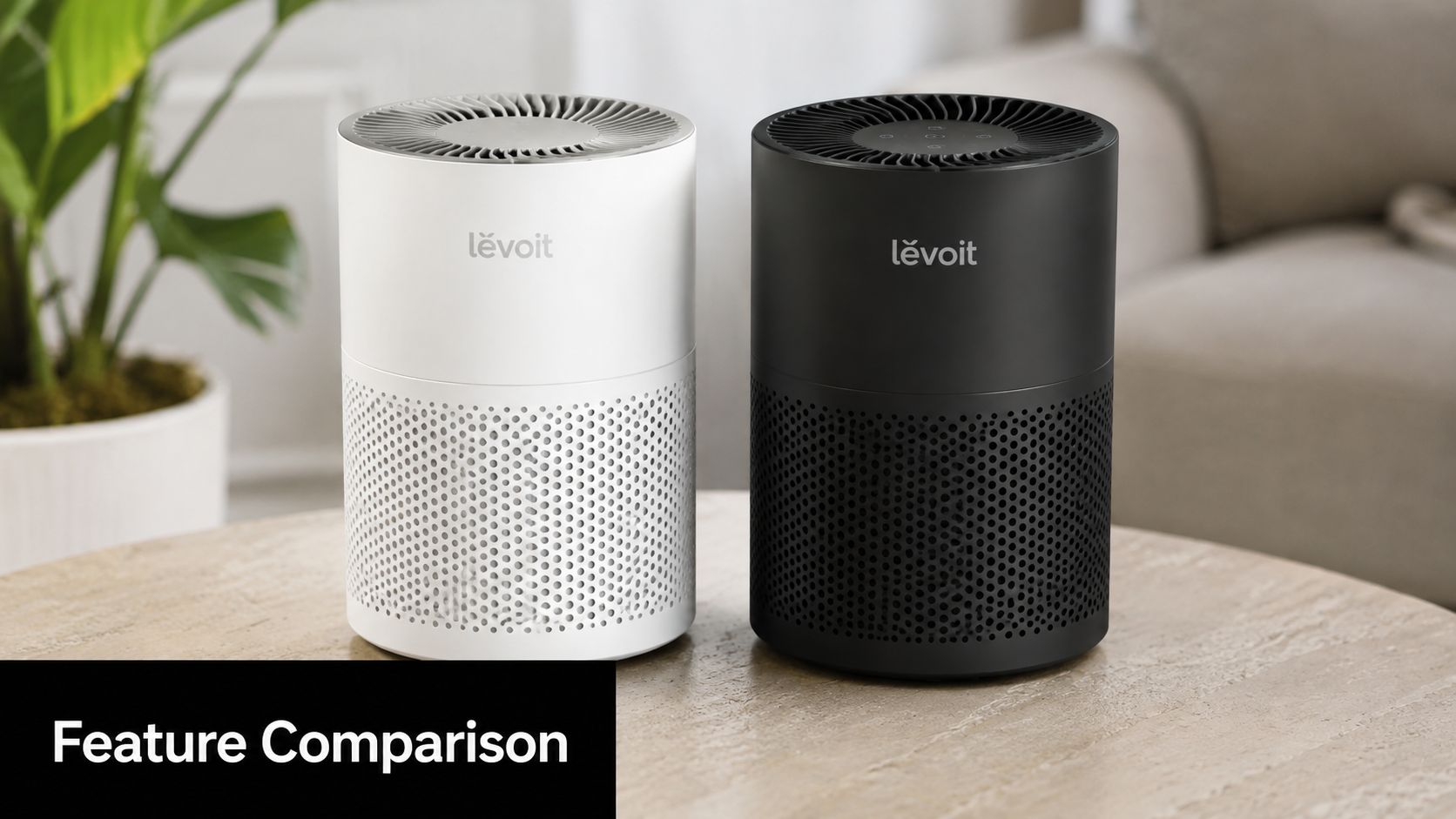
A water filtration brand can compare itself with bottled water, a standard filter, and untreated tap water. A phone case brand can compare durability, design variety, and material quality against generic bulk cases. A sleep supplement brand can contrast ingredient quality, transparency, and testing against the usual category playbook.
How to keep comparisons believable
Don't make the ad sound like a cheap attack. The goal is to show why your product fits the customer better, not to trash every other option. Use category language like “traditional options” or “leading brands” if naming competitors feels messy or legally risky.
- Lead with the strongest difference: Put the clearest advantage on card 1 or 2, not buried at the end.
- Translate specs into outcomes: Don't just say “premium materials,” say what that means in daily use.
- Use proof where you can: Third-party certifications, testing, or awards make comparisons easier to trust.
- Stay benefit-first: Buyers care more about the result than the mechanism.
This format is especially strong when the customer already knows the category but hasn't picked a winner yet. Meta's own guidance frames carousel ads as a flexible multi-card format, not a universal solution, so comparison carousels work best when the choice itself is part of the decision Meta's carousel help center. Keep the strongest differentiator near the front, because skeptical viewers don't wait around for your big reveal.
5. Identity and Lifestyle Carousel Brand Positioning
Identity carousels sell belonging before they sell the product. They work when the buyer wants to be seen as the kind of person who uses it, whether that identity is eco-conscious, athletic, luxury-oriented, or rebellious. For fashion, wellness, and lifestyle brands, this format fits well because the product is often a signal of self-image, not just a functional item.
A cleaner way to build this format is to start with the buyer's self-concept, then match every card to that identity. An eco apparel brand can use cards like “Conscious creator,” “Ethical choices matter,” and “Made for changemakers,” with atmosphere carrying more weight than heavy product detail. A fitness brand can use phrases like “Strong is the new sexy” or “Your workout, your rules,” paired with diverse body types and active scenes. A premium supplement brand can frame the audience as biohackers and high achievers, then support that positioning with minimalist design and subtle science cues.
Build the identity before the offer
Start by deciding which tribe the brand belongs to. Is it practical, luxury, accessible, performance-driven, or socially aware? Once that identity is clear, every slide should reinforce it through color, typography, imagery, and language. The offer still matters, but the audience should feel the brand's point of view before they evaluate the product details.
A strong identity carousel needs restraint. Too much product detail turns the ad into a catalog. Too much aspiration without proof makes the message feel hollow. The better balance is lifestyle imagery paired with one believable credential, certification, or ingredient detail so the positioning feels real enough to trust.
- Use people who look like the buyer: Relatability beats polished perfection, especially for beginner audiences who are deciding whether the brand fits their life.
- Keep the copy identity-led: Headlines should describe the self-image, values, or result the buyer wants, not just the item itself.
- Match the visual world to the promise: Soft neutrals, bold contrast, outdoor scenes, or studio minimalism should all support the same identity.
- Avoid overexplaining the product: Let the carousel do positioning work first, then move the buyer toward the offer once the brand feels familiar.
This format works best in categories where the emotional payoff matters as much as the product. Fashion, wellness, beauty, home decor, and premium accessories all benefit because the buyer is often choosing a version of themselves. For beginner dropshippers, the practical takeaway is simple, define the identity clearly, then build cards that make the audience want to belong to it.
5. Identity and Lifestyle Carousel Brand Positioning
Identity carousels sell belonging, not just product features. They work when the buyer wants the feeling of being the kind of person who uses the product, whether that's eco-conscious, athletic, luxury-oriented, or rebellious. This is one of the cleanest formats for fashion, wellness, and lifestyle brands because the product is often a symbol of self-image.
An eco apparel brand might use cards like “Conscious creator,” “Ethical choices matter,” and “Made for changemakers,” with minimal product shots and more atmosphere. A fitness brand can lean into “Strong is the new sexy” or “Your workout, your rules,” using diverse body types and active scenes. A premium supplement brand can frame the audience as biohackers and high achievers, then pair that with minimalist design and subtle science cues.
Build the identity before the offer
Start by deciding what tribe the brand belongs to. Is it practical, luxury, accessible, performance-driven, or socially aware? Once that identity is clear, every slide should reinforce it through color, typography, imagery, and language.
A good identity carousel usually needs a little restraint. Too much product detail makes the ad feel like a catalog. Too much aspiration without proof makes it feel hollow. The balance is lifestyle imagery paired with one believable credential, certification, or ingredient detail.
- Use people who look like the buyer: Relatability beats polished perfection in many cases.
- Keep the visual system tight: Repeated colors and font choices help the brand stick.
- Match the promise to the product: Don't sell luxury if the product experience doesn't support it.
- Test identity angles early: Sustainability, performance, and community often land differently.
This style is subtle, but it can do a lot of long-term brand work while still supporting conversion. It's especially useful when the product isn't radically different, but the customer wants to feel aligned with the brand.
6. Educational Tutorial Carousel How-To Format
Educational carousels earn attention because they give value before they ask for the sale. The reader feels like they learned something useful, and the product enters the story as the tool that makes the result easier. That's a strong shape for unfamiliar products or anything that needs a bit of explanation.
A DIY home improvement brand can teach “5 steps to perfect caulking” and then show its tool as the cleaner, faster option. A skincare brand can walk through a simple routine, then attach each step to the relevant product. A productivity app can turn “How to organize your week in 10 minutes” into a swipe-by-swipe tutorial that makes the software look like the shortcut.
If your product needs education, this format usually outperforms a straight sales pitch because it lowers the learning barrier. The viewer doesn't feel sold to, they feel helped. That makes the final CTA feel like the logical next step instead of a hard pivot.
The best how-to carousels teach one useful thing even if the buyer never clicks.
Use numbers to create structure, because numbers make swipe behavior easier. “3 steps,” “5 ways,” or “the complete guide” gives the audience a reason to keep moving through the cards. Keep the language simple, and don't hide the product until the end, because the product should feel like part of the solution from the start.
7. Customer Testimonial Carousel with Results Proof
A testimonial carousel has one job, answer the buyer's quiet question, “Will this work for me?” That question matters most for products where the outcome is visible, measurable, or easy to feel. Each card should stand on its own as proof, so the viewer can swipe without feeling like they are reading the same opinion in a new layout.

A weight-loss supplement can pair before-and-after photos with different customer outcomes, so each slide proves a different kind of result. A project management tool can show one customer who cut meetings, another who saved time, and another who improved team coordination. A fashion brand can feature customers with different body types saying the fit finally worked for them.
Make the proof feel specific
Generic praise gets skipped fast. Specific results stop the scroll. Use names, locations, and outcome language that sounds like a real person wrote it, not a brand team.
The strongest testimonial cards usually include one clear detail per slide. A quote about comfort should stay about comfort. A quote about results should stay about results. That restraint makes the proof easier to believe, and it also helps each card speak to a different objection.
If you're showing star ratings, keep them believable. A final card with a solid, imperfect rating can feel more credible than a spotless score that looks manufactured. Rotate testimonials often so the same quote does not keep showing up across every ad set. Fresh comments from returning customers usually carry more weight than recycled praise from first-time buyers.
For a practical swipe file of testimonial structures, customer testimonial examples are useful when you are learning how to shape quotes into ad-ready cards.
The advantage is variety. Some buyers want physical results, others care about confidence, convenience, or quality. A good carousel gives each slide a different angle on the same purchase, so the viewer sees a version of themselves in at least one card.
8. Carousel Bundle and Pricing Strategy
Bundle carousels work when you want to reduce decision fatigue and steer people toward a better order value. Instead of throwing one price at the customer and hoping they buy, you present choices in a clear sequence. Good, better, best tends to work because it creates structure without overwhelming the viewer.
A supplement brand can show a single bottle, a multi-month supply, and a larger bundle with more savings. A software brand can lay out starter, pro, and enterprise-style tiers. A phone case brand can push one case, a two-pack, and a five-pack for people who want backups or gifts.
Make the middle option feel natural
The middle tier often feels safest because it looks like the sensible compromise. That's why your pricing layout should make the recommended choice easy to spot without making the others look fake. Every tier should serve a real customer need, otherwise the structure starts to feel manipulative.
Use concrete savings language. Buyers understand exact dollars faster than abstract percentage talk. Keep the card design clean, with enough spacing so each tier reads in a single glance on mobile.
- Good: Lowest-friction entry point for first-time buyers.
- Better: The option you want many to choose.
- Best: The highest-value bundle for committed buyers.
- Clarity: Each tier should answer a different budget or usage case.
This format is not just about price. It's about choice architecture. If you get the layout right, you can guide people toward the bundle that makes the most sense without forcing the decision.
9. Video Carousel with Multiple Angles or B-Roll
Video carousels add motion to the same swipeable format, so the ad feels more immediate than a static image set. Each card can be a short clip that shows the product from a different angle, in a different setting, or moving through a clear sequence from unboxing to demo to outcome. That structure turns the carousel into a short sales story, not just a collection of clips.
For beginner dropshippers, the value here is practical. If the product needs motion to make sense, video can explain it faster than a still image. A tech gadget carousel might open with unboxing, move into feature details, then show the product in use, and finish with a testimonial clip. A fitness equipment brand can start with a close-up of durability, then show a quick workout demo, then switch to lifestyle footage, then close with a result-focused clip. A beauty product can combine product shots, application, timelapse results, and a customer reaction.
The trade-off is production effort. Video carousels take more time to shoot and edit, and pacing matters more than it does in a static format. If the clips feel slow, repetitive, or overproduced, viewers swipe past before the sequence has a chance to build interest.
Keep every clip tight and readable
The message should survive with the sound off. Captions need to carry the main point, not just decorate the frame. Use the first few seconds for the strongest visual, because weak openers get ignored before the rest of the carousel can do any work.
A short, clean clip usually outperforms a long one because it respects the swipe. That matters even more on mobile, where attention shifts fast and viewers decide quickly whether the next card deserves a look.
If you are testing this format for the first time, start with three clips. One can show the product in the box, one can show it solving the problem, and one can show the result or the best proof point. From there, you can test whether demo footage, lifestyle footage, or result footage gets the strongest response. Keep the aspect ratio and color grading consistent, because mismatched visuals make the carousel feel stitched together instead of planned.
10. Objection-Handling Carousel FAQ Format
Objection carousels are one of the smartest formats for new brands because they meet skepticism head-on. Instead of hoping the viewer won't worry about shipping, quality, fit, legitimacy, or results, you answer the concern before it blocks the sale. That's especially useful for dropshippers, where trust has to be earned quickly.
A new brand can ask, “Is this product legitimate?” and answer with testing and reviews. Another card can address shipping timelines without sounding defensive. A third can answer, “Do I really need this?” by showing before-and-after evidence or a clear use case. A final card can close with a guarantee that lowers the risk.
The best version of this format starts with the easiest objection and works toward the deeper ones. Price is usually surface-level. Legitimacy and performance are more serious. Fit, safety, and long-term trust are where the buyer really decides whether to move forward.
Write like a helpful person, not a defender
Use language that acknowledges the question without making it bigger than it is. “You might be wondering” works better than “Stop worrying.” Then answer with specifics, not vague reassurance.
- Price objection: Explain the value, not just the cost.
- Shipping objection: Be clear about what the buyer should expect.
- Quality objection: Show materials, testing, or process.
- Risk objection: Make the guarantee easy to understand.
- Results objection: Set honest expectations.
Meta's format itself is flexible, so this style works best when the goal is to remove doubt rather than generate pure curiosity Meta's carousel help center. That makes it one of the most useful beginner-friendly ad structures for new stores that don't have a lot of trust yet but do have a strong product.
10 Carousel Ad Formats Compared
| Format / Title | Implementation Complexity 🔄 | Resource Requirements ⚡ | Expected Outcomes ⭐📊 | Ideal Use Cases | Key Advantages & Tips 💡 |
|---|---|---|---|---|---|
| Product Showcase Carousel with Problem-Solution Arc | Medium–High 🔄, multi-card narrative (5–7 cards) | Moderate ⚡, visuals + staged copy + testimonials | High ⭐📊, stronger engagement & CTR; guides buyer journey | New dropshippers explaining product fit or unfamiliar solutions | Story-driven conversions; lead with card 1, concise copy |
| User-Generated Content (UGC) Carousel Ads | Medium 🔄, curation & rights management | Low–Moderate ⚡, source customer media, permissions | High ⭐📊, boosts trust and CTR (UGC > branded shots) | Budget-conscious sellers, social-proof dependent products | Authenticity at low cost; always secure written permission |
| Feature Comparison Carousel (Product vs. Alternative) | Medium 🔄, accurate claims + clear design | Moderate ⚡, research, icons, certifications | Medium–High ⭐📊, differentiates in crowded categories | Saturated markets (supplements, electronics, home goods) | Emphasize benefits, avoid naming competitors; use 3rd‑party proof |
| FOMO-Driven Limited Stock Carousel | Low–Medium 🔄, simple sequence but accuracy-critical | Low ⚡, inventory data, countdown visuals | High ⭐📊, strong short-term conversion lift for impulses | Flash sales, low-priced impulse items, inventory clearouts | Truthful scarcity; test urgency language; segment audiences |
| Identity/Lifestyle Carousel (Brand Positioning) | High 🔄, requires brand strategy & nuanced creative | High ⚡, lifestyle shoots, audience research | Medium ⭐📊, long-term brand lift, higher LTV & loyalty | Premium apparel, fitness, lifestyle and community brands | Builds emotional loyalty; align visuals with stated values |
| Educational/Tutorial Carousel (How‑To) | Medium–High 🔄, structured, accurate step sequence | Moderate ⚡, subject-matter content + progressive visuals | Medium–High ⭐📊, positions brand as authority; shareable leads | Products with learning curves, SaaS onboarding, DIY tools | Deliver value early; use numbered steps and before/after visuals |
| Customer Testimonial Carousel with Results Proof | Medium 🔄, requires volume of authentic testimonials | Moderate ⚡, collect photos, permissions, edit | High ⭐📊, strong social proof; effective for retargeting | Measurable‑outcome products (fitness, SaaS, finance) | Prioritize quantifiable results; rotate testimonials regularly |
| Carousel Bundle & Pricing Strategy | Medium 🔄, clear tier logic & visual hierarchy | Low–Moderate ⚡, pricing graphics, savings calc | Medium–High ⭐📊, increases AOV; reduces decision friction | Upsells, subscription tiers, products with add-ons | Highlight “recommended” tier; show concrete savings |
| Video Carousel with Multiple Angles or B‑Roll | High 🔄, multi-clip sequencing, captioning | High ⚡, video shoot, edit, captions, color grade | High ⭐📊, 2–3x engagement vs static carousels | Motion-driven products (tech, fitness, demos) | Lead with 3‑sec hook; always include captions and consistent grading |
| Objection‑Handling Carousel (FAQ Format) | Medium 🔄, research-driven question ordering | Low–Moderate ⚡, evidence, guarantees, concise copy | Medium–High ⭐📊, reduces friction; converts skeptical buyers | New brands, cart abandoners, audiences with credibility concerns | Order Qs surface→deep; back answers with proof and risk-reversal |
Your Turn Build a High-Converting Carousel Ad in Minutes
The strongest carousel ads examples aren't just visually clean, they're built on a clear job. One carousel introduces a problem and resolves it. Another uses customer proof. Another handles objections before they become reasons to leave. That's the key advantage of the format, it lets you control the sequence of persuasion instead of hoping one image does everything.
For beginner dropshippers, that matters more than fancy design. You don't need to invent a brand universe on day one. You need a repeatable structure, a clear angle, and enough discipline to keep each card focused on one job. The 2026 multimethod research on carousel swiping found that sideways-swiping ad units increased attention and brand recall across multiple studies, which is a good reminder that the interaction itself matters, not just the artwork The carousel effect study. Use that interaction wisely.
If you're choosing your next test, start with the angle that matches the product. Multi-SKU catalog, use comparison or bundle. New product with skepticism, use objection handling or testimonials. Story-driven offer, use problem-solution or tutorial. That's how you keep the ad aligned with the buyer's state of mind instead of forcing one generic template onto everything.
Social Loop AI fits into that workflow because it turns a product URL into a launch plan, angle ideas, and a set of brand-aware creatives for Meta ads. If you want a faster way to move from product page to swipeable ad concepts, visit Social Loop AI and build your next carousel with a clearer structure, sharper copy, and a test plan you can run.