Blog
Video Maker with Photos and Music: A 2026 Ad Guide
Published June 21, 2026
You've got a folder full of product photos, a small ad budget, and a deadline that's already too close. Maybe your supplier sent clean packshots but no usable video. Maybe you shot a few iPhone photos yourself and now need to turn them into something that can run on Meta without looking like a lazy slideshow.
That's exactly where a video maker with photos and music helps. But the tool isn't the hard part anymore. Mainstream platforms now treat photo-to-video as a standard browser workflow, which is why this process is widely accessible even if you've never touched desktop editing software before, as shown by Kapwing's picture-to-video workflow. The hard part is making the ad feel intentional enough that a stranger stops scrolling.
For budget-conscious ecommerce founders, the winning move usually isn't “learn advanced editing.” It's building a simple ad story, pacing the photos properly, syncing music with purpose, and exporting a format that matches where the ad will appear. Do that well, and plain product photos can carry a lot more weight than most beginners expect.
Table of Contents
- Before You Open a Tool Plan Your Video's Story
- Assembling Your Photos into a Cohesive Narrative
- Choosing and Syncing Music That Converts
- Polishing Your Video with Captions and Transitions
- Exporting for Peak Performance on Social Ads
- Your Shortcut to High-Performing Video Ads
Before You Open a Tool Plan Your Video's Story
The most common rookie mistake is opening Canva, InVideo, CapCut, or another editor before deciding what the ad is supposed to say. That feels productive, but it usually creates a messy sequence of decent-looking images with no sales logic behind them. You end up tweaking fonts and transitions while the core message stays fuzzy.
A fast planning pass fixes that. Give yourself 15 minutes and answer three questions: what's the single message, what's the opening hook, and what photo sequence proves the claim.

Pick one message only
If your product “hydrates skin, reduces the messy routine, feels premium, saves time, and makes a great gift,” you don't have one ad. You have several possible ads. A photo-based Meta creative works better when it carries one angle from first frame to last.
Use one of these simple structures:
- Problem to solution: Start with the pain, then show the product as relief.
- Before and after: Contrast frustration with the improved outcome.
- Social proof: Lead with visible trust cues, then support with visuals.
- Identity angle: Make the buyer feel the product fits who they are.
If you need help framing that angle, a short review of ad persuasion techniques for ecommerce creatives can help sharpen the message before you touch the timeline.
Build the first seconds first
Your hook decides whether the rest of the ad gets a chance. With product photos, the first image can't just be the cleanest image. It has to create tension or curiosity.
For a skincare product, a weak opening is the jar on a white background. A stronger opening is dry-looking skin, a cluttered routine, or a close crop that highlights the problem the product is meant to solve. The opening should make the next frame feel necessary.
Practical rule: If the first image doesn't create a reason to keep watching, the rest of the edit won't save it.
Sketch a napkin storyboard
You don't need a script deck. A six-box sketch is enough. Think in micro-scenes:
| Scene | Job in the ad | Example for skincare |
|---|---|---|
| 1 | Hook | Tired-looking skin or overloaded shelf |
| 2 | Problem | “Too many steps” or visible dryness |
| 3 | Product intro | Hero shot of the product |
| 4 | Use moment | Texture, hand application, close-up |
| 5 | Outcome | Cleaner look, calmer skin, simpler routine |
| 6 | CTA | Offer, benefit, or direct next step |
This step saves editing time because it tells you which photos matter. You stop treating every image as equal. Some images hook, some explain, some close. That distinction is what turns a folder of assets into an ad.
Assembling Your Photos into a Cohesive Narrative
Once the story is clear, the job becomes mechanical in a good way. Import the photos, put them in order, and shape the pacing. That's the core workflow described by MusicArt AI's photo video process, and it matters because timing is where most beginner edits break down.
A product photo video isn't a gallery. It's a sequence of decisions. Each image should earn its spot by moving the viewer one step closer to understanding the product and wanting it.
Think like a three-act ad
A simple way to sequence product photos is to treat them like a compressed story.
Beginning: Show the pain, desire, or promise.
Middle: Introduce the product and show how it fits into the solution.
End: Deliver the outcome and ask for action.
Take a skincare ad. The first frames might show the problem. The middle frames shift to the jar, texture, ingredient feel, or application context. The final frames show the improved result, the simplified routine, or a clean product shot with a clear CTA.
That structure works because it gives the viewer orientation. Randomly alternating lifestyle photos, flat lays, and close-ups usually feels like a brand mood board, not a sales asset.
Choose photos for function, not beauty
A common beginner habit is selecting only the prettiest images. Pretty helps, but function matters more. Pick images that do different jobs.
- Hook image: Creates friction, contrast, or curiosity.
- Proof image: Shows product detail, texture, packaging, or use.
- Outcome image: Shows the benefit the buyer cares about.
- Closing image: Supports the CTA without visual confusion.
If you want more examples of structuring image-led creative around realism and conversion, UGC-style ad construction principles can help even when your assets are still photos rather than live clips.
A beautiful image in the wrong place weakens the ad faster than an average image in the right place.
Control duration by feel, then preview
There isn't one universal timing rule that fits every product. What matters is whether the viewer has enough time to absorb the frame before the next one appears. If a close-up contains packaging details or text, it usually needs more breathing room than a quick mood shot.
Use this practical review pass before adding music:
- Watch for confusion: If you can't tell what a frame is doing, cut it or replace it.
- Watch for drag: If a photo lingers without adding meaning, shorten it.
- Watch for repetition: Two similar shots back-to-back often waste attention.
- Watch the handoff: Each image should make the next image feel logical.
The key mistake is assuming music will later solve pacing problems. It won't. A soundtrack can support rhythm, but if the visual order is weak, the ad still feels off. Tight sequencing first. Audio second.
Choosing and Syncing Music That Converts
A founder uploads six product photos, drops in a trending track, and launches the ad by lunch. By dinner, the video looks polished but the clicks are weak. The usual problem is not the tool. The music is pushing one feeling while the photos and offer are selling another.
Music sets expectation before the buyer reads a caption or registers the price. In a video maker with photos and music, that means audio is doing sales work, not just filling silence.
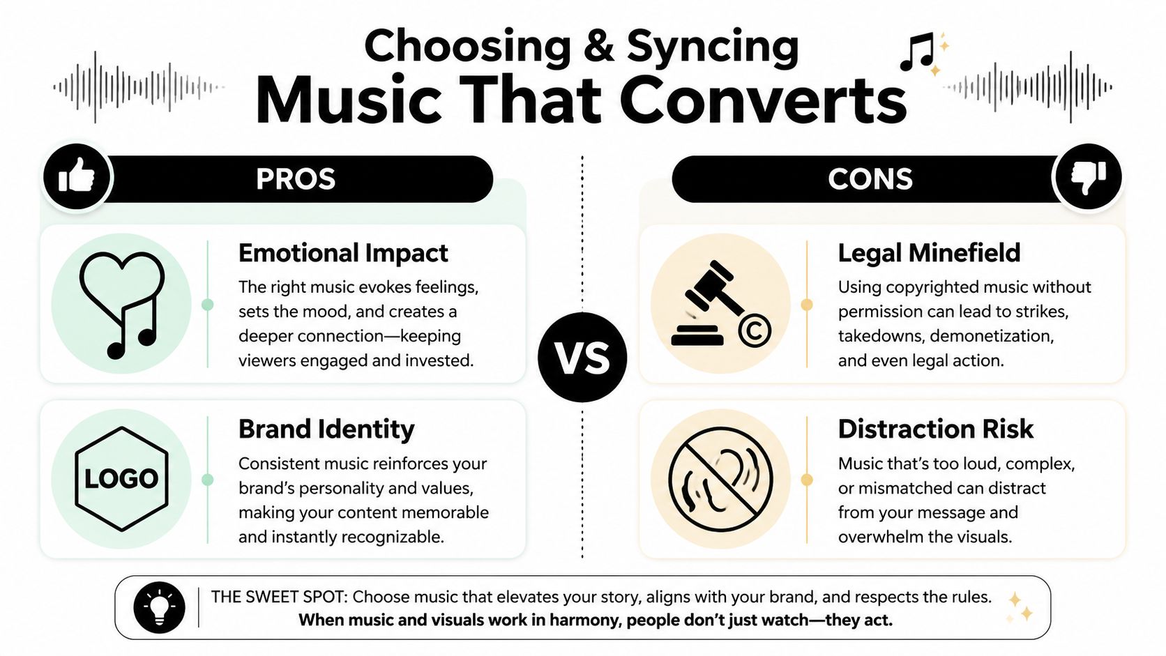
It also creates compliance risk. Ads are public brand assets, so use music you have permission to run commercially, as noted in Canva-related guidance on royalty-free music and copyright.
Match the track to the buying mood
Start with the customer state you want to create. Then choose music that supports it.
A good track does one job well. It makes the product feel more believable in the context of the offer. If you are selling a calming skincare routine, the audio should feel clean and restrained. If you are selling a clever kitchen gadget, the pace can be brighter and more utility-driven. Founders often pick music based on personal taste, then wonder why the ad feels off. Taste is irrelevant here. Conversion fit matters.
| Product type | Better music feel | Usually a weak match |
|---|---|---|
| Skincare or wellness | Calm, clean, restrained | Aggressive, busy, high-pressure |
| Fashion accessory | Stylish, rhythmic, confident | Generic corporate background audio |
| Kitchen or home gadget | Bright, upbeat, utility-driven | Slow cinematic music with no energy |
| Giftable product | Warm, optimistic, emotional | Harsh electronic tracks |
One practical rule helps on small budgets. If the track pulls attention away from the product photos, keep looking. Strong ad music supports the message. It should not become the message.
A quick visual example helps before we get into syncing:
Sync edits to beats that matter
Rookie editors try to snap every image change to the beat. That usually makes a photo ad feel mechanical. Better results come from matching only the moments that deserve emphasis: the first hook, the product reveal, the benefit shot, and the final offer frame.
Use this workflow:
- Listen once without editing: Mark the obvious beat drops, rises, or pauses.
- Anchor key photos to those moments: Hook image, hero product shot, proof image, CTA frame.
- Let supporting photos breathe between anchors: A small detail shot does not need a dramatic beat hit.
- Read captions against the music: If the text needs an extra half-second to register, give it that time.
This is the trade-off. Tighter sync feels more polished, but over-syncing can rush the story and hurt comprehension. On Meta, comprehension wins.
One more warning from repeated account work: avoid tracks with a huge intro or a slow emotional build. Static-photo ads need to get to the point fast. If the music only gets interesting after several seconds, the buyer may already be gone.
Polishing Your Video with Captions and Transitions
Many beginner ads get worse instead of better. The first rough cut often has a clear idea. Then someone adds dramatic zooms, flashy transitions, stickers, shadows, and too much text. The result looks edited, but not clearer.
For ads built from still images, polish should increase understanding. If it doesn't help the buyer grasp the product faster, it's clutter.
Use simple transitions
Most photo-based ads don't need fancy transitions. Clean cuts, quick fades, and occasional gentle motion are usually enough. A transition should move the story forward without announcing itself.
Use stronger visual movement only when there's a reason. For example, a push-in can help emphasize texture on a skincare product or highlight a product detail on packaging. But if every frame zooms, slides, and spins, the ad starts feeling cheap.
A simple rule set helps:
- Do use: Cuts, fades, slight motion, restrained scale changes.
- Don't use: Novelty wipes, distracting spins, layered theme effects, random animation styles.
- Save emphasis: Reserve the most noticeable movement for the hook or reveal.
Write captions for silent viewers
A lot of people will see your ad with the sound off or with only partial attention. Captions carry more weight in a product photo video than most founders realize.
Write short text that can be understood instantly on a phone screen. That usually means one idea per frame. Don't stack multiple claims, feature lists, and a CTA on the same image unless the design clearly supports it.
A clean caption progression might look like this:
- Hook text: “Dry skin by noon?”
- Problem text: “Too many steps. Still not enough moisture.”
- Product text: “One cream. Simple routine.”
- Outcome text: “Softer feel. Cleaner shelf.”
- CTA text: “Shop now”
Editing note: If your caption needs a full sentence to make sense, it probably belongs on the landing page, not inside the ad.
Place text where the product can still breathe
Good caption placement is partly copy and partly layout discipline. Don't drop text over the product label, the face, or the one visual element doing the selling. Keep margins consistent so the ad still works when adapted for different placements.
A quick check before export:
| Check | What to look for |
|---|---|
| Readability | High contrast between text and background |
| Brevity | Minimal words per scene |
| Placement | Text avoids faces, labels, and focal details |
| Consistency | Same font system and alignment throughout |
| CTA clarity | Final frame tells the viewer what to do next |
When in doubt, remove one effect and cut one line of text. Ads usually improve when you simplify them.
Exporting for Peak Performance on Social Ads
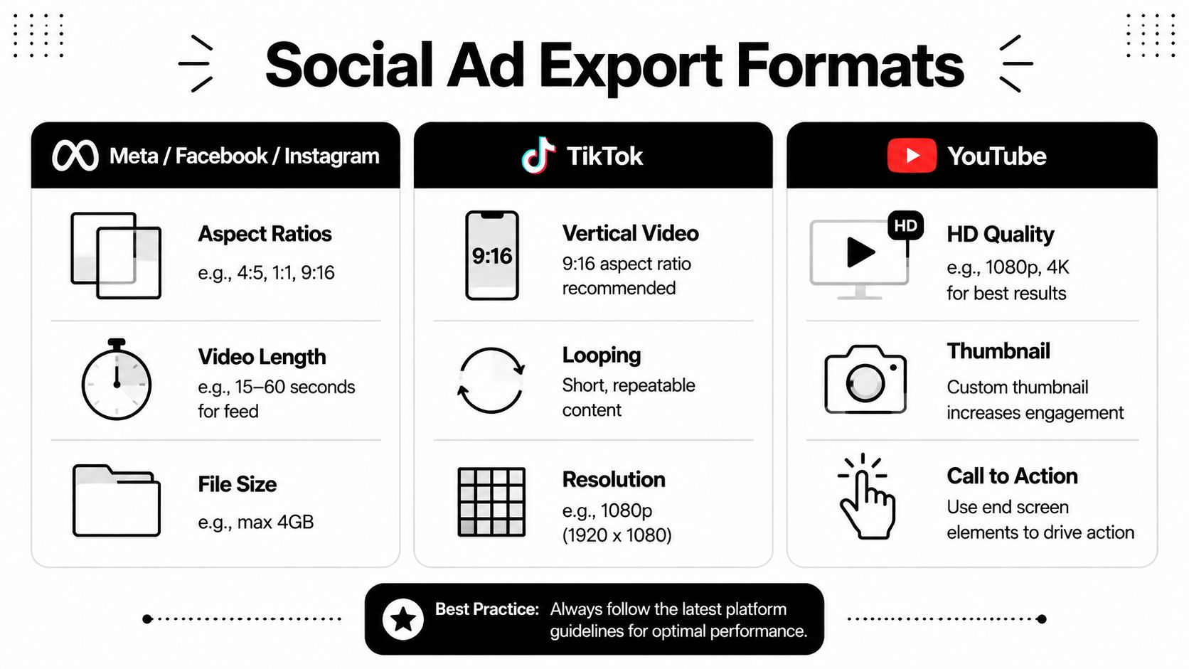
A clean edit can still underperform if the exported file doesn't fit the placement. Meta is unforgiving about awkward crops. If your product label gets chopped, your caption sits too low, or the composition feels built for desktop instead of mobile, the ad loses impact before the message even lands.
That's why export readiness matters. For social content, Adobe Express and InVideo both position their workflows around sharing and rapid customization, and InVideo's process emphasizes a reliable order of operations: lock photo order, finalize scene durations, add music, then apply effects and captions, which reduces rework across formats, as described on InVideo's video maker workflow.
Pick the format based on placement
Don't export one file and hope it works everywhere. Start with the placement you care about most.
For Meta, a simple decision tree works well:
- If the ad is for Reels or Stories: Use a vertical layout.
- If the ad is for Feed: Use a feed-friendly layout with enough room for text and product framing.
- If you'll run both: Build the master layout with safe spacing so adaptation is easier.
If you're building specifically for Instagram placements, this walkthrough on creating Instagram ads with the right structure and format is a useful companion to the export step.
Keep export choices boring
Boring export settings are good. You want compatibility, not cleverness.
Use a practical checklist:
- File type: MP4 is the safe default for ad delivery.
- Resolution: Export high enough to stay sharp on mobile.
- Compression: Keep visual quality intact without creating a bloated file.
- Safe margins: Leave breathing room around text and logos.
- Thumbnail frame: Pick a frame that still communicates the product if autoplay stalls.
Test the file like a buyer sees it
Before launch, watch the export on your phone. Not in the editor. Not fullscreen on desktop. On your phone, in normal viewing conditions.
Check three things:
- Can you understand the ad with sound off?
- Does the opening frame stop the thumb?
- Does every crop still make sense vertically and in-feed?
If the export only looks good inside the editing canvas, it isn't ready.
This final review catches most cheap mistakes. Text too close to the edge. Product too small. CTA frame too busy. Music cue landing after the visual change. Fixing those before launch is cheaper than paying Meta to reveal them for you.
Your Shortcut to High-Performing Video Ads
A founder pulls together 12 product photos, drops them into an editor, adds a trending track, and hits export. The ad looks finished. It still fails because the first second is weak, the sequence has no selling logic, and the music is driving the edit instead of supporting it.
That is why the shortcut is not a faster button. It is a tighter workflow.
The lean workflow that saves time
When I hand this off to a junior marketer, I want them making decisions in the right order:
- Pick one angle: Solve one buyer objection or promise one outcome.
- Build the photo sequence: Hook, product, proof, result, CTA.
- Set timing by hand: Hold strong images longer. Cut weak ones faster.
- Choose music after the structure works: Then align key visual changes to the track.
- Add captions for clarity: Short lines, high contrast, easy to read on mobile.
- Export per placement: Prepare versions for the placements you plan to buy.
This works because it protects the parts that influence performance. Teams waste hours testing fonts, transitions, and motion presets before they have a clear selling message. Static photos can still produce a strong Meta ad, but only if the viewer can follow the story in seconds.
Templates help. Guided tools help more when they reduce decision fatigue instead of adding decoration. Reusing a proven structure and swapping in new photos, copy, and music is usually cheaper than building every ad from scratch.
Use tools that solve the main hurdle
Any basic editor can place photos on a timeline. The main hurdle is getting pacing right. A photo ad starts to feel expensive when each frame earns its place, the product reveal lands at the right moment, and the CTA appears before attention drops.
That is the standard to use when choosing a tool.
If you want practical options:
| Need | Tool style to consider |
|---|---|
| Fast browser editing | Canva, Kapwing, Clideo |
| Template-heavy social assembly | InVideo, Adobe Express |
| Guided ad workflow with brand-aware creative structure | Social Loop AI |
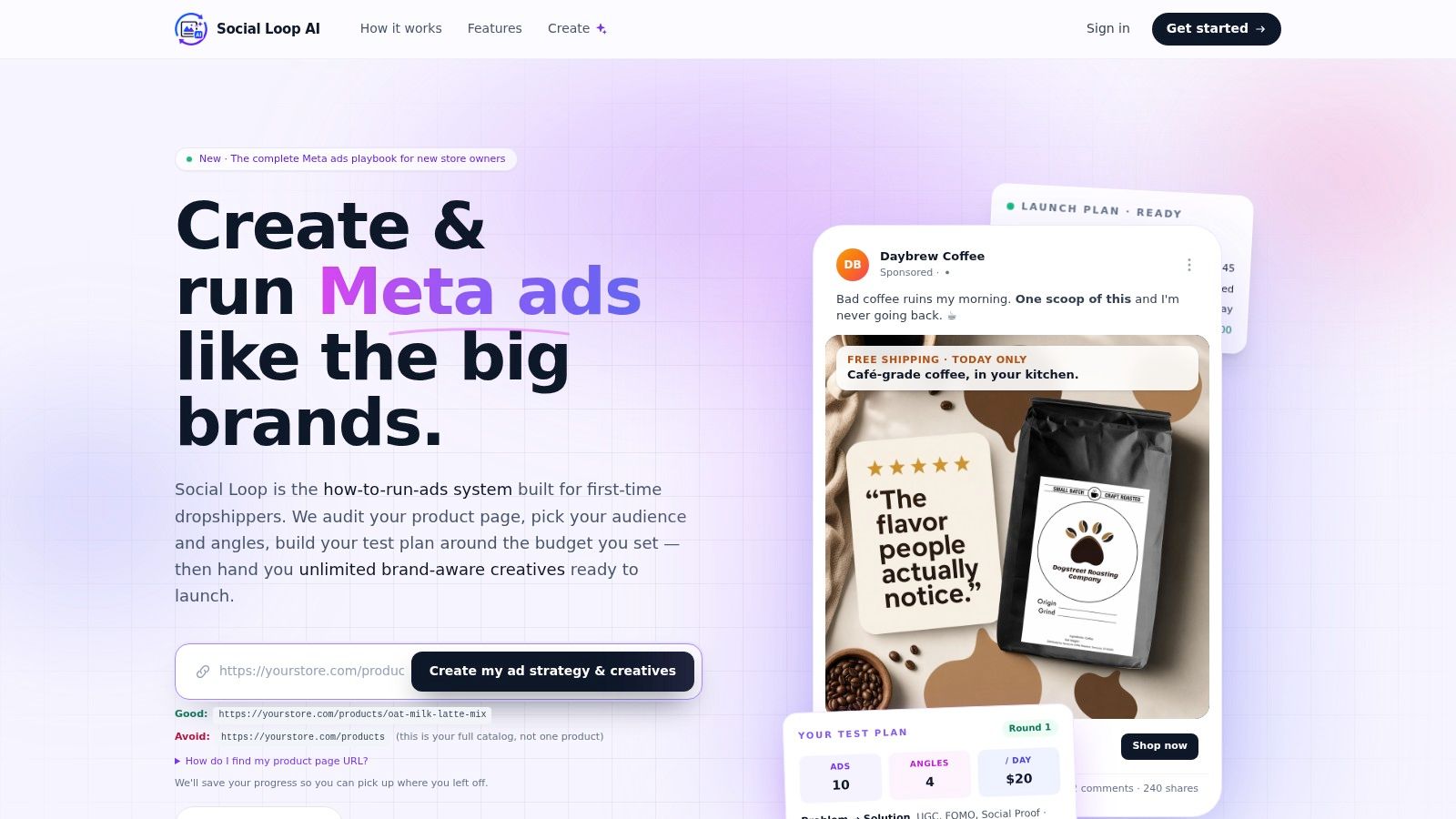
Social Loop AI fits this section for a simple reason. It connects the strategy step and the production step. It turns a product URL into a Meta ads launch plan and brand-aware creatives, and it supports video editing with b-roll and music in the same workflow. For a founder with limited budget and limited time, that cuts down on random choices that usually weaken the ad.
Use automation where it saves time. Keep human judgment on the angle, the opening frame, and the order of proof. That balance is what gets photo-based ads to look deliberate instead of assembled.
If you want a faster way to turn product photos into conversion-focused Meta creatives, Social Loop AI helps you build a clear ad angle, structure the creative, and assemble brand-aware assets without starting from a blank canvas every time.